Audience
When it comes to designing a CCTV logo, itâs important to understand your target audience and tailor your logo accordingly. Your target audience for a CCTV logo typically includes security companies, surveillance system providers, and businesses in the security industry. These companies and organizations rely on CCTV systems to protect their assets and ensure the safety of their premises. Therefore, it is crucial to create a logo that instills a sense of trust, professionalism, and reliability.
Icons
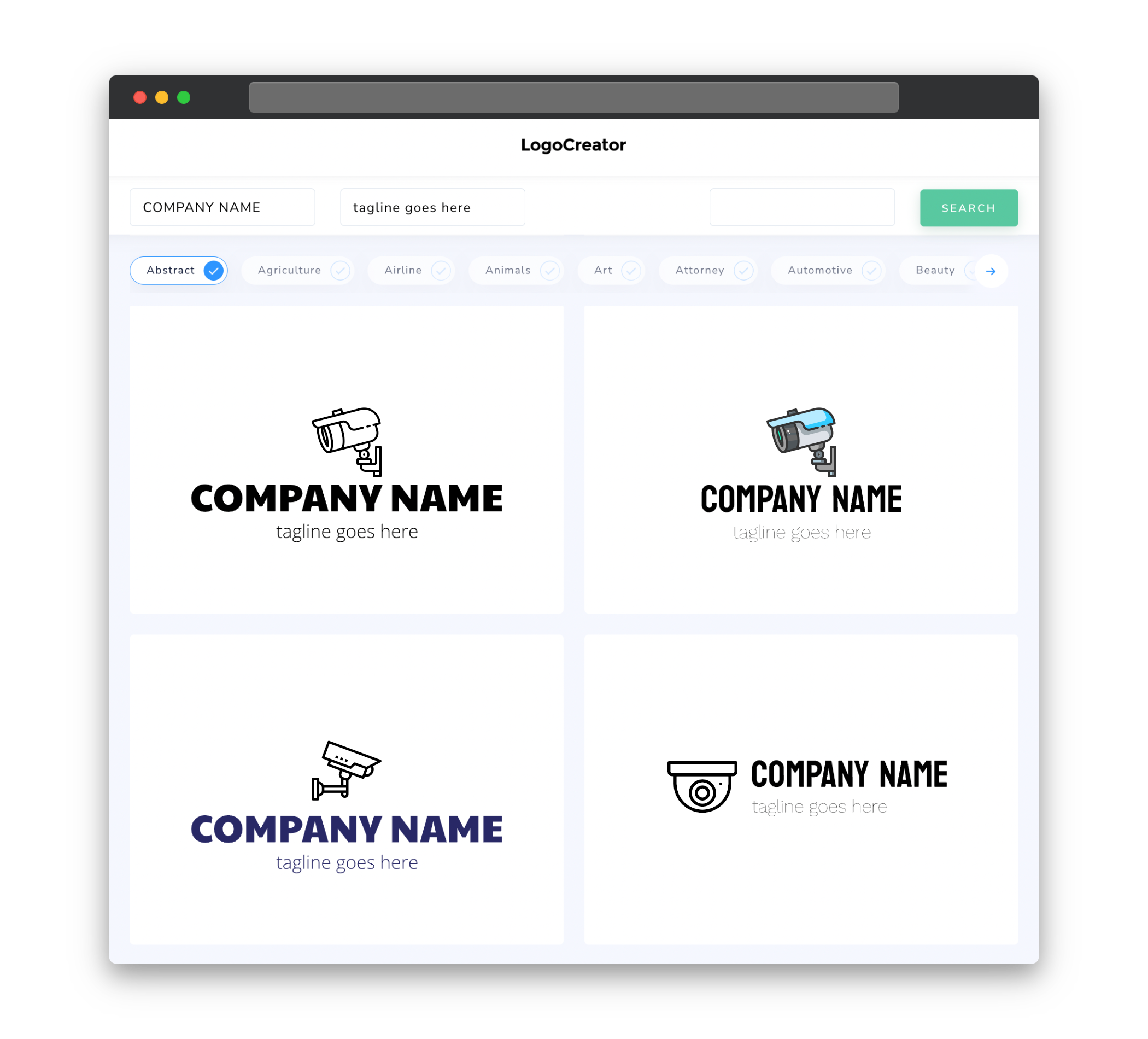
Choosing the right icons for your CCTV logo is an essential step in creating a visually appealing and memorable design. Icons associated with surveillance and security can include cameras, eyes, locks or shields. These symbols can effectively convey the purpose of the logo and communicate the idea of surveillance and safety to your target audience. It’s important to select icons that are clear, simple, and easily recognizable, as they will play a significant role in representing the purpose and identity of your CCTV logo.
Color
Selecting the right colors for your CCTV logo is crucial in creating a visually striking and impactful design. When it comes to security-related logos, colors like blue, black, and silver are commonly used. Blue represents trust, reliability, and professionalism, while black signifies strength and authority. Silver is often associated with modernity and sophistication. Combining these colors or using them individually can help create an eye-catching and professional-looking logo that resonates with your target audience.
Fonts
Choosing appropriate fonts for your CCTV logo is an important aspect of creating a strong visual identity. Clean, modern, and bold fonts are generally preferred for security-related logos as they convey a sense of professionalism and authority. Sans-serif fonts like Arial, Helvetica, or Montserrat are popular choices for CCTV logos due to their clean and sleek appearance. It’s important to ensure that the selected fonts are easily legible, even when used in smaller sizes. This will ensure that your logo remains distinct and easily recognizable.
Layout
The layout of your CCTV logo should be simple yet impactful. A combination of symbols, text, and negative space can help create a balanced and visually appealing design. Placing the icon or symbol on the left side and the company or brand name on the right is a common approach in CCTV logo design. This promotes easy recognition and allows flexibility in using different sizes and formats of the logo. Experimenting with different arrangements and alignments can help create a unique and memorable logo that stands out from the competition.
Usage
Once your CCTV logo is designed, it’s important to consider its potential usage across various platforms and mediums. Your logo should be scalable and adaptable to different sizes, ensuring that it remains recognizable and clear whether displayed on a website, mobile app, or physical signage. It’s also essential to create versions of your logo in different file formats (e.g., JPEG, PNG, SVG) to accommodate various requirements. By considering the potential usage scenarios from the beginning, you can save time and ensure consistency in your brand representation across all platforms.


