Audience
When it comes to creating a cement logo, it’s important to consider your target audience. Cement is often associated with construction and industrial projects, so your logo should appeal to professionals in these fields. Consider the type of clients or customers you are targeting – architects, engineers, contractors, or even homeowners who are involved in DIY projects. Understanding your audience will help you create a logo that speaks directly to their needs and preferences.
Icons
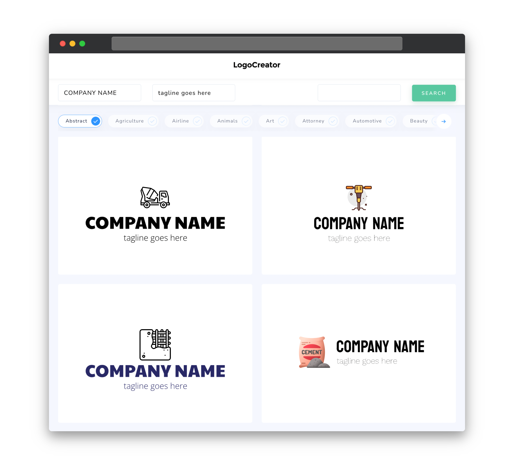
Icons can be a powerful way to communicate your message in a cement logo. Whether it’s a construction tool like a trowel or a representation of a building, incorporating relevant icons can help convey the purpose of your business. These icons should be simple, recognizable, and easily scalable to different sizes. Consider using strong and bold lines to represent the strength and durability of cement.
Color
Choosing the right colors for your cement logo is crucial in conveying the right message. Earth-toned colors such as various shades of gray, brown, and beige are often associated with cement. These colors can give your logo a sense of stability, reliability, and professionalism. Additionally, you may want to consider using accent colors such as blue or green to represent environmental friendliness or sustainability, especially if your business focuses on eco-friendly cement products.
Fonts
When selecting fonts for your cement logo, it is best to opt for simple and bold typography. Clean and geometric fonts can convey a sense of professionalism and strength. Avoid overly decorative or intricate fonts that may be difficult to read or appear too delicate for the cement industry. Letterforms that have straight, strong, and confident strokes can reinforce the message of durability and reliability that cement represents.
Layout
The layout of your cement logo should be clean, balanced, and easy to comprehend. Make sure all elements are well-organized, ensuring that the logo is visually appealing and easy to understand at a glance. Consider the placement of icons, company name, and any additional taglines or slogans. Experiment with different arrangements to find the ideal balance of elements that best represents your brand and attracts the attention of your target audience.
Usage
When creating a cement logo, keep in mind the various ways in which it will be used. Your logo should be versatile and adaptable across different platforms and media. Whether it’s for print materials like business cards and brochures, or for digital use on websites and social media profiles, your logo needs to be scalable without losing its clarity or impact. Ensure that your logo looks great in color as well as in black and white, and maintain consistency in its appearance across different sizes and formats.
Creating a cement logo that appeals to your target audience, incorporates relevant icons, utilizes appropriate colors and fonts, maintains a clean and balanced layout, and is versatile in its usage will help establish a strong and memorable brand identity for your cement-related business.


