Audience
When it comes to creating a climate change logo, it is important to consider your target audience. Identify who your logo will be communicating with and tailor your design to resonate with them. Are you targeting environmentally conscious individuals, organizations, or businesses? Understanding your audience’s values and preferences will help you create a logo that effectively communicates your message.
Icons
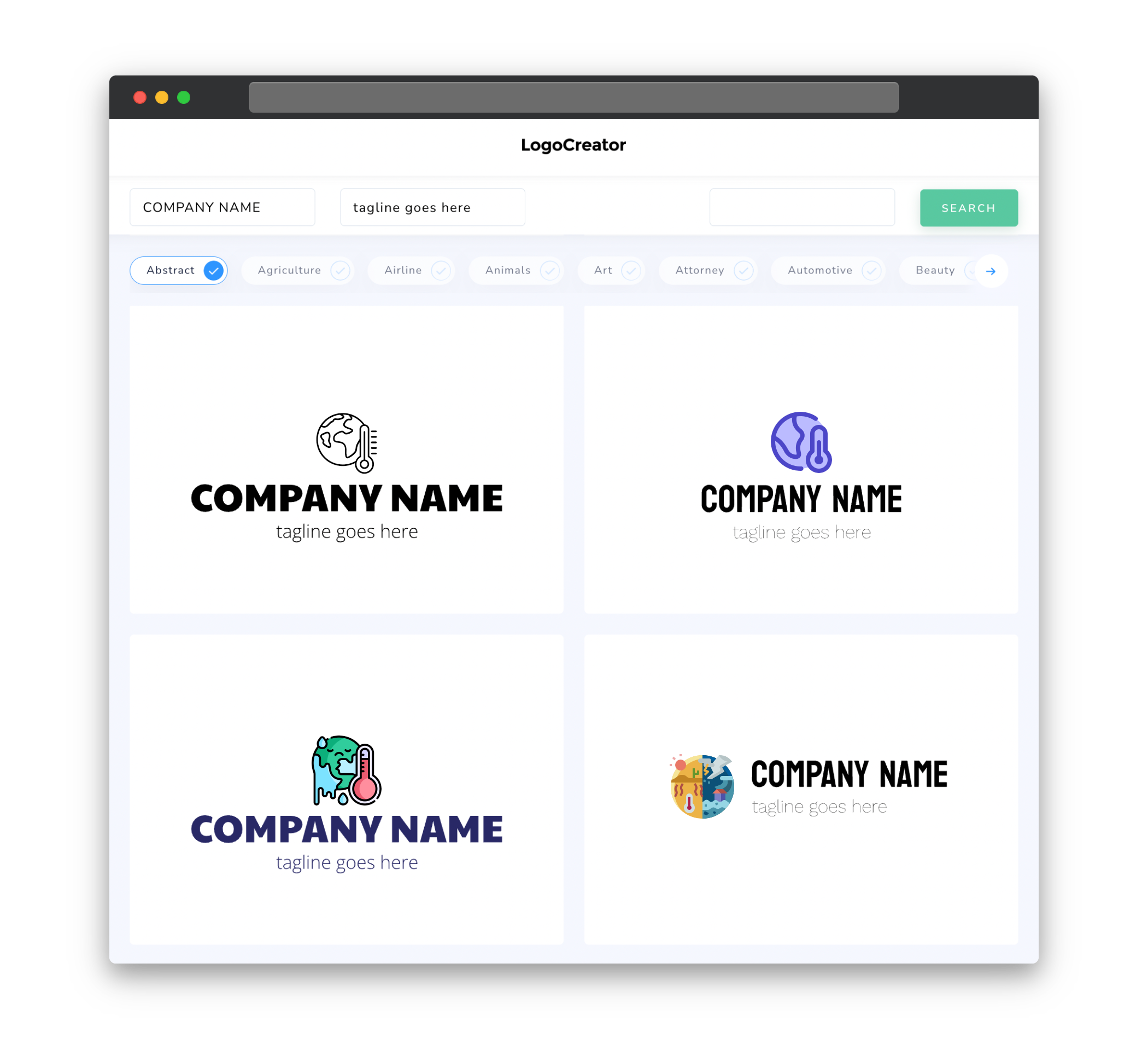
Choosing the right icons for your climate change logo is crucial in representing your message visually. Icons related to nature, sustainability, renewable energy, and climate activism can be powerful symbols to convey your commitment to addressing climate change. Incorporating elements such as leaves, trees, water droplets, or even a globe can help create a strong visual impact that captures the essence of your cause.
Color
Color plays a significant role in creating a climate change logo that effectively conveys your message. Consider using nature-inspired colors, such as shades of green, blue, and earth tones, to reinforce the connection with the environment. Additionally, you may want to incorporate bright and vibrant colors to evoke a sense of optimism and hope for a sustainable future. Striking the right balance between soothing and energetic color palettes can help your logo stand out and communicate the urgency and importance of addressing climate change.
Fonts
Choosing the right fonts for your climate change logo can enhance its visual appeal and ensure that your message is conveyed effectively. Opt for clean and modern font styles that are easily readable, as they tend to communicate professionalism and clarity. Aim for fonts that have a sense of balance and simplicity while reflecting the spirit of the environmental movement. Additionally, consider incorporating custom lettering or typography to add a unique touch and make your logo more memorable.
Layout
The layout of your climate change logo should be carefully designed to ensure its visual impact and readability. A balanced and symmetrical layout can create a sense of stability and order, while an asymmetrical design can convey the dynamic and ever-evolving nature of climate change. Consider the use of negative space to give your logo breathing room and make it visually appealing. Experiment with different arrangements of icons, text, and other elements to find a layout that best represents your message and captures attention.
Usage
When designing a climate change logo, it is essential to consider how it will be used and where it will be displayed. Whether it’s on your website, social media profiles, newsletters, or merchandise, the logo needs to be versatile and adaptable across various platforms and media. Ensure that the logo retains its visual impact and clarity, regardless of its size or resolution. It should maintain its legibility and recognition when scaled down for smaller applications or when displayed in black and white. Creating a well-designed, scalable logo will ensure its effectiveness and consistency across different usage scenarios.


