audience
When designing a logo for a compassion-focused organization or initiative, it is important to consider the target audience. A compassion logo should resonate with individuals who value empathy, kindness, and a desire to make a positive impact on the world. Your logo should aim to evoke emotions of warmth, trust, and understanding. By understanding and connecting with your audience, you can create a logo that speaks directly to their values and aspirations.
icons
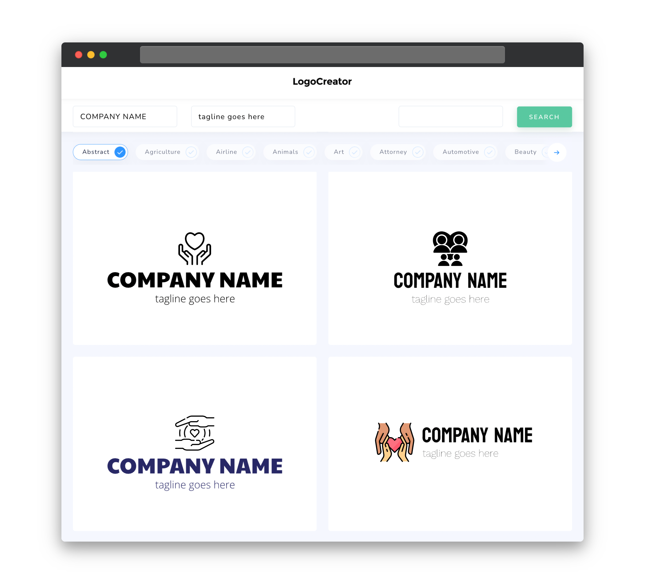
Choosing the right icons for your compassion logo is crucial in conveying your message effectively. Icons can be powerful symbols that represent compassion, such as hands extending support, a heart symbolizing love and care, or a globe signifying global unity. These icons should be chosen carefully, ensuring they align with the values and mission of your organization. Additionally, simplicity is key when it comes to icons for compassion logos â clean and minimalistic designs tend to have a stronger impact and are more easily recognizable.
color
Color plays a vital role in evoking emotions and setting the tone for your compassion logo. Typically, warm and soothing colors are preferred to create a sense of warmth and empathy. Shades of blue, green, and yellow often evoke feelings of tranquility, compassion, and hope. Adding accents of softer colors like pastels can also enhance the emotional appeal of your logo. It’s important to choose colors that not only represent compassion but also resonate with your audience’s preferences and cultural associations.
fonts
When selecting fonts for your compassion logo, it is important to prioritize readability and simplicity. Clean, sans-serif fonts are often preferred as they convey a sense of clarity and approachability. Fonts with gentle curves and smooth lines can also help create a harmonious and compassionate visual aesthetic. Avoid using overly ornate or elaborate fonts that may detract from the overall message and make the logo appear cluttered. Remember, the primary goal is to communicate compassion effectively through your logo, and the right font choice can contribute significantly to achieving that.
layout
The layout of your compassion logo should be carefully planned to ensure that it effectively conveys your message while retaining simplicity and clarity. Consider using a balanced layout that allows the elements to flow seamlessly and create a sense of visual harmony. Placing icons and text in a cohesive arrangement helps establish a strong connection between the visual and textual aspects of your logo. Experiment with different arrangements and proportions to find the most effective layout that captures the essence of compassion and resonates with your target audience.
usage
To ensure your compassion logo is versatile and can be used across various platforms, it is crucial to create variations suitable for different use cases. Design different versions of your logo for different backgrounds, such as light and dark versions, to ensure optimal visibility and legibility. Additionally, create versions of your logo that work well at different sizes, whether it’s for a website header or a small social media profile picture. By creating adaptable versions of your logo, you can maintain a consistent brand identity and maximize its impact across different mediums.


