Audience
When it comes to creating a logo for your condominium, it is important to consider your target audience. Your logo should resonate with both current and potential residents, as well as capture the essence and unique characteristics of your condominium. Whether your target audience consists of young professionals, families, or retirees, your logo should reflect their interests, aspirations, and values. By understanding your audience, you can create a logo that appeals to their preferences and makes a lasting impression.
Icons
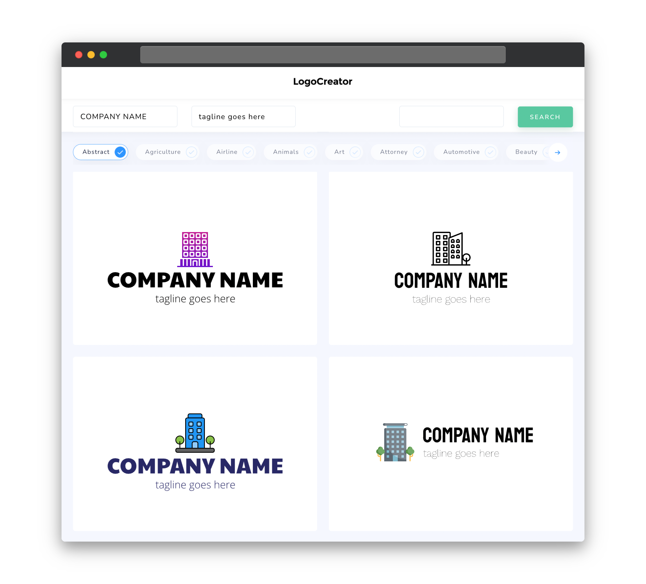
Choosing the right icons for your condominium logo can help convey its identity and purpose effectively. Consider including icons that represent the key features and amenities of your condominium, such as a swimming pool, fitness center, or recreational spaces. These icons will visually communicate the benefits and lifestyle associated with living in your condominium. Additionally, you can incorporate icons that symbolize community, such as buildings, trees, or hands joining together, to emphasize the sense of belonging and togetherness within your condominium.
Color
Colors play a significant role in logo design as they evoke emotions and associations. When selecting colors for your condominium logo, think about the overall ambiance and atmosphere that you want to create. Calming and soothing colors like blue and green can evoke a sense of tranquility and relaxation, perfect for a condominium that aims to provide a peaceful living environment. On the other hand, vibrant and energetic colors like red and orange can portray a dynamic and lively atmosphere, ideal for condominiums targeting young professionals or families.
Fonts
Fonts have the power to set the tone and personality of your condominium logo. Choosing the right font is crucial to ensure that your logo aligns with the image and brand identity of your condominium. Clean and modern fonts with straight lines and clear readability are often preferred for condominium logos, as they convey a sense of professionalism and sophistication. Alternatively, if your condominium has a more playful and artistic theme, you can opt for script or decorative fonts that add a touch of creativity and uniqueness to the logo.
Layout
The layout of your condominium logo should be both visually appealing and functional. Consider the various ways your logo will be used, such as on signage, websites, or promotional materials, and design a layout that can easily adapt to different sizes and formats. A well-balanced and symmetrical layout is often preferred for condominium logos, as it portrays a sense of stability and harmony. However, depending on your condominium’s unique characteristics, you might choose to use an asymmetrical layout to reflect a more eclectic and unconventional style.
Usage
When designing a logo for your condominium, it is essential to consider its usage across different channels and platforms. Your logo should be versatile and easily adaptable to different sizes, backgrounds, and mediums. Whether it is used on websites, brochures, or social media profiles, your logo must maintain its legibility and impact. It’s also recommended to create a version of your logo that works well in black and white, ensuring it remains visually striking in any situation. Lastly, consider creating variations of your logo, such as a simplified icon or a stacked version, to provide flexibility in its application while maintaining brand recognition.


