Is a conferences logo the right choice for me?
A conferences logo is the perfect choice if you are an event organizer, a conference planner, or part of a team responsible for hosting knowledge-sharing events. It’s also ideal for educational institutions, businesses, and associations that frequently host conferences. If your mission is to facilitate meaningful discussions, foster learning, and create a platform for networking, a conferences logo can effectively communicate the essence of your events.
What makes a good conferences logo?
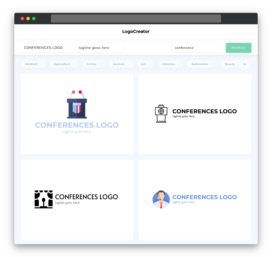
A good conferences logo should capture the essence of knowledge sharing, networking, and professional development. Simplicity and clarity are key, with elements like abstract conference motifs, podiums, speech bubbles, or interconnected people often working well. Your logo should convey a sense of expertise and organization while maintaining a clean and versatile design.
What are the best icons for conferences logos?
When selecting icons for your conferences logo, consider symbols that represent the world of conferences and events, such as podiums, microphones, arrows, or abstract representations of people coming together. These icons symbolize the essence of conferences and the opportunities they offer for learning and networking. Choose icons that resonate with your brand’s values and the message you want to convey about knowledge sharing and professional growth.
What colors are best for conferences logos?
Colors play a significant role in conveying the emotions and ideals associated with conferences. Professional and corporate colors like deep blues, sophisticated grays, and vibrant reds are often suitable choices. These colors evoke feelings of expertise, organization, and professionalism, which are central to the world of conferences. Experiment with color palettes to find the one that best represents your conference brand and the diverse range of topics you cover.
Which fonts go best with conferences logos?
Choose fonts that complement the professional and organized aspects of your conferences logo. Clean and modern sans-serif fonts with clear lines often work well, as they convey a sense of professionalism and straightforwardness. Alternatively, elegant and timeless serif fonts can also be a good fit for a more traditional and refined look. Explore different font styles to find the one that best resonates with your brand’s identity and the values of knowledge sharing and professional development.
Now that you have a better understanding of what makes a compelling conferences logo, why not give our logo maker a try? Create a logo that symbolizes the world of learning, networking, and knowledge sharing. Start hosting memorable and impactful conferences today!


