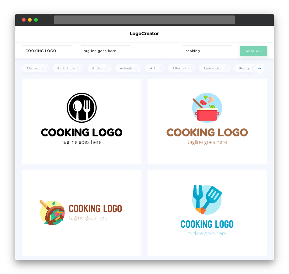
Is a cooking logo the right choice for me?
Absolutely! A cooking logo is a perfect choice for anyone immersed in the world of gastronomy, whether as a chef, a food blogger, or a restaurateur. It’s not just for established culinary businesses; it’s equally valuable for home cooks and passionate foodies looking to showcase their culinary talents. A cooking logo serves as the visual essence of your culinary brand, conveying the flavors, aromas, and love you put into your dishes. Whether your cuisine is gourmet, comfort, or global, a well-designed logo can enhance your brand’s identity and tantalize the taste buds of your audience.
What makes a good cooking logo?
A good cooking logo is a blend of taste, creativity, and visual appeal. It should effectively communicate your culinary focus while being visually enticing. Effective cooking logos often incorporate elements like utensils, cooking tools, ingredients, or chef’s hats to represent the culinary world. The key is to design a logo that not only looks delectable but also resonates with your audience, creating an appetite for your brand.
What are the best icons for cooking logos?
The best icons for cooking logos are those that directly relate to culinary themes and the joy of cooking. Consider using symbols like chef’s hats, aprons, pots, pans, utensils, or ingredients like herbs, spices, and vegetables. Icons should be visually appealing and enhance the overall theme of your cooking logo, making it clear that your brand is all about the love of food.
What colors are best for cooking logos?
Color choices for cooking logos should evoke the senses and mirror the flavors of your cuisine. Warm and inviting colors like reds, oranges, and yellows can stimulate appetite and create a sense of comfort, making them excellent choices for cooking logos. Earthy tones like browns and greens can reflect natural and organic aspects of cuisine, while neutral colors like white or black can add sophistication. The key is to create a harmonious color palette that resonates with your cuisine style and enhances the overall visual impact of your cooking logo.
Which fonts go best with cooking logos?
Fonts in cooking logos should prioritize readability, warmth, and a sense of culinary passion. Script fonts can add a touch of elegance and mimic the flowing movements of culinary creations. Serif fonts can convey tradition and quality, ideal for restaurants and established culinary brands. Sans-serif fonts can create a modern and clean look, suitable for contemporary and casual dining establishments. The font choice should enhance the overall style of your logo and ensure that your brand name or slogan remains clear and inviting, whether displayed on menus, signage, or websites.
Ready to infuse your culinary brand with a logo that captures the essence of your gastronomic journey? Try our cooking logo maker and discover how easy it is to create a logo that satisfies both the eyes and the taste buds. Whether you’re a home chef, a restaurant owner, or a culinary influencer, our tool is designed to help you craft a logo that celebrates your love for food and invites others to savor the experience. Get started today and watch your cooking logo become the secret ingredient to your culinary success!


