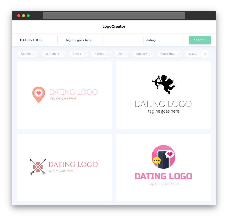
Is a dating logo the right choice for you?
Absolutely! A dating logo is a must-have for anyone venturing into the realm of online matchmaking. It’s the face of your dating platform and sets the tone for the entire user experience. Whether you’re catering to a niche audience or aiming for a broad market, a well-crafted logo is essential. It communicates the essence of your platform, whether it’s about casual encounters, long-term relationships, or LGBTQ+ dating. A dating logo is your chance to create an emotional connection with potential users and reassure them that your platform is the place to find love.
What makes a good dating logo?
A good dating logo should encapsulate the core values of your platform: love, trust, and connection. Simplicity is key, as it ensures your logo is easily recognizable and memorable. Consider using heart symbols, abstract couples, or silhouettes to represent love and relationships. These elements evoke emotions and make your logo relatable to your target audience. A strong logo should also be versatile, appearing equally striking on various platforms, from mobile apps to social media profiles and marketing materials.
What are the best icons for dating logos?
The best icons for dating logos are those that resonate with the romantic aspirations of your users. Hearts are a timeless symbol of love and passion, making them an excellent choice for dating logos. They instantly convey the purpose of your platform and evoke emotions associated with romance. Other icons to consider include arrows representing connection or intertwined rings symbolizing commitment. Abstract couples or silhouettes can also be effective, allowing users to see themselves in the logo and sparking curiosity about the potential for connection.
What colors are best for dating logos?
Color selection in dating logos is critical, as different hues can evoke various emotions and set the tone for your platform. Red, a color associated with love and passion, is a popular choice for dating logos. It can create a sense of excitement and urgency, perfect for platforms promoting casual dating or speed dating events. Blue, on the other hand, symbolizes trust and reliability, making it a great option for platforms emphasizing long-term relationships and compatibility. Consider using softer tones like pink or lavender for a more romantic and gentle appeal. Ultimately, your color palette should align with your brand’s message and values.
Which fonts go best with dating logos?
When it comes to fonts for dating logos, simplicity and readability are paramount. Clean and modern sans-serif fonts like Helvetica, Arial, or Proxima Nova are popular choices. They convey a sense of professionalism and make your logo easy to read, even at small sizes. If your platform has a specific theme, such as vintage romance or playful dating, consider using custom or script fonts to reflect that style. Remember that legibility is key, as users should be able to read your logo effortlessly across various devices and platforms.
Ready to craft a dating logo that sparks connections and ignites love stories? Don’t miss the opportunity to create a memorable first impression. Try our dating logo maker now and watch your platform become the go-to destination for singles seeking love and companionship. Whether you’re fostering new beginnings or helping people find their soulmates, a captivating logo is your first step in uniting hearts. Start designing your dating logo today!


