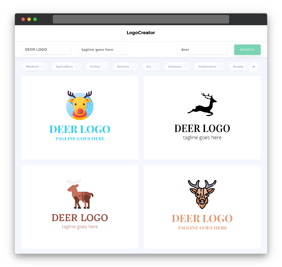
Is a deer logo the right choice for me?
A deer logo is an excellent choice for businesses and organizations that want to evoke feelings of grace, adaptability, and natural beauty. If your brand’s values align with these qualities, a deer logo can effectively communicate your message to your target audience.
What makes a good deer logo?
A good deer logo should capture the essence of the deer’s characteristics, including grace, strength, and agility. Focus on creating a design that embodies these qualities while maintaining simplicity and versatility. Pay attention to the details in the deer’s antlers, posture, and overall silhouette to ensure they align with your brand’s identity.
What are the best icons for deer logos?
When choosing icons for your deer logo, consider elements like antlers, a leaping deer, or a serene forest backdrop. These symbols complement the natural beauty and grace associated with deer and add depth to your logo’s meaning. Experiment with different combinations to find the one that best represents your brand.
What colors are best for deer logos?
Colors play a crucial role in conveying the emotions and natural imagery associated with your brand. For deer logos, earthy tones like brown, forest green, and warm neutrals work exceptionally well. These colors evoke a sense of connection to nature and the outdoors, aligning perfectly with the deer’s symbolism.
Which fonts go best with deer logos?
Choose fonts that complement the elegance and strength of your deer logo. Serif fonts with clean lines and a timeless feel often work well, as they provide a classic and sophisticated look that pairs harmoniously with the majestic image of a deer. Experiment with different font styles to find the one that best suits your brand’s identity.
Now that you have a better understanding of what makes a great deer logo, why not give our deer logo maker a try? Create a logo that embodies grace, strength, and natural beauty for your brand today!


