Audience
When it comes to building a successful brand for your dietitian services, it’s important to understand your audience. Identifying your target audience helps you create a logo that appeals to their unique needs, preferences, and aspirations. Your target audience could consist of individuals seeking weight loss guidance, athletes looking to optimize their nutrition, or people with specific medical conditions requiring dietary management. By tailoring your dietitian logo to resonate with your ideal audience, you can effectively communicate your expertise and build trust with potential clients.
Icons
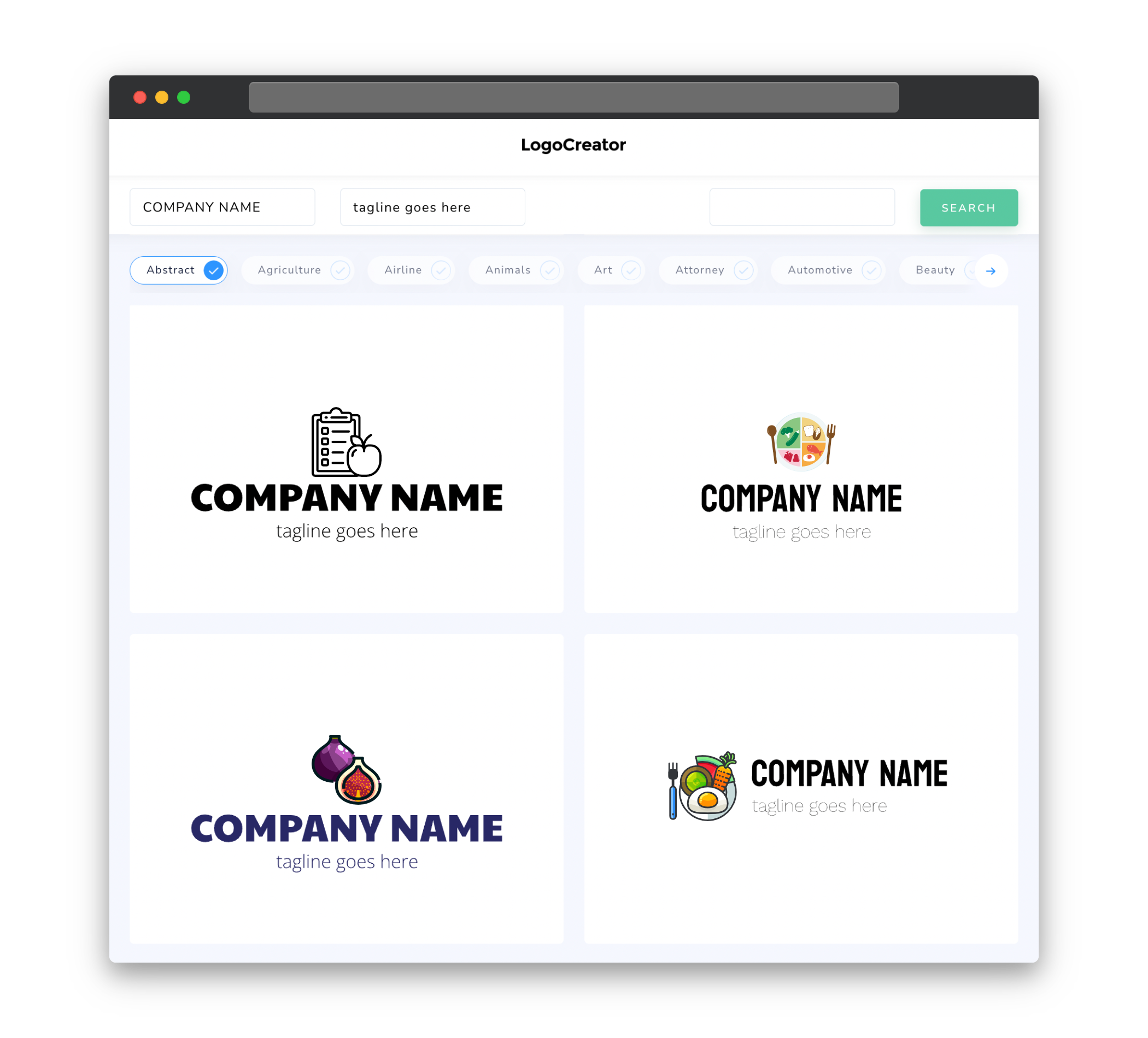
The right icon can instantly convey the essence of your dietitian services and make your logo more memorable. Consider incorporating symbols that represent health, nutrition, and well-being, such as a fruit or vegetable icon, a measuring tape, or a heart symbolizing a healthy lifestyle. These icons can help visually communicate your profession and the positive impact you make on your clients’ lives. It’s important to choose a simple, clean icon that is recognizable and scalable, allowing you to use it across various platforms, from your website to social media profiles.
Color
Selecting the right colors for your dietitian logo is crucial, as colors evoke emotions and associations. Opt for colors that are associated with health, vitality, and trust. Green is often associated with fresh produce and nature, while blue conveys a sense of trustworthiness and dependability. You may also consider using lighter, pastel shades that create a calming effect and evoke feelings of balance and harmony. Ensure your chosen colors complement each other well and consider the contrast between the background and text to ensure readability.
Fonts
Incorporating the right fonts into your dietitian logo can enhance its overall look and feel. Consider using clean and modern fonts, such as sans-serif typefaces, to convey professionalism and clarity. Fonts with a slight curve or gentle slant may also add a touch of elegance and approachability to your logo. It’s important to choose legible fonts, even when scaled down to smaller sizes. A combination of two complementary fonts, one for the logo’s main text and another for supporting text (like the tagline or contact information), can create visual contrast and help communicate your unique brand personality.
Layout
The layout of your dietitian logo plays a crucial role in its visual appeal and message delivery. A balanced layout that places emphasis on the main icon or text can create a sense of stability and professionalism. Experiment with different combinations of icon, text, and tagline placement, ensuring they don’t overcrowd or overshadow each other. Aim for simplicity and clarity in your logo’s composition, keeping in mind that it needs to be versatile and easily recognizable across different applications and sizes.
Usage
Your dietitian logo will serve as the face of your brand, appearing across various platforms and collaterals. Develop guidelines for consistent logo usage to maintain brand integrity and recognition. Consider its placement on your website, social media profiles, business cards, stationery, and promotional materials. Ensure your logo is legible and effectively communicates your brand message, regardless of its size or context. It’s essential to create logo variations for different backgrounds and formats, whether it’s a full-color version for digital use or a simplified version for black and white printing.


