Audience
When it comes to creating a logo for your drinking water brand, it’s important to consider your target audience. Understanding who your customers are will help you design a logo that resonates with them and appeals to their preferences. Think about the age group, lifestyles, and values of your audience. Are they health-conscious millennials, active individuals, or families looking for purity and quality in their drinking water? Knowing your audience will give you valuable insights into the type of logo design that will attract and engage them.
Icons
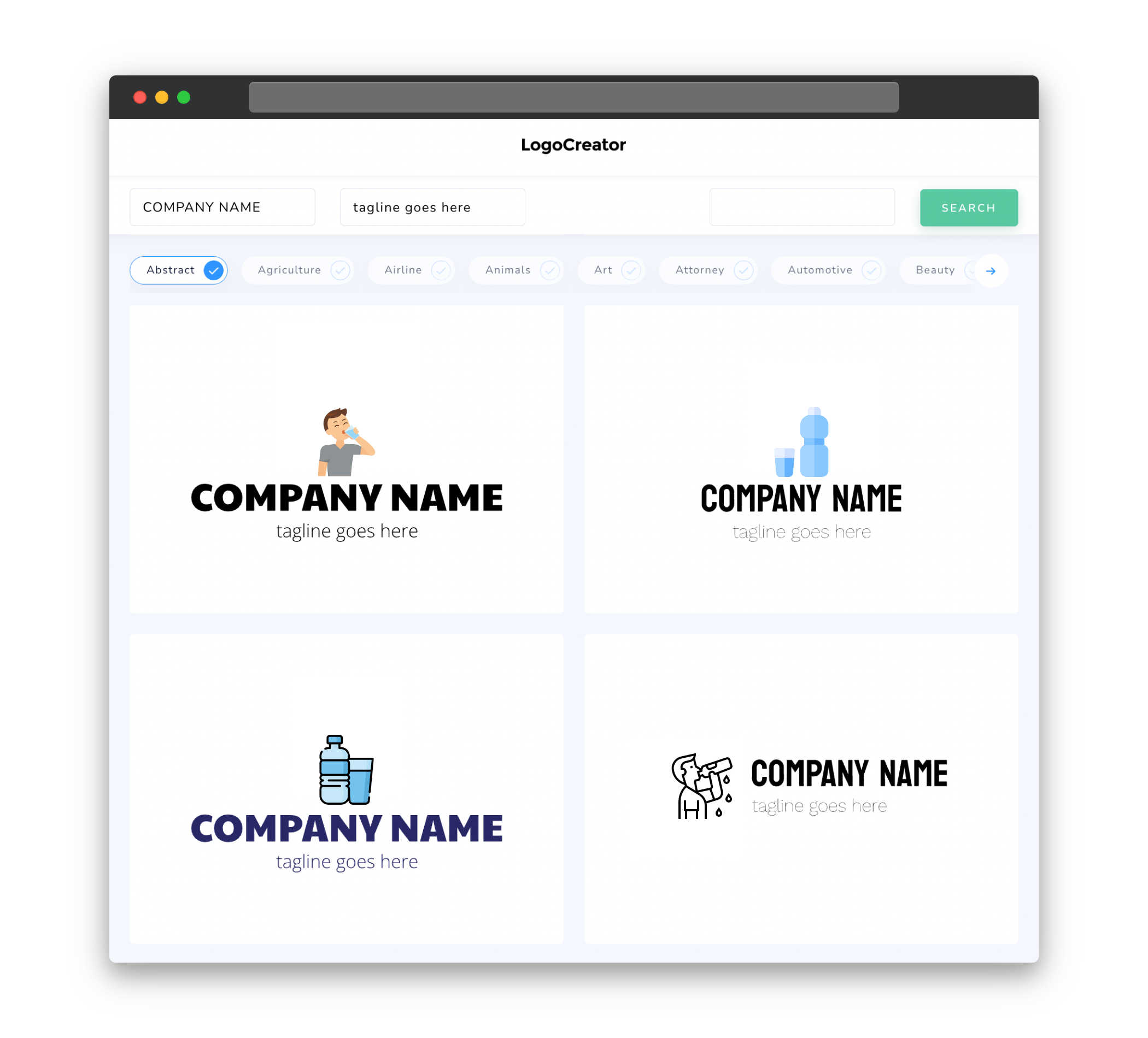
Icons play a crucial role in conveying the essence of your drinking water brand and making it memorable. In the context of a logo, icons can represent various elements such as water drops, refreshing imagery, or purity symbols. Choose icons that align with your brand’s identity and values. Perhaps you want to emphasize sustainability and use a leaf icon, or maybe you want to showcase purity by incorporating a water drop. Icons can add visual appeal and communicate your brand message effectively.
Color
Choosing the right colors for your drinking water logo is essential in evoking the right emotions and associations. Different colors have varying effects on people’s perceptions and can create an instant connection with your brand. Consider using shades of blue, as they are often associated with purity, freshness, and tranquility – qualities that are highly sought after in the drinking water industry. Green can be used to convey eco-friendliness and natural elements, while white represents purity and cleanliness. Experiment with color combinations to find the perfect palette that represents your brand values and resonates with your target audience.
Fonts
The choice of fonts in your drinking water logo can greatly influence the overall perception of your brand. Selecting the appropriate typography sets the tone for your logo and needs to reflect your brand identity. Clean, modern, and sans-serif fonts can convey a sense of sleekness and purity, which are desirable qualities in the drinking water industry. Alternatively, you might opt for a more playful and bold font to demonstrate a sense of personality and creativity. Remember to choose fonts that are easily readable at different sizes, ensuring your logo maintains its impact across various platforms.
Layout
When it comes to logo design, simplicity is key. A clutter-free and balanced layout will help your drinking water logo make a strong first impression. Consider using symmetrical or asymmetrical arrangements of icons, typography, and other graphical elements to create a visually appealing composition. Think about the various applications of your logo, whether it will be on product packaging, websites, or social media platforms. By keeping the layout versatile, you can ensure your logo remains cohesive, recognizable, and adaptable across different mediums.
Usage
Your drinking water logo will be the face of your brand, appearing on everything from product labels to marketing materials. It’s important to consider how and where the logo will be used. For instance, if you plan to print it on small packaging, you’ll need a simple and scalable logo that remains clear and legible even at small sizes. Similarly, if you plan to use it on digital channels, such as social media, a logo that can be easily recognized as a small avatar is vital. Prioritize a versatile logo design that can be adapted to different sizes, resolutions, and mediums, while still retaining its identity and impact.


