Audience
When it comes to creating a logo for your drug store, it’s important to consider your target audience. Think about the type of customers you want to attract and what will resonate with them. A well-designed drug store logo can help instill trust and confidence in your customers, making them more likely to choose your store over competitors. Your logo should be clear, concise, and convey the values and services that set your drug store apart from others. By understanding your audience and tailoring your logo design to their needs and preferences, you can create a logo that attracts and engages your target market.
Icons
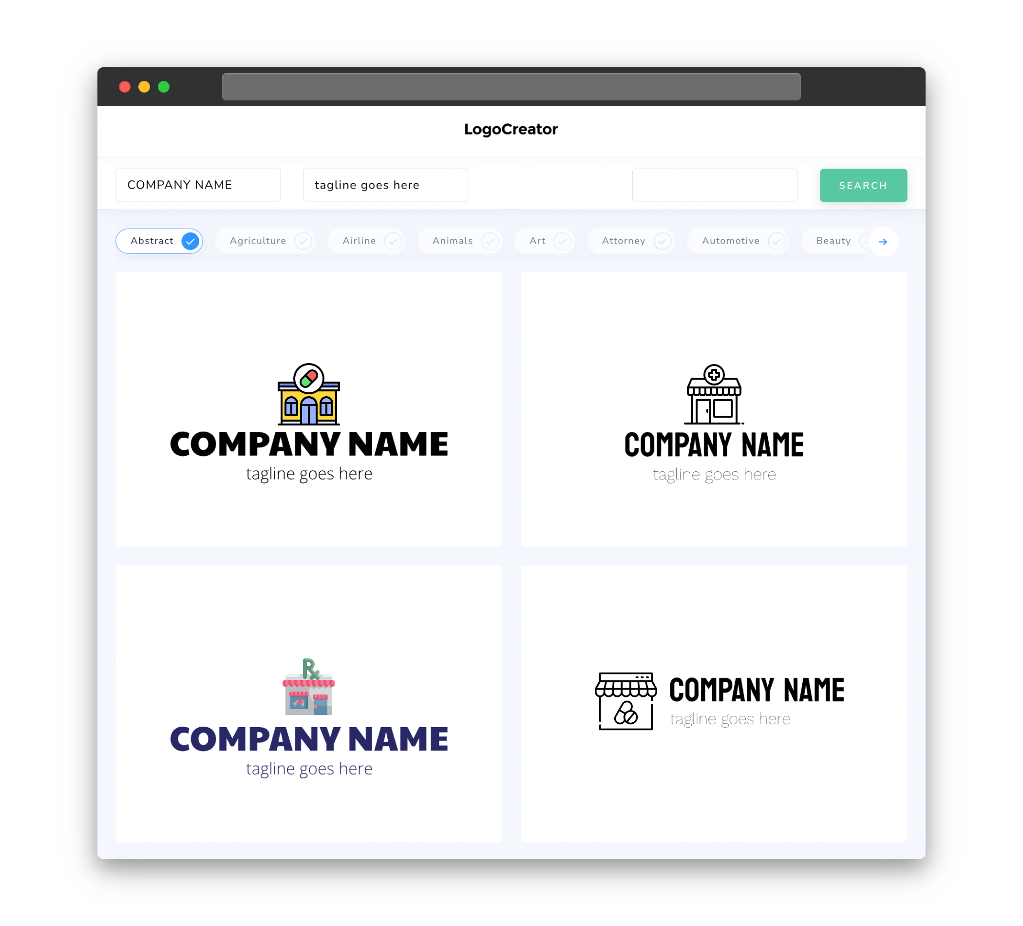
Icons are a vital element of any drug store logo. They provide a visually appealing representation of your store’s identity in a simple and memorable way. Consider incorporating icons that are relevant to the pharmaceutical industry, such as a mortar and pestle, medical cross, or prescription bottle. These symbols are instantly recognizable and can help communicate the purpose and focus of your drug store. Additionally, using icons in your logo design allows for versatility, as they can be scaled easily and used in various marketing materials, from signage to online platforms.
Color
Choosing the right color palette for your drug store logo plays a crucial role in conveying the right message to your target audience. Consider using colors that are associated with trust, professionalism, and health. Blue, for example, is often associated with reliability and dependability, making it a popular choice for drug store logos. Green can convey a sense of wellness and vitality, while white can represent cleanliness and purity. It’s important to strike a balance between colors that reflect your brand’s personality and those that align with the values of your audience.
Fonts
The choice of fonts in your drug store logo should reflect the image you want to portray. When choosing fonts, consider ones that are easy to read, professional, and convey a sense of stability and reliability. Sans-serif fonts are often preferred for their clean and modern look, while serif fonts can add a touch of sophistication and elegance. Avoid overly decorative or hard-to-read fonts that may confuse or alienate your audience. Remember, simplicity is key when it comes to a drug store logo, as it should be easily recognizable and legible across different mediums.
Layout
The layout of your drug store logo should be carefully considered to ensure it effectively communicates your brand message. A well-balanced and visually pleasing design is essential to grab the attention of your audience. Consider using a symmetrical or balanced layout, which can create a sense of stability and order. It’s important to strike a balance between simplicity and uniqueness, ensuring that your logo stands out without overwhelming or confusing viewers. Experiment with different layouts and arrangements to find the one that best represents your drug store’s identity and resonates with your target audience.
Usage
Your drug store logo should be designed with versatility and adaptability in mind. It should work seamlessly across different marketing materials, from business cards and packaging to online platforms and signage. Ensure that your logo is scalable, so it can be easily resized without losing its clarity or legibility. Additionally, consider creating variations of your logo for different applications, such as a simplified version for small spaces or a horizontal layout for certain formats. By ensuring your drug store logo is versatile, you can maintain a consistent and professional image across all platforms and touchpoints.


