Audience
As a Dutch logo maker, it’s essential to understand your audience and cater to their specific needs. You have the opportunity to work with a diverse range of clients, including startups, small businesses, and established companies throughout the Netherlands. Each client will have their own unique brand identity and target audience, so it’s crucial to create logos that resonate with their specific market. By understanding your audience’s preferences, industry trends, and cultural influences, you can create logos that effectively communicate your clients’ message and help their businesses stand out in the Dutch market.
Icons
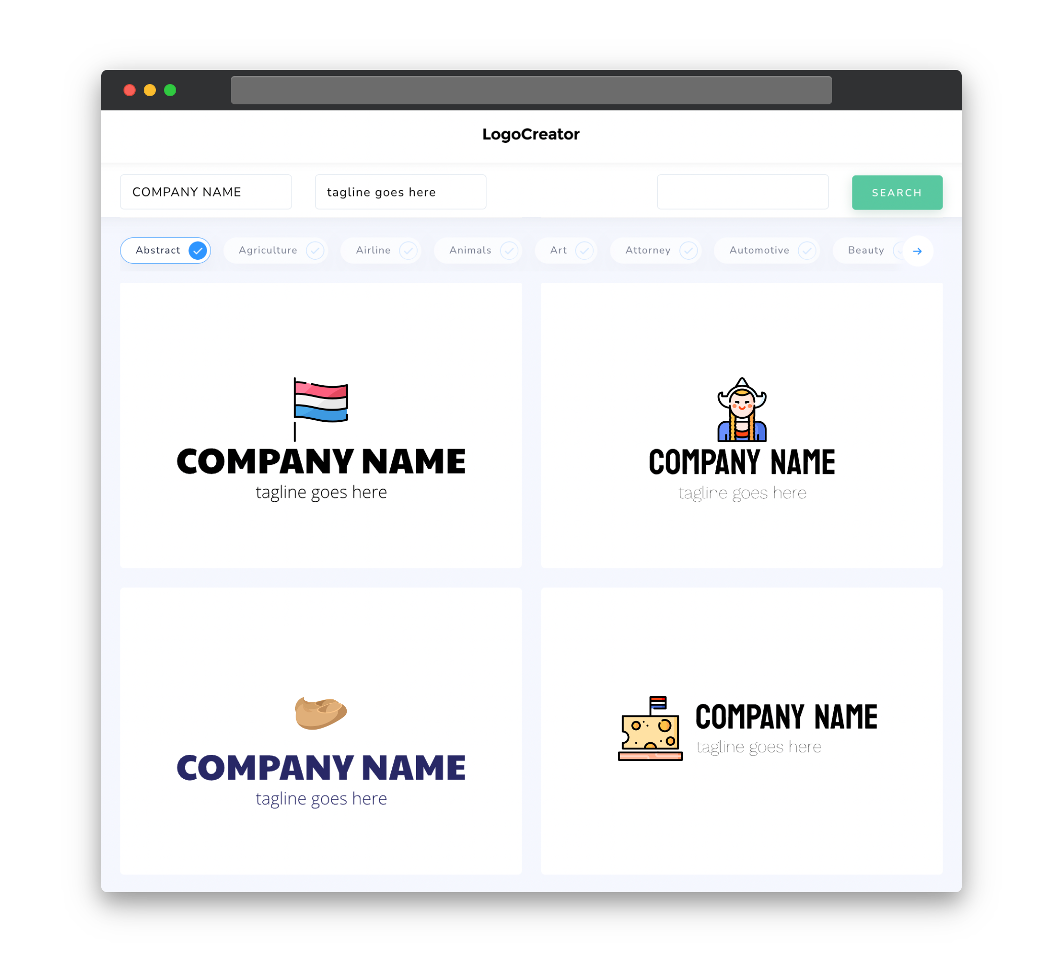
Icons play a significant role in logo design, as they help visually represent a company’s brand and values in a concise and memorable way. When designing logos for your Dutch clients, consider incorporating icons that are culturally relevant and evoke a sense of Dutch heritage. Elements such as windmills, tulips, bicycles, or traditional Dutch architecture can add a touch of familiarity and local charm to the logos you create. However, it’s essential to strike a balance between incorporating these culturally significant icons and keeping the design clean, modern, and visually appealing.
Color
Color is a powerful tool in logo design, as it can evoke emotions and convey brand personality. When working with Dutch clients, consider incorporating colors that are meaningful and resonate with the local culture. The Dutch flag’s colors, red, white, and blue, can serve as a starting point for creating logos that feel distinctly Dutch. Alternatively, you can explore other colors that have cultural significance in the Netherlands, such as orange, which is associated with the Dutch royal family and symbolizes national pride. Remember to consider the client’s brand identity and industry when selecting colors, as they should align with their specific goals and target audience.
Fonts
Choosing the right fonts is crucial in logo design, as they help convey the brand’s personality and style. When working with Dutch clients, consider using fonts that are clean, modern, and easy to read. Sans-serif fonts are often a popular choice in contemporary logo design, as they exude a sense of professionalism and simplicity. However, it’s also important to consider the client’s industry and brand image. For example, a Dutch tech startup may prefer a sleek and streamlined font, while a Dutch bakery may opt for a more playful and decorative typeface. Ultimately, the fonts you choose should align with the brand’s personality and effectively communicate its message to the Dutch audience.
Layout
The layout of a logo plays a crucial role in its effectiveness and visual appeal. When designing logos for your Dutch clients, aim for a balanced and harmonious composition that captures attention and communicates the brand’s message clearly. Consider using a combination of text and icons or graphics that work cohesively together. The arrangement of elements should be well-proportioned and visually pleasing, ensuring that the logo is easily recognizable and adaptable to various platforms and sizes. A well-crafted logo layout will help your Dutch clients establish a strong visual identity and make a lasting impression on their target audience.
Usage
Logo usage refers to how the logo will be applied across various platforms and mediums. As a Dutch logo maker, it’s essential to create logos that can be easily translated and applied to different types of media, such as print and digital. Ensure that the logo design is versatile and scalable, allowing for seamless usage on websites, social media profiles, business cards, signage, and more. By creating logos that are adaptable and visually consistent across different mediums, you can help your Dutch clients maintain a strong and cohesive brand presence. Additionally, provide your clients with guidelines and recommendations for logo usage to ensure that their brand identity remains consistent and impactful.


