Audience
When it comes to designing a logo for your ebike business, it is essential to consider your target audience. Your logo should appeal to electric bike enthusiasts, eco-conscious individuals, and anyone looking for an efficient and sustainable mode of transportation. By understanding the interests and preferences of your potential customers, you can create a logo that resonates with them and attracts their attention.
Icons
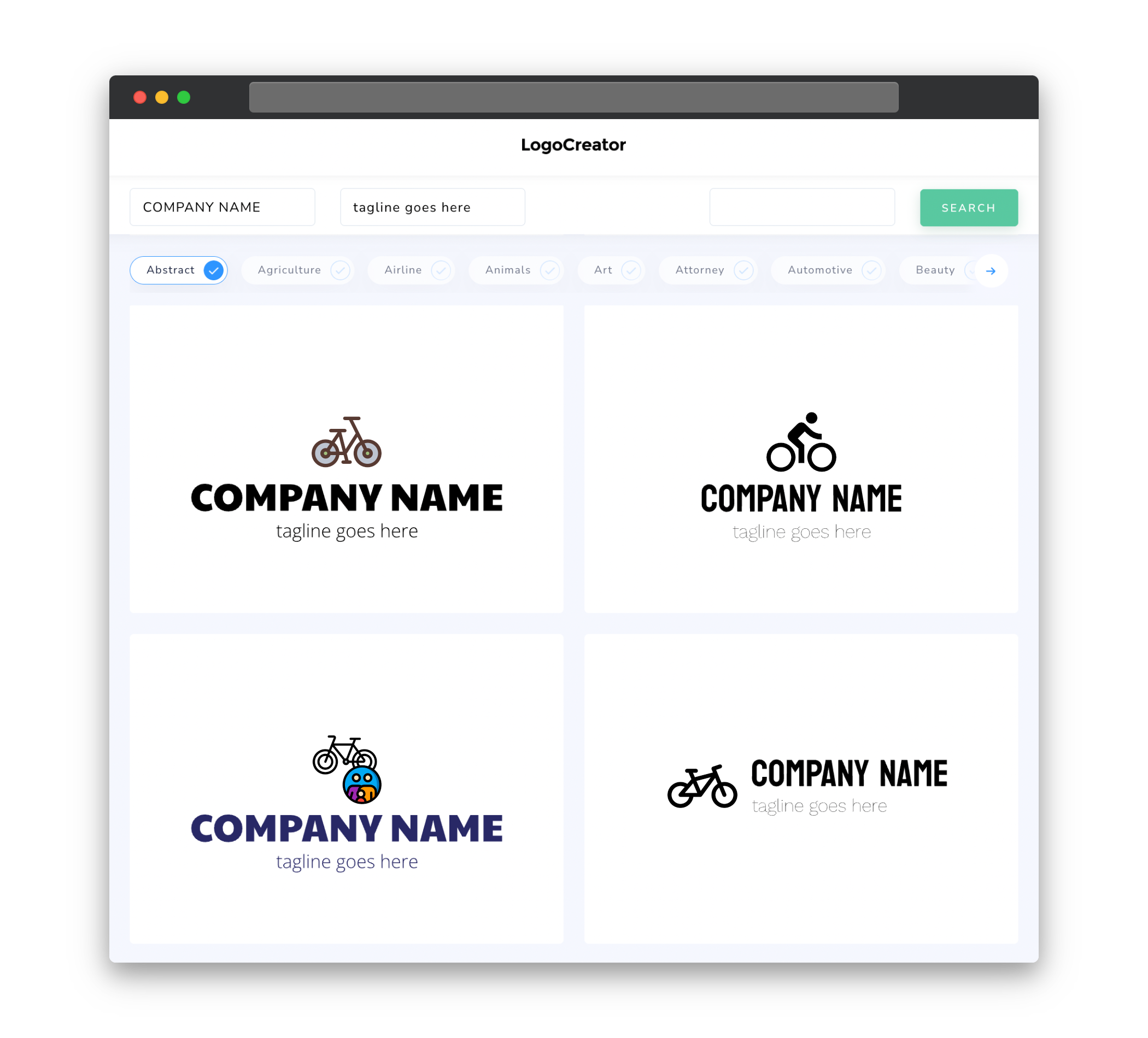
A well-designed icon can be a powerful element in your ebike logo. Consider incorporating symbols that represent energy, speed, and sustainability. Elements like lightning bolts, gears, and arrows can effectively convey the electric and dynamic nature of ebikes. It is important to strike the right balance between simplicity and uniqueness in your icon, ensuring that it is easily recognizable yet memorable.
Color
Color plays a significant role in evoking emotions and creating a visual impact. When choosing colors for your ebike logo, consider using shades of green, blue, and silver. Green symbolizes nature, sustainability, and environmental friendliness, aligning with the eco-friendly aspect of ebikes. Blue represents trust, reliability, and technology, while silver adds a touch of elegance and sophistication. Incorporating these colors into your logo will help communicate the essence of your ebike brand.
Fonts
The choice of fonts for your ebike logo should reflect the modern, sleek, and progressive nature of electric bikes. Opt for clean and bold fonts that are easy to read, ensuring your logo remains visually appealing and legible at different sizes. Avoid overly decorative or intricate fonts as they may distract from the core message of your logo. Strike a balance between professionalism and creativity to convey a sense of innovation and forward-thinking.
Layout
An effective layout will ensure that your ebike logo looks harmonious and balanced. Consider positioning the icon and text in a way that creates a cohesive visual impact. Whether you choose a horizontal or vertical layout, make sure the elements are aligned and visually coherent. Experiment with different arrangements and proportions to find the perfect balance between the icon and text, ensuring your ebike logo is visually pleasing and memorable.
Usage
Your ebike logo should be versatile and adaptable for various marketing materials and platforms. Ensure that it looks equally impressive on a website, social media profiles, business cards, and merchandise. Design a scalable logo that retains its clarity and legibility at different sizes. Moreover, consider creating a simplified version of your ebike logo that can be used as a favicon or as a small watermark. This will maintain brand consistency across different online platforms and touchpoints.


