Audience
When it comes to creating a logo for your economics business, it is important to consider your target audience. The audience for an economics logo maker typically includes economists, financial professionals, and individuals or businesses working in the economic sector. These individuals are often looking for a logo that portrays professionalism, trust, and expertise in the field of economics. Therefore, it is important to create a logo that appeals to this specific audience by incorporating elements that represent financial growth, stability, and analytical thinking.
Icons
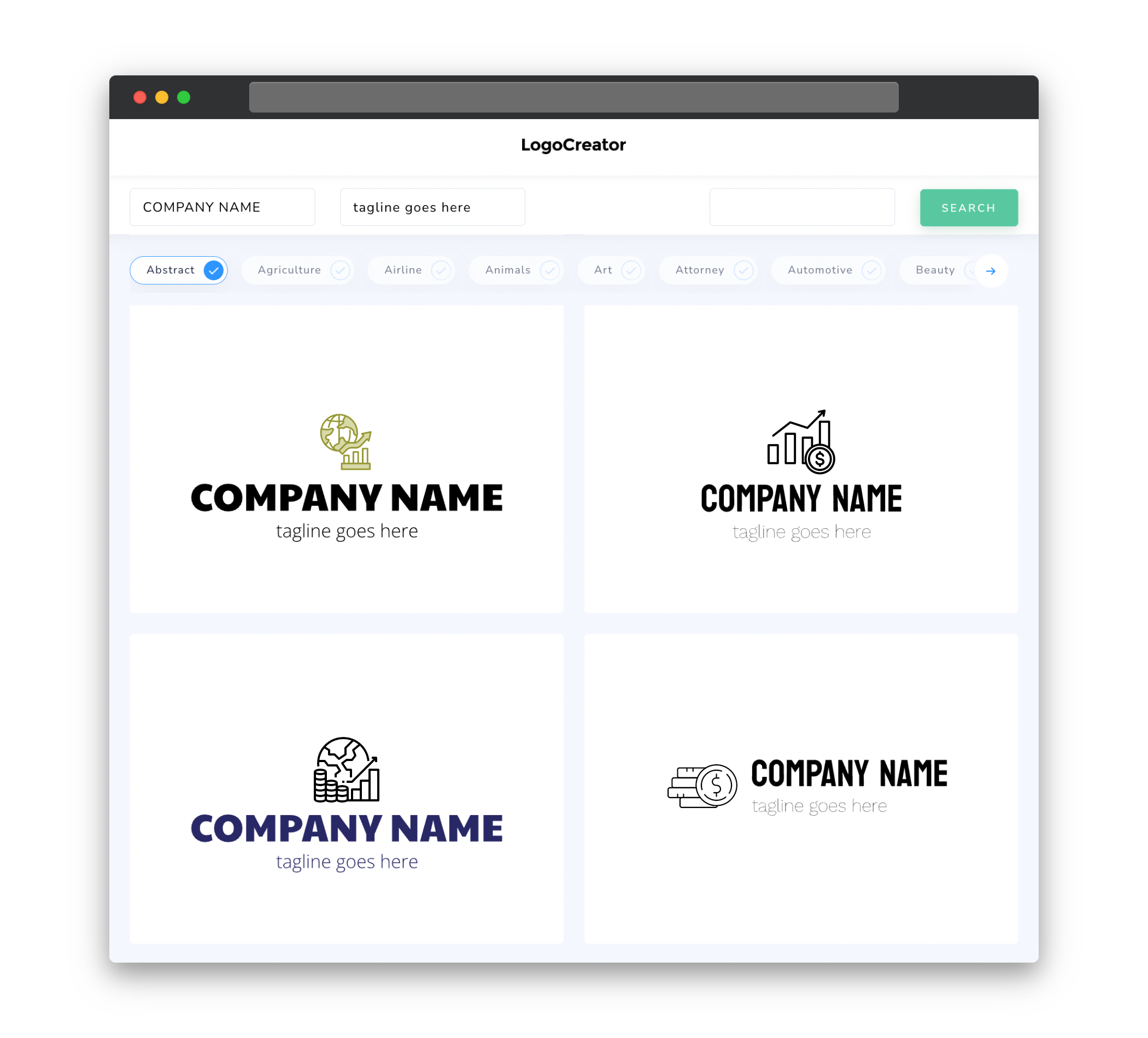
Choosing the right icons for your economics logo is crucial in conveying the message of your brand. Icons that are commonly associated with economics include graphs, charts, dollar signs, and other financial symbols. These icons can be used to represent concepts such as data analysis, market trends, and financial growth. It is essential to select icons that are easily recognizable and can be scaled down without losing clarity, ensuring that your logo remains visually appealing and versatile across various platforms and sizes.
Color
The choice of color in your economics logo plays a significant role in evoking specific emotions and attracting your target audience. When selecting colors for your logo, consider using shades of blue, which are often associated with trust, reliability, and intelligence. In economics, blue is frequently used to represent stability and expertise. Additionally, you may consider incorporating shades of green to symbolize growth, prosperity, and wealth. Carefully chosen color combinations can help to enhance the professionalism and credibility of your logo.
Fonts
Font selection plays a crucial role in creating an impactful economics logo. It is important to choose fonts that reflect the identity of your brand and evoke a sense of professionalism. Fonts that are clean, modern, and easy to read are typically preferred for economics logos. Sans-serif fonts, such as Helvetica or Arial, are commonly used to convey a sense of reliability and simplicity. These fonts provide a clean and sophisticated look that works well in the field of economics.
Layout
The layout of an economics logo should be clean, balanced, and easily comprehensible. Since economics often revolves around numbers, data, and analysis, consider incorporating elements such as graphs, charts, or other visual representations within the logo design. This can help to convey the core concept of economics and immediately communicate the nature of your business. A well-structured layout promotes a sense of professionalism and clarity, ensuring that your logo resonates with your target audience.
Usage
An economics logo should be versatile and adaptable for various applications and platforms. It is important to design a logo that can be used across different mediums, such as digital platforms, print materials, or merchandise. When creating an economics logo, consider its scalability and ensure that it remains recognizable and legible at different sizes. This will allow you to use your logo effectively on websites, social media profiles, business cards, letterheads, and other marketing collateral, helping to establish a strong and consistent brand presence.


