Audience
When designing a logo for your eye clinic, it’s important to consider your target audience. Your eye clinic caters to a diverse group of individuals including patients of all ages, with various eye conditions and needs. To create a strong and appealing logo, you need to understand your audience’s preferences and expectations. Consider factors such as the age demographics of your patients, their visual impairments, and any specific services or specialties your eye clinic offers. By understanding your audience, you can create a logo that resonates with them and effectively communicates your expertise and commitment to eye care.
Icons
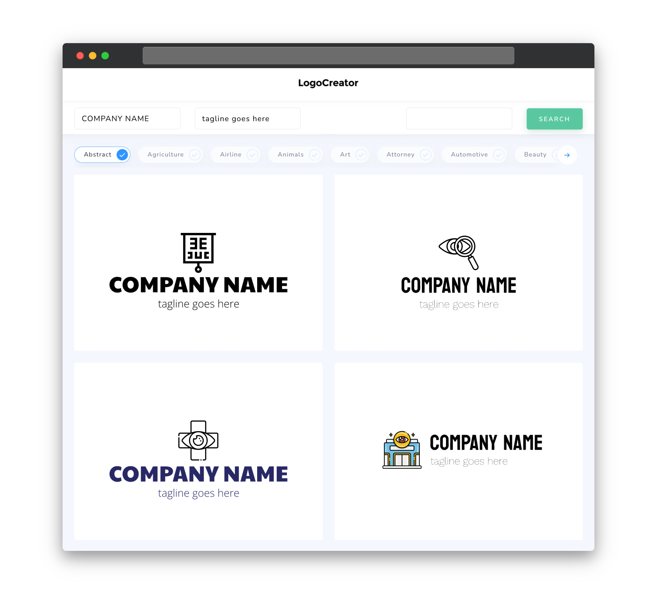
Choosing the right icons to incorporate into your eye clinic logo can help visually emphasize your specialization in eye care. Some common icons that work well for eye clinics include eyes, glasses, ophthalmoscope, or a combination of these elements. These icons instantly convey the nature of your business and create a strong connection between your logo and the eye health industry. Opt for simple and recognizable icons that can be easily understood and associated with your eye clinic.
Color
Color plays a crucial role in evoking emotions and creating a visual identity for your eye clinic. When choosing colors for your logo, it’s important to consider the nature of your eye clinic and the message you want to convey. Blue is often associated with trust, professionalism, and reliability – qualities that are highly desired in an eye clinic. Alternatively, green can be used to represent growth, health, and nature. Consider color combinations that complement each other and create a harmonious visual appeal. Remember to avoid using too many colors, as it can distract from the main message of your logo.
Fonts
The selection of appropriate fonts for your eye clinic logo can greatly impact its overall look and feel. Opt for fonts that are clear, legible, and professional. Sans-serif fonts are a popular choice as they give a modern and clean appearance to your logo. Additionally, consider fonts that have a medical or clinical feel, to further enhance your eye clinic’s credibility and expertise. Make sure to avoid overly decorative or elaborate fonts, as they can make the logo difficult to read or understand.
Layout
The layout of your eye clinic logo should be simple, balanced, and easily recognizable. A well-structured logo helps convey professionalism and establishes your eye clinic as a reputable establishment. Consider a layout that incorporates the chosen icons and typography in a way that is visually appealing and easy to comprehend. Whether you opt for a logo with text beside or below the icons, be sure to create a sense of harmony and even distribution of elements. This ensures that your eye clinic logo remains visually balanced and leaves a lasting impression on your patients.
Usage
Your eye clinic logo will be used across various platforms and mediums, so it’s essential to create a versatile design. Ensure that your logo looks great in both color and black and white. This allows for flexibility in printing and reproduction, as well as maintaining a consistent brand identity across different applications. Additionally, consider how your logo will appear in different sizes, from business cards to online banners. Test its readability when scaled down, ensuring that it remains clear and legible. By creating a logo that can be easily adapted and used in different formats, you’ll enhance its effectiveness in representing your eye clinic and leave a lasting visual impact.


