
Audience
When it comes to creating a first aid logo, it is crucial to understand your target audience. Your audience consists of individuals who are looking for reliable and trustworthy first aid services, such as healthcare providers, emergency response teams, and community organizations. Your logo should convey a sense of professionalism, expertise, and a dedication to saving lives. It should also be easily recognizable, memorable, and invoke a sense of trust and reliability. By understanding your audience and their needs, you can create a logo that effectively represents your brand and resonates with your target market.
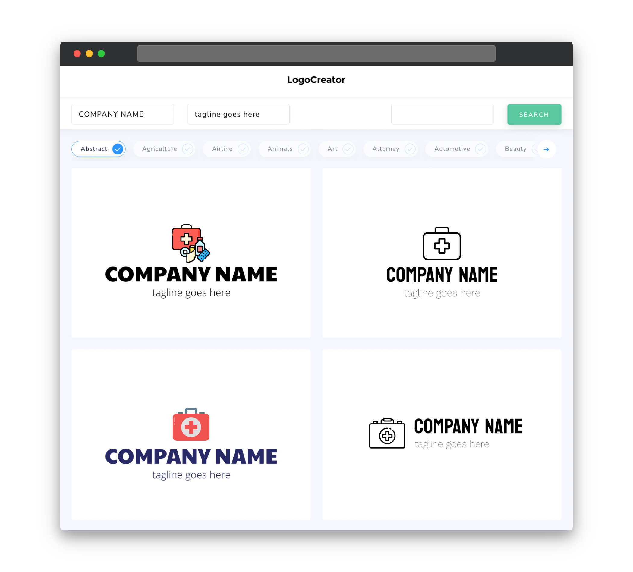
Icons
Icons play a significant role in first aid logos as they visually represent the services or care that you provide. Common first aid icons include medical crosses, hearts, ambulances, and hand gestures indicating assistance. These icons convey a message of safety, medical expertise, and reliability. When designing your first aid logo, it is important to choose icons that are clean, simple, and easily recognizable. Avoid overly complex or abstract icons that may confuse or fail to convey the intended message. Remember, the use of icons in your logo should align with your brand’s identity and the services you offer.
Color
Choosing the right colors for your first aid logo is crucial as colors have a strong impact on how people perceive your brand. Colors like red, blue, and white are commonly associated with first aid and emergency services. Red embodies urgency, energy, and attention-grabbing qualities. Blue represents trust, reliability, and professionalism. White signifies cleanliness, purity, and a sterile environment. Combining these colors can create a strong and visually appealing logo that captures the essence of first aid care. However, it’s important to select colors that align with your brand’s identity and evoke the right emotions within your audience.
Fonts
The choice of fonts in your first aid logo can have a significant impact on how your brand is perceived. When selecting fonts, it is important to prioritize legibility and professionalism. Sans-serif fonts, such as Arial or Helvetica, are commonly used in first aid logos as they are clean, simple, and easy to read. These fonts convey a sense of modernity and professionalism. Pairing a sans-serif font with a more decorative font can create a visually appealing contrast and add a touch of personality to your logo. However, avoid overly decorative or intricate fonts that may compromise legibility, especially when the logo is scaled down or viewed from afar.
Layout
The layout of your first aid logo should be well-balanced, visually appealing, and easy to understand. Consider incorporating elements such as icons, text, and shapes in a cohesive manner. Placing the icon on the left side with the text on the right is a common and effective layout approach. This layout ensures that the icon is prominently displayed and instantly recognizable, while the text complements the icon and provides additional information about your brand. Additionally, proper spacing and alignment of elements in your logo will contribute to a polished and professional look. Experiment with different layouts to find the one that best suits your brand identity and effectively communicates your first aid services.
Usage
Once you have created your first aid logo, it is important to make sure it is used consistently and effectively across various channels. Ensure that your logo is scaled appropriately for different platforms, such as social media profiles, websites, and print materials. It should be easily recognizable even when displayed in smaller sizes. Consistency is key in building a strong brand identity, so make sure to use your logo consistently across all marketing materials, including business cards, brochures, and advertisements. This will help to reinforce your brand message and make your first aid logo instantly recognizable to your target audience.

