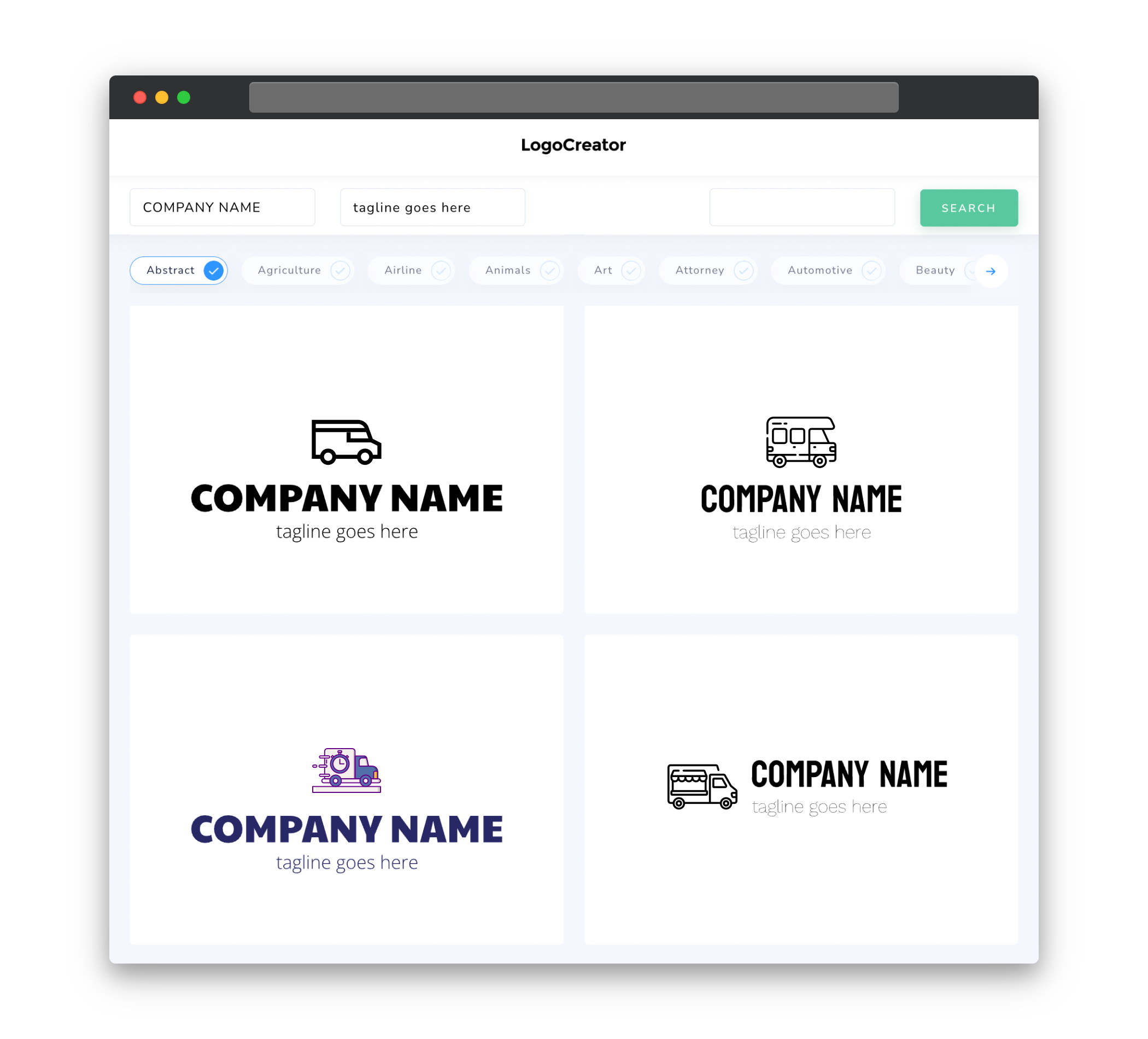
Audience
When it comes to designing a logo for your food van, itâs important to understand your audience. Consider who you are targeting with your delicious food offerings. Are you catering to college students looking for a quick and affordable bite, or are you targeting busy professionals who want a gourmet meal on the go? Understanding your audience will help you create a logo that appeals to them and effectively communicates your unique selling proposition.
Icons
Icons are a great way to visually represent your food van and its offerings. Incorporating food-related icons, such as a burger, tacos, or a pizza slice, can instantly convey the type of cuisine your van serves. You can also consider using icons that represent speed, quality, or convenience to further enhance the message your logo sends. Remember to choose icons that are simple, recognizable, and scalable, as they will be an integral part of your branding.
Color
Color plays a crucial role in logo design as it can evoke emotions, convey brand personality, and make your logo visually appealing. When choosing colors for your food van logo, consider the type of cuisine you offer, your target audience, and your brand identity. Vibrant and warm colors like red, orange, and yellow can stimulate appetite and convey a sense of energy. On the other hand, cooler colors like blue and green can evoke a sense of freshness and healthiness. Whichever colors you choose, consistency and simplicity are key to creating a memorable and impactful logo.
Fonts
The right choice of fonts can greatly enhance the overall look and feel of your food van logo. When selecting fonts, aim for simplicity and legibility. Avoid using too many different fonts as it can make your logo look cluttered and confusing. For a modern and trendy aesthetic, consider using clean and sleek sans-serif fonts. If you want to evoke a sense of tradition or elegance, serif fonts can be a great choice. Experiment with different font combinations and remember to choose fonts that align with your brand’s personality and the message you want to convey.
Layout
The layout of your food van logo is crucial in creating a visually balanced and attractive design. Keep in mind that your logo will often appear on various marketing materials and surfaces, such as your van, menus, and social media platforms. Make sure the layout is scalable and works well in both horizontal and vertical orientations. Consider the hierarchy of elements in your logo and ensure that the most important elements, such as your business name or main icon, are prominent and easily recognizable. A well-designed and balanced layout will make your logo stand out and leave a lasting impression on your customers.
Usage
Once you have created a compelling food van logo, it’s important to consider its usage across different platforms and materials. Ensure that your logo is versatile and adaptable to various sizes and formats – from small social media icons to large signage on your food van. Consider creating different versions of your logo, such as a simplified version or a monochrome version, to ensure its legibility in different contexts. Additionally, ensure that your logo is compatible with different backgrounds and maintains its visual impact in both color and black-and-white formats. By considering the usage of your logo from the outset, you can ensure its effectiveness across various mediums and platforms.


