Audience
When it comes to designing a logo for your hardware store, it is crucial to understand your target audience. Your logo should resonate with the people who are most likely to visit and make purchases at your store. Typically, the audience for a hardware store logo comprises homeowners, DIY enthusiasts, contractors, and professional tradespeople.
Consider the needs, preferences, and values of your audience when designing your logo. For example, homeowners may be drawn to logos that convey a sense of trust, dependability, and quality. On the other hand, contractors and tradespeople may appreciate logos that reflect professionalism, expertise, and efficiency. By understanding your audience, you can create a logo that not only attracts their attention but also establishes a connection with them.
Icons
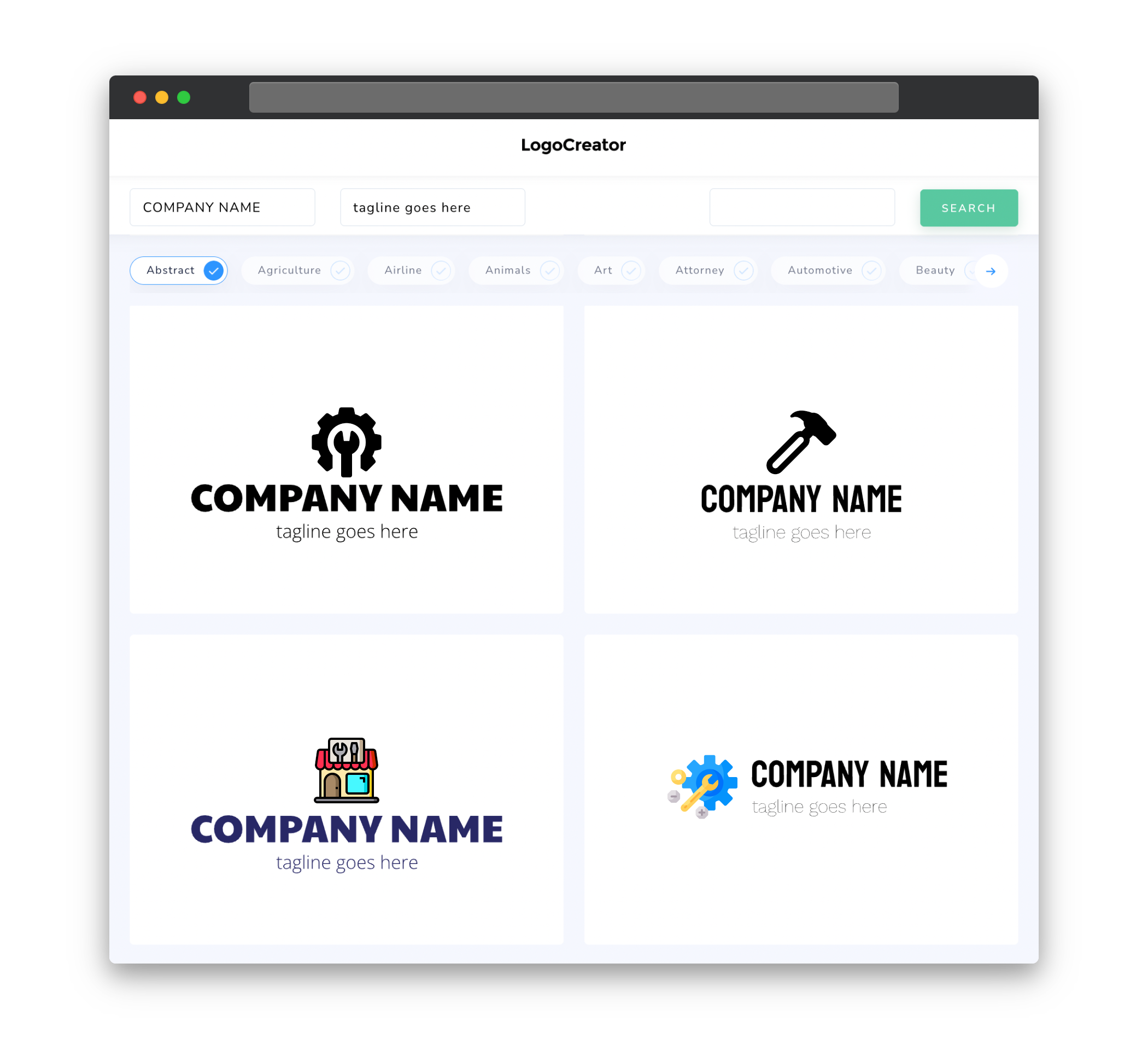
Icons play a crucial role in a hardware store logo as they symbolize the essence of your business. Incorporating relevant icons can immediately convey what your store offers and help your logo stand out among competitors. Some common icons used in hardware store logos include tools (such as hammers, wrenches, or screwdrivers), construction materials (like nails, screws, or wood planks), and building structures (such as houses or buildings).
When choosing icons for your hardware store logo, make sure they are both visually appealing and easily recognizable. You can opt for simple, clean icons to ensure clarity and readability, especially when your logo is displayed in smaller sizes. Additionally, consider the overall style and aesthetic of your logo to ensure the icons blend seamlessly with the other elements.
Color
The color scheme of your hardware store logo plays a significant role in creating a visually appealing and memorable design. Colors evoke emotions and can even influence customers’ purchasing decisions. When choosing colors for your logo, it is essential to consider the message you want to convey and the impression you want to make on your audience.
Typically, hardware store logos tend to feature colors that symbolize strength, reliability, and trustworthiness. Shades of blue, gray, and black are often used, as they convey a sense of professionalism, stability, and quality. Additionally, incorporating colors associated with construction materials, such as orange or yellow, can add vibrancy and catch the attention of potential customers.
However, it’s important to strike a balance and not overwhelm your logo with too many colors. Too much complexity can make the design appear cluttered and confusing. Remember to also consider the practicality of your color choices, as your logo will be used across various mediums, such as signage, websites, and promotional materials.
Fonts
Selecting the right fonts for your hardware store logo is crucial, as they contribute to the overall tone and personality of your brand. When it comes to choosing fonts, consider readability and legibility, as well as the style and image you want to portray.
For hardware store logos, it is common to use bold, robust fonts that convey strength and durability. Serif fonts, which have small decorative lines or curves at the end of characters, can add a touch of sophistication and professionalism. On the other hand, sans-serif fonts, which lack these decorative lines, offer a more modern and clean look.
Regardless of the font style you choose, make sure it is easily readable, especially when displayed in different sizes or formats. Your logo should be effortlessly recognizable, with clear typography that people can associate with your hardware store.
Layout
The layout of your hardware store logo is the structure and arrangement of its various elements, such as icons, text, and any other graphical elements. A well-designed logo layout helps to create a harmonious, balanced visual composition that is pleasing to the eye.
Consider a layout that allows for flexibility and scalability, ensuring your logo retains its visual appeal across different sizes and formats. It should be easily recognizable even when displayed on small items such as business cards or as a website favicon. A balanced layout will enable viewers’ eyes to flow naturally across the logo, making it easier for them to comprehend and remember your brand.
Take into account the placement and arrangement of the elements within your logo, ensuring they do not overcrowd or overlap each other. This clarity and organization will enhance the overall legibility and impact of your hardware store logo.
Usage
Your hardware store logo will be used across a variety of platforms, such as signage, business cards, websites, social media, and promotional materials. Therefore, it is essential to design a versatile logo that can adapt seamlessly to different sizes, backgrounds, and color variations.
When creating your logo, consider creating versions that work well both in full color and in single-color formats. This will ensure that your logo stays recognizable and legible, even without its original color scheme. Additionally, design variations that work well on both light and dark backgrounds to maintain consistency across different applications.
Remember to create your logo in vector format, which allows for easy scalability without losing quality. This will ensure that your logo looks crisp and sharp at any size. Also, provide various file formats to accommodate different design needs, such as SVG for web use or EPS for print purposes.
By keeping these considerations in mind, you can create a well-designed hardware store logo that effectively represents your brand and resonates with your target audience.


