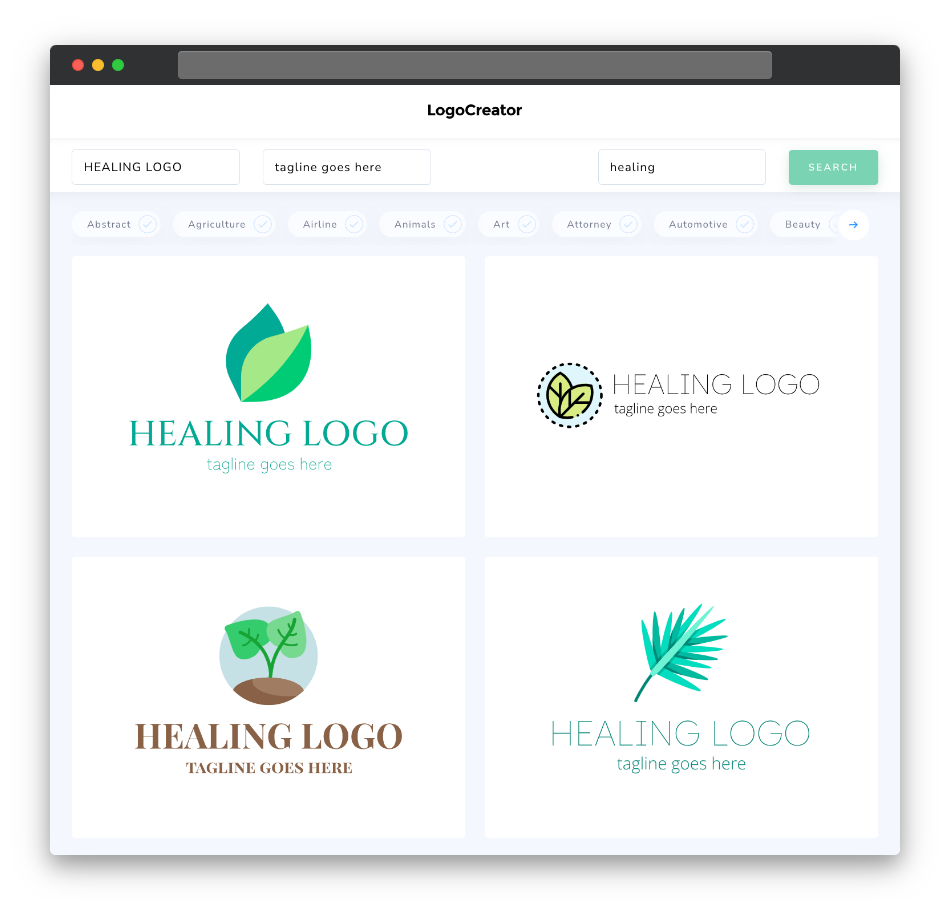
Is a healing logo the right choice for you?
A healing logo is a fantastic choice if your work revolves around promoting healing, wellness, or personal transformation. It’s ideal for healers, therapists, yoga instructors, wellness centers, or anyone looking to convey a sense of serenity, balance, and well-being. If you want a logo that signifies your dedication to the art of healing and your role in facilitating positive change, a healing logo is the right choice for your brand.
What makes a good healing logo?
A good healing logo should capture the essence of healing while being visually soothing and memorable. Focus on designs that reflect serenity, with clean lines, balanced proportions, and elements that represent healing hands, lotus flowers, butterflies, or other symbols of transformation and well-being. Choose fonts and typography that are gentle, legible, and reflective of your brand’s healing style. Your logo should convey tranquility and the potential for positive change that comes with healing.
What are the best icons for healing logos?
Icons for healing logos should be highly relevant to the healing and wellness industry and instantly recognizable as symbols of well-being and transformation. Consider using classic icons like healing hands, lotus flowers, leaves, or abstract shapes that convey serenity and balance. These icons not only reinforce your brand’s connection to healing but also make your logo relatable to individuals seeking wellness and personal growth. Keep the design clean and uncluttered, ensuring that the icon harmonizes with the overall look and feel of your logo while evoking feelings of peace and positivity.
What colors are best for healing logos?
When choosing colors for your healing logo, opt for shades that evoke calmness, serenity, and positivity. Classic colors like soft blues, soothing greens, and gentle purples often represent the tranquility and balance associated with healing and wellness. You can also explore other harmonious color combinations to match the tone and personality of your brand. The key is to ensure that your chosen color palette resonates with the nurturing and rejuvenating qualities of healing while maintaining a visually calming and welcoming design.
Which fonts go best with healing logos?
Selecting the right fonts for your healing logo depends on your brand’s identity. Soft and flowing fonts like Raleway or Quicksand are popular choices for their gentle and approachable style, aligning with the calming and positive nature of healing. Serif fonts can add a touch of tradition and sophistication, which may be suitable for certain wellness brands. Ultimately, the font you choose should align with your brand’s identity and messaging, reinforcing the serenity and compassion that your healing logo represents.
Ready to embark on a path of branding that promotes well-being and positivity? Try our healing logo maker today and create a logo that’s as tranquil and compassionate as your dedication to the art of healing. Your perfect healing logo is just a few clicks away!


