Audience
When it comes to creating a logo for your hostel, it’s important to understand your target audience. Think about the type of travelers who are likely to stay at your hostel. Are they young backpackers, families, or digital nomads? Consider their interests, preferences, and the overall vibe of your hostel. This will help you design a logo that appeals to your target audience and effectively communicates your hostel’s unique personality.
Icons
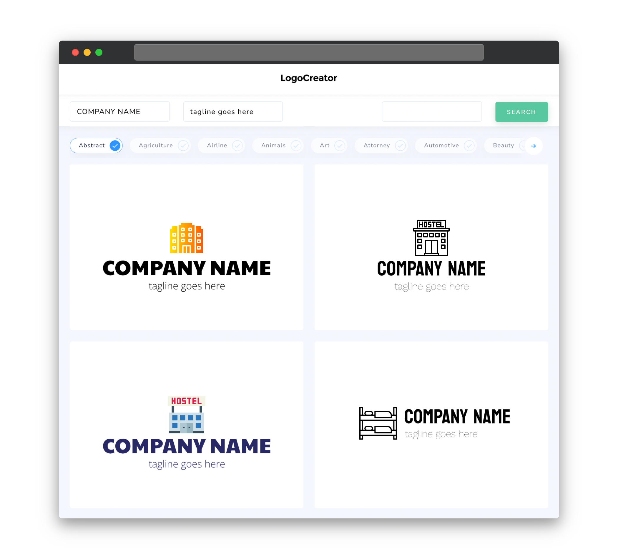
Icons are a great way to visually represent your hostel and convey its key features or services. When choosing icons for your hostel logo, think about the amenities or unique selling points that set your accommodation apart from others. For example, if your hostel is known for its rooftop bar, incorporating a cocktail glass or a skyline silhouette could be a great idea. Remember to keep the icons simple, recognizable, and relevant to your hostel’s brand identity.
Color
Colors play a crucial role in logo design, as they evoke certain emotions and can leave a lasting impression on your audience. When selecting colors for your hostel logo, consider the atmosphere or theme of your accommodation. Bright and vibrant colors like blue, yellow, or green can convey a sense of energy and fun, making them great choices for youth-oriented hostels. On the other hand, earthy tones like brown or green can create a more relaxed and nature-inspired feel for eco-friendly or countryside hostels. Whichever colors you choose, make sure they complement each other and create a harmonious overall design.
Fonts
The font you choose for your hostel logo should reflect the personality and style of your accommodation. If your hostel has a modern and trendy atmosphere, opt for sleek and clean fonts like sans-serif or minimalist script fonts. On the other hand, if your hostel has a more rustic and laid-back vibe, consider using handwritten or vintage-inspired fonts. Make sure the font is legible and easy to read, even when scaled down to smaller sizes. Additionally, using a maximum of two fonts in your logo design will keep it simple and avoid visual clutter.
Layout
The layout of your hostel logo should be well-balanced and visually appealing. Consider the different elements that will be included in the logo, such as the hostel name, icons, and tagline. Experiment with different arrangements to find a layout that is aesthetically pleasing and captures the essence of your hostel. Keep in mind that the logo should look good when scaled down to smaller sizes, so avoid overcrowding and ensure that all elements are clear and distinguishable.
Usage
Your hostel logo will be used across various platforms and mediums, so it’s essential to design a versatile logo that can adapt to different formats. Ensure that your logo works well in both horizontal and vertical orientations and looks good in both large and small sizes. It should be easily recognizable and legible even when scaled down for social media profiles or website icons. Additionally, design your logo in a vector format, such as SVG or EPS, so that it can be resized without losing its quality. This will allow you to use your logo on signage, promotional materials, and digital platforms with ease.


