Audience
When designing a logo for an immigration company, it is crucial to consider the target audience. The primary audience for immigration services typically includes individuals who are in need of assistance with immigration documentation and processes. This could include individuals applying for visas, permanent residency, or citizenship, as well as businesses looking to employ foreign workers. It is important to create a logo that resonates with this audience and communicates professionalism, trustworthiness, and expertise in immigration matters. A well-designed logo can help establish a strong brand identity and build credibility among potential clients.
Icons
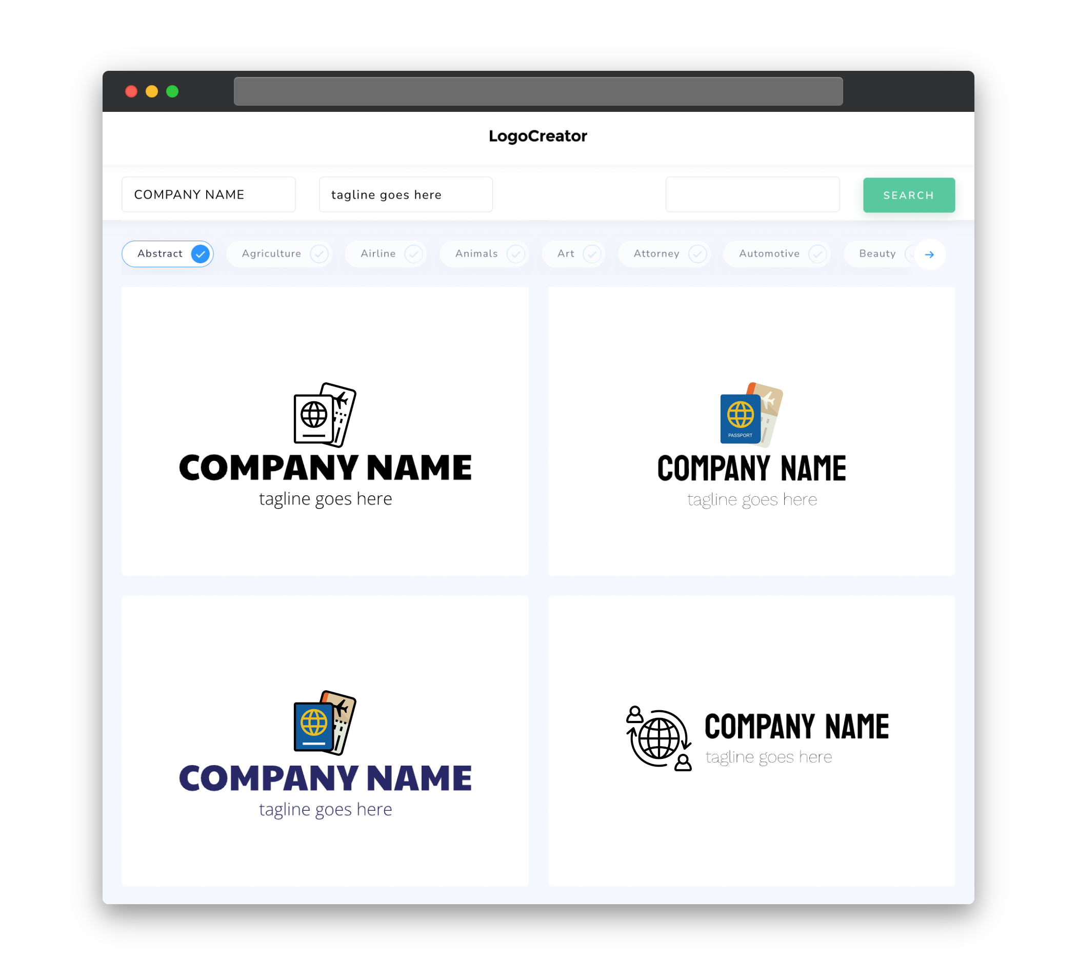
Icons play a significant role in logo design, as they can convey messages and ideas without the need for words. When choosing icons for an immigration logo, it is important to select imagery that is relevant to the immigration industry and the services provided. Commonly used icons include passports, globes, airplanes, and landmarks of different countries. These symbols can represent global connections, travel, and the idea of crossing borders, which are all integral to immigration. Additionally, icons can be used creatively to symbolize concepts like unity, diversity, and growth, which are also important aspects of the immigration experience.
Color
Color selection is crucial when designing a logo for an immigration company. Colors can evoke different emotions and perceptions, and they can have cultural connotations as well. For an immigration logo, it is advisable to use colors that convey professionalism, trustworthiness, and a sense of security. Classic color options like blues and greys are often chosen for their associations with stability and reliability. Additionally, incorporating colors that represent diversity and inclusivity, such as a range of vibrant hues, can also resonate with the immigration audience.
Fonts
The choice of fonts for an immigration logo should reflect the values and image of the company. It is important to choose fonts that are legible and professional, yet also convey a sense of warmth and approachability. Sans-serif fonts are often preferred for their clean and modern appearance, while serif fonts can add a touch of elegance and sophistication. It is important to strike a balance between these qualities to ensure that the logo is both visually appealing and easy to read. Custom lettering can also be considered to create a unique and recognizable brand identity.
Layout
The layout of an immigration logo should be simple, balanced, and visually appealing. A logo that is too cluttered or complex may not make a strong impression or be easily recognizable. A common approach is to combine icons and typography in a way that is visually pleasing and easily understood. Placing the company name alongside or beneath the icon can help establish a clear association between the logo and the brand. It is also important to consider the scalability of the logo, ensuring that it remains legible and recognizable at various sizes, from digital platforms to printed materials.
Usage
When designing an immigration logo, it is important to consider how it will be used across various mediums and platforms. The logo should be versatile and adaptable, capable of maintaining its visual impact and legibility in different contexts. This includes considerations for its usage on different backgrounds, in different sizes, and in both digital and print formats. It is recommended to create variations of the logo to accommodate different scenarios, such as a simplified version for small sizes or a monochrome version for black and white applications. By designing a logo that is flexible and versatile, it can be effectively utilized across a wide range of marketing materials and platforms.


