Audience
When it comes to designing a logo for your instrumental brand, you want to appeal to the right target audience. Knowing who your audience is will help you design a logo that resonates with them. Whether you’re a solo artist, a band, or a music production company, your logo should reflect the type of music you create and the emotions you want to evoke in your listeners. For example, if you create calming and soothing instrumental music, you may want to incorporate soft colors and gentle imagery into your logo design. On the other hand, if your music is energetic and upbeat, you might opt for bold and vibrant visuals. Understanding your audience is key to creating a logo that effectively communicates your brand identity.
Icons
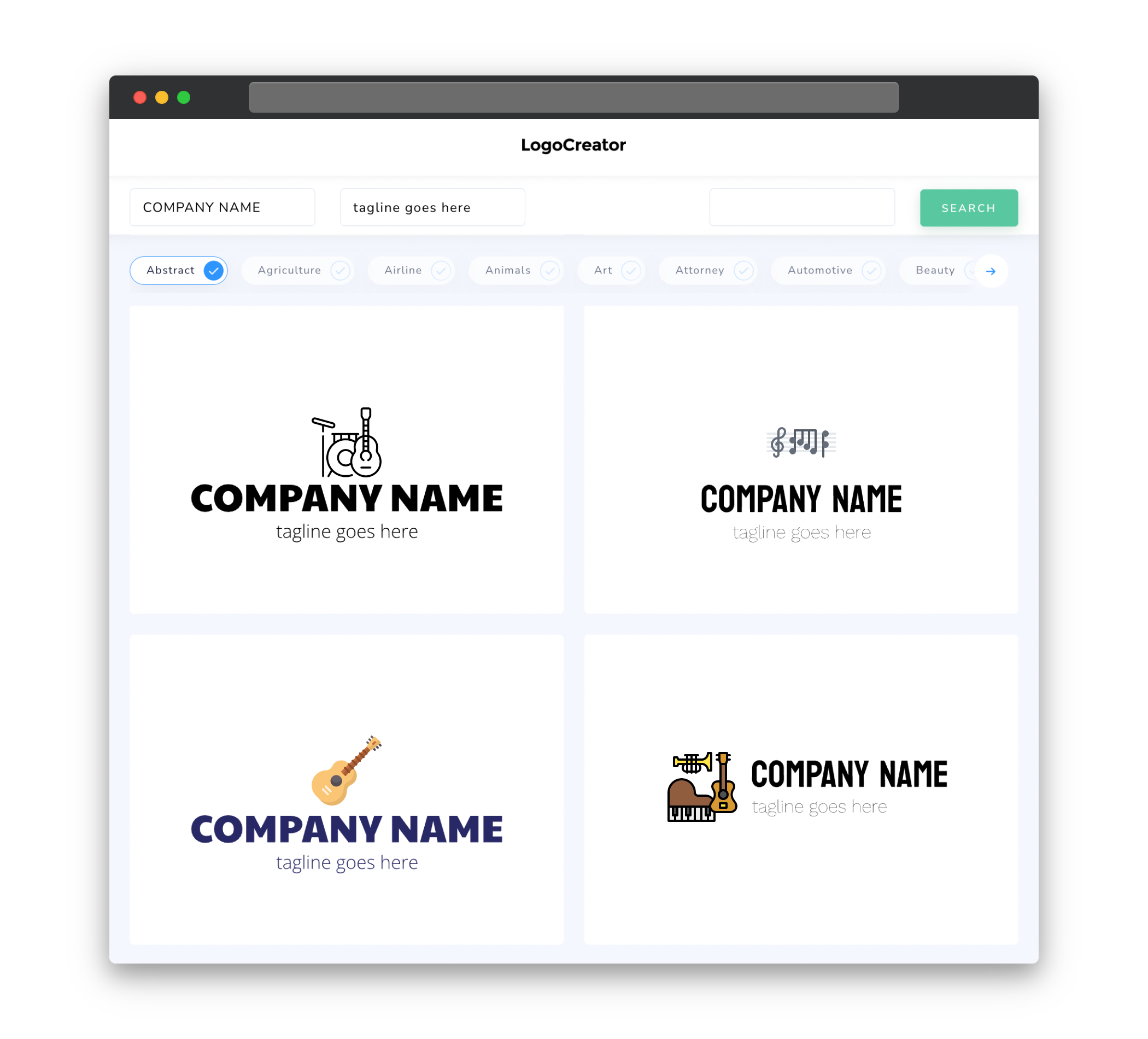
Icons are an important element in a logo design as they can convey meaning and instantly capture attention. In the context of instrumental logos, you’ll want to choose icons that symbolize the essence of your music. For instance, you could use musical instruments such as a guitar, piano, or saxophone to represent your genre or style. Alternatively, you might explore more abstract icons that evoke a sense of rhythm, harmony, or emotion. When selecting icons, it’s important to consider their visual appeal, versatility, and how well they align with your overall brand image.
Color
Color plays a vital role in logo design, as it subconsciously communicates emotions and associations. For instrumental logos, you’ll want to choose colors that reflect the mood and atmosphere of your music. Soft, muted colors like blues, greens, or pastels can convey a sense of calm and serenity for instrumental genres like ambient or classical music. On the other hand, vibrant and bold colors like reds, oranges, or purples can be used to express energy and dynamism for genres such as jazz or rock. It’s important to choose colors that are harmonious and visually appealing, while also aligning with your intended brand identity.
Fonts
Choosing the right fonts is essential for creating a cohesive and professional logo for your instrumental brand. You’ll want to select fonts that are legible, aesthetically pleasing, and reflect the tone of your music. For example, if your music falls under the classical or elegant genre, you might opt for timeless and sophisticated fonts such as serif or script styles. Alternatively, if you create modern and experimental instrumental music, you could explore more avant-garde and sleek fonts. It’s important to strike a balance between uniqueness and readability to ensure your logo is both visually appealing and easily recognizable.
Layout
The layout of your instrumental logo should be well-balanced and visually pleasing. Consider the placement and arrangement of the various elements, such as icons, text, and any additional graphical elements. Your logo should convey a sense of professionalism and creativity while being easy to comprehend at a glance. Whether you choose a symmetrical or asymmetrical layout, make sure it enhances the overall composition and harmonizes with your branding. Mock up different layouts and test them to see which one best represents your instrumental brand’s identity and resonates with your target audience.
Usage
Once you have designed your instrumental logo, it’s essential to consider its usage across different platforms and mediums. Your logo should be scalable and versatile, ensuring it looks great whether it’s displayed on a website, social media profile, merchandise, or promotional materials. Make sure the logo is presented consistently across all platforms to establish brand recognition and reinforce your visual identity. Additionally, consider creating alternate versions of your logo for different purposes, such as simplified versions for small-scale use or monochrome versions for black and white printing. By considering the various ways your logo will be used, you can ensure its effectiveness across different contexts.


