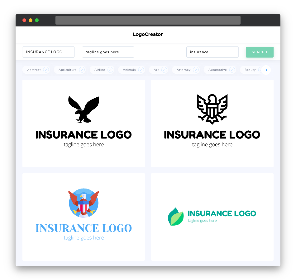
Is an insurance logo the right choice for you?
Curious if an insurance logo aligns with your brand’s vision? Insurance logos are a perfect choice for insurance companies, agencies, brokers, and professionals operating in the insurance sector. They symbolize security, trustworthiness, and the commitment to safeguarding assets. If your brand is dedicated to providing peace of mind and financial protection, an insurance logo is the shield that represents your values.
What makes a good insurance logo?
Creating an exceptional insurance logo involves capturing the essence of trust and protection. A successful insurance logo should be visually reassuring, reflecting a sense of security and professionalism. It should align with your brand’s commitment to safeguarding assets and communicating your dedication to helping clients. The key is to strike a balance between reliability and modernity.
What are the best icons for insurance logos?
Icons in insurance logos should naturally revolve around elements related to protection, trust, and security. Consider using symbols like shields, umbrellas, locks, or hands offering protection to evoke the concept of safety. Incorporating insurance-related elements like policy documents or keys can also work well, depending on your brand’s focus.
What colors are best for insurance logos?
Color selection plays a pivotal role in insurance logo design. The colors you choose should reflect trust, professionalism, and the idea of security. Classic colors like blues, grays, and greens can convey a sense of reliability and credibility. Experiment with color palettes to find the one that resonates with your brand and promotes a message of trust and financial protection.
Which fonts go best with insurance logos?
Font selection in insurance logos should align with the overall theme of professionalism and security. Consider using clean and modern sans-serif fonts for a contemporary and approachable look. Serif fonts can add a touch of tradition and solidity to your logo, reinforcing trustworthiness. The font should enhance the overall impact of your insurance logo, ensuring it conveys the confidence and commitment to financial security your brand represents.


