Audience
To create an impactful and memorable intelligence logo, you must first understand your target audience. The intelligence field is diverse, encompassing a wide range of professionals, including security agencies, investigative firms, software developers, and data analysts. Each of these audiences has unique needs and expectations when it comes to logo design.
For security agencies, a logo should convey trust, reliability, and professionalism. Clean and bold icons, such as a shield or a lock, can symbolize security and protection. Investigative firms might prefer logos that emphasize a sense of curiosity and problem-solving, with icons like a magnifying glass or a puzzle piece. Software developers and data analysts, on the other hand, may lean towards logos that represent innovation, precision, and cutting-edge technology, with icons resembling computer chips or data visualizations.
Understanding your audience and tailoring your logo design to their specific expectations is crucial for establishing a strong brand identity and connecting with your target market effectively.
Icons
Choosing the right icon for your intelligence logo is essential as it serves as a visual representation of your brand’s values and core offerings. When selecting an icon, consider the message you want to convey. Key qualities to focus on include intelligence, critical thinking, precision, and trustworthiness.
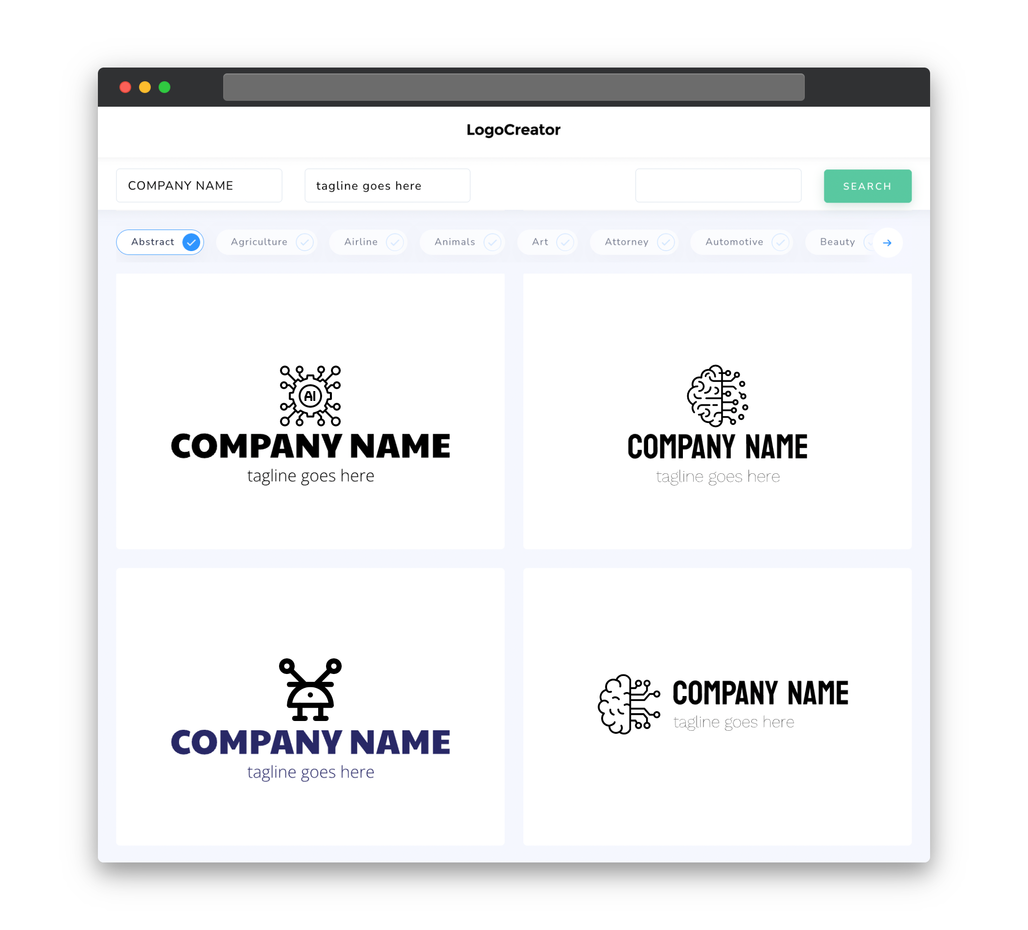
For intelligence-related logos, some popular icons include a brain, a lightbulb, a radar, or a combination of shapes that symbolize data analysis or perception. These icons can help create an immediate association with intelligence and the specific field you are targeting. It is essential to ensure the chosen icon is unique and easily recognizable even at smaller sizes, ensuring that your logo remains versatile across various marketing materials and platforms.
Color
Color plays a significant role in logo design as it can evoke emotions, convey messages, and create a distinct brand identity. When designing an intelligence logo, consider the type of message you want to communicate to your audience and choose colors accordingly.
For security agencies, using deep blues or blacks can convey a sense of trust, professionalism, and authority. Investigative firms might consider using bold and vibrant colors like red or yellow to symbolize urgency and enthusiasm for problem-solving. Software developers and data analysts often opt for clean and modern color schemes, such as blues, greens, or grays, to evoke a sense of innovation and technological advancement.
Additionally, it is important to consider how colors will appear on different backgrounds and in various contexts. Choosing a versatile color palette ensures your logo remains impactful regardless of where it is used.
Fonts
In logo design, typography plays a crucial role in communicating the tone and personality of your brand. When choosing fonts for an intelligence logo, consider the overall aesthetic you want to convey.
For security agencies, clean and bold fonts with strong lines can convey reliability, professionalism, and authority. Investigative firms might prefer fonts with a sense of curiosity and creativity, such as handwritten or script-style fonts, to emphasize problem-solving skills and attention to detail. Software developers and data analysts often opt for modern and technological fonts that exude innovation and efficiency.
Regardless of the specific font choice, it is important to ensure readability and legibility, even at small sizes. A well-chosen font will seamlessly complement the icon and color palette, resulting in a harmonious and impactful logo.
Layout
The layout of an intelligence logo should optimize readability and visual balance. The arrangement of the icon, company name, and any additional elements should be carefully considered to create a cohesive and visually appealing design.
A common approach is to place the icon on the left side and the company name on the right, in a horizontal layout. This creates a balanced and eye-catching logo that is easily recognizable. However, depending on the specific design elements, a vertical or stacked layout can also be effective.
The spacing and positioning of each element should be carefully aligned to ensure clarity and readability. It is important to test the logo in different sizes and formats to ensure it maintains its visual impact across various marketing materials and platforms.


