Audience
When it comes to creating a professional logo for your IT business, it is important to consider your target audience. Your logo should resonate with the tech-savvy individuals who are your potential clients. Think about their preferences and interests. Do they prefer minimalist or bold designs? Are they more drawn to modern or classic aesthetics? By analyzing your target audience, you can ensure that your IT professional logo will effectively communicate your brand identity to the right people.
Icons
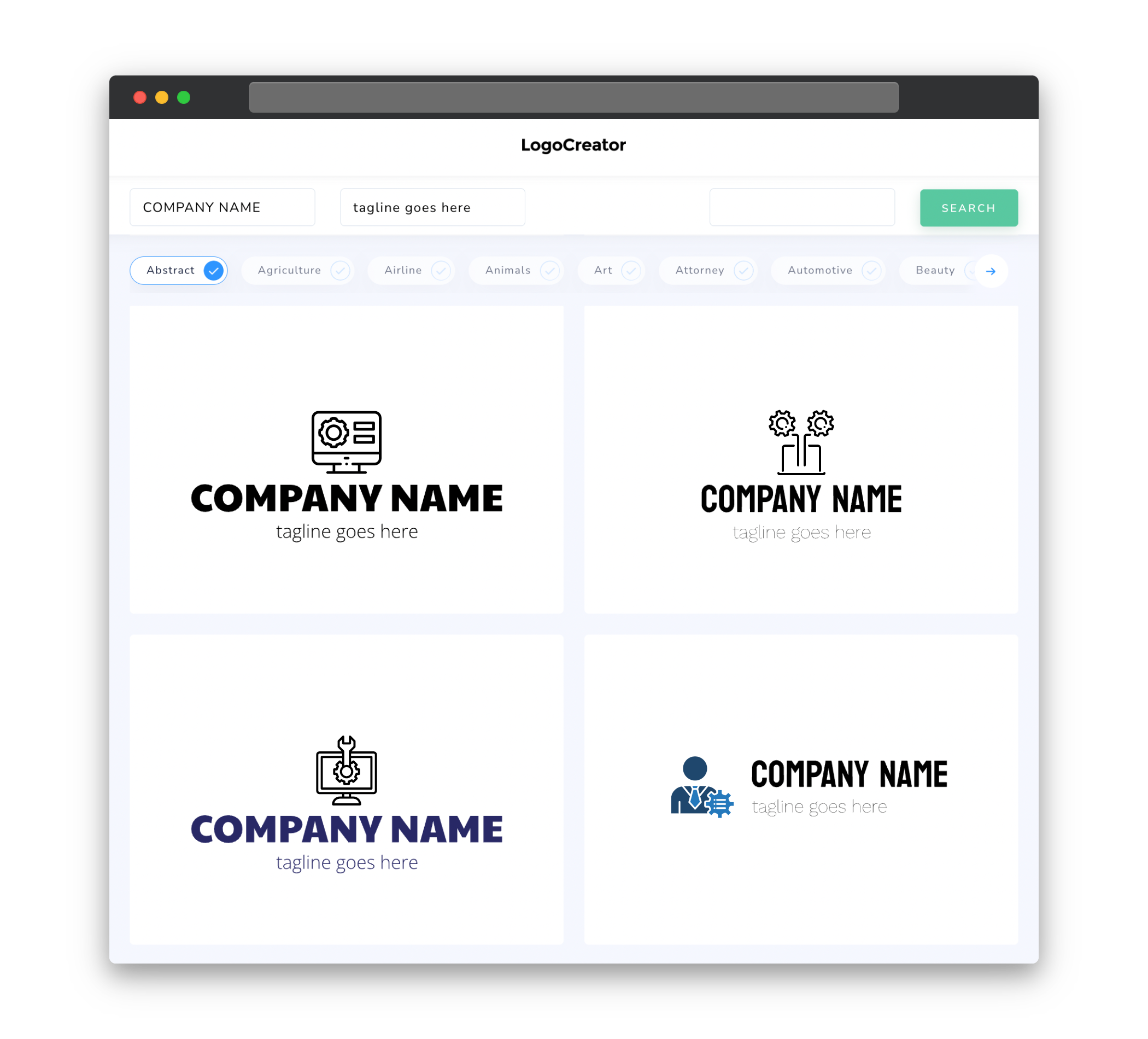
Icons play a crucial role in IT professional logos as they can instantly convey the nature of your business. Incorporating relevant icons that represent technology, computers, or any other aspect of IT can make your logo more visually appealing and easily recognizable. However, it is important to strike a balance between simplicity and creativity. Too many icons can clutter your logo, while too few may not effectively communicate your message. Opt for clean and concise icons that capture the essence of your IT business.
Color
Color psychology is a powerful tool when designing an impactful IT professional logo. Different colors evoke different emotions and perceptions. For an industry like IT, which is associated with innovation, trustworthiness, and reliability, opting for colors like blue, gray, or green can be effective. Blue represents professionalism and expertise, while gray conveys sophistication and stability. Green symbolizes growth and harmony, which can be particularly fitting for IT companies focused on sustainability or environmental solutions. Carefully selecting the right color palette for your logo can help establish a strong brand identity for your IT business.
Fonts
Fonts play an integral role in portraying your IT business as professional, reliable, and forward-thinking. When selecting fonts for your IT professional logo, consider opting for modern and clean typefaces that reflect the sleekness and precision associated with technology. Avoid overly ornate or decorative fonts that may distract from the main message of your logo. Sans-serif fonts like Helvetica or Arial are popular choices due to their simplicity and readability. However, don’t be afraid to experiment with different font combinations that align with your brand personality while maintaining legibility.
Layout
The layout of your IT professional logo should be carefully crafted to ensure it effectively communicates the core values and uniqueness of your business. Consider the balance and symmetry within your logo design, as it should convey a sense of order and professionalism. Pay attention to the placement of icons, typography, and any additional elements to ensure a visually pleasing composition. Keep in mind that simplicity often trumps complexity when it comes to logo design, so strive for a clean and uncluttered layout that resonates with your target audience.
Usage
Once you have designed your IT professional logo, it is important to consider its usage across various platforms and mediums. Your logo should be adaptable and scalable, allowing for easy application on different surfaces and devices. Whether it is for websites, social media profiles, business cards, or signage, your logo needs to maintain its integrity and legibility regardless of size or format. Therefore, it is recommended to create variations of your logo for different use cases, ensuring that it remains recognizable and effective across all platforms. This adaptable usage will help solidify your brand identity and enhance brand visibility in the IT industry.


