Audience
When designing a logo for your judiciary organization, it is crucial to consider your target audience. Your logo should not only reflect the values and principles of the judiciary system, but also resonate with the individuals who interact with it. From judges and lawyers to plaintiffs and defendants, your logo should inspire trust, confidence, and respect. By utilizing appropriate imagery, colors, and fonts, your logo will effectively communicate the integrity and professionalism that is associated with the judiciary.
Icons
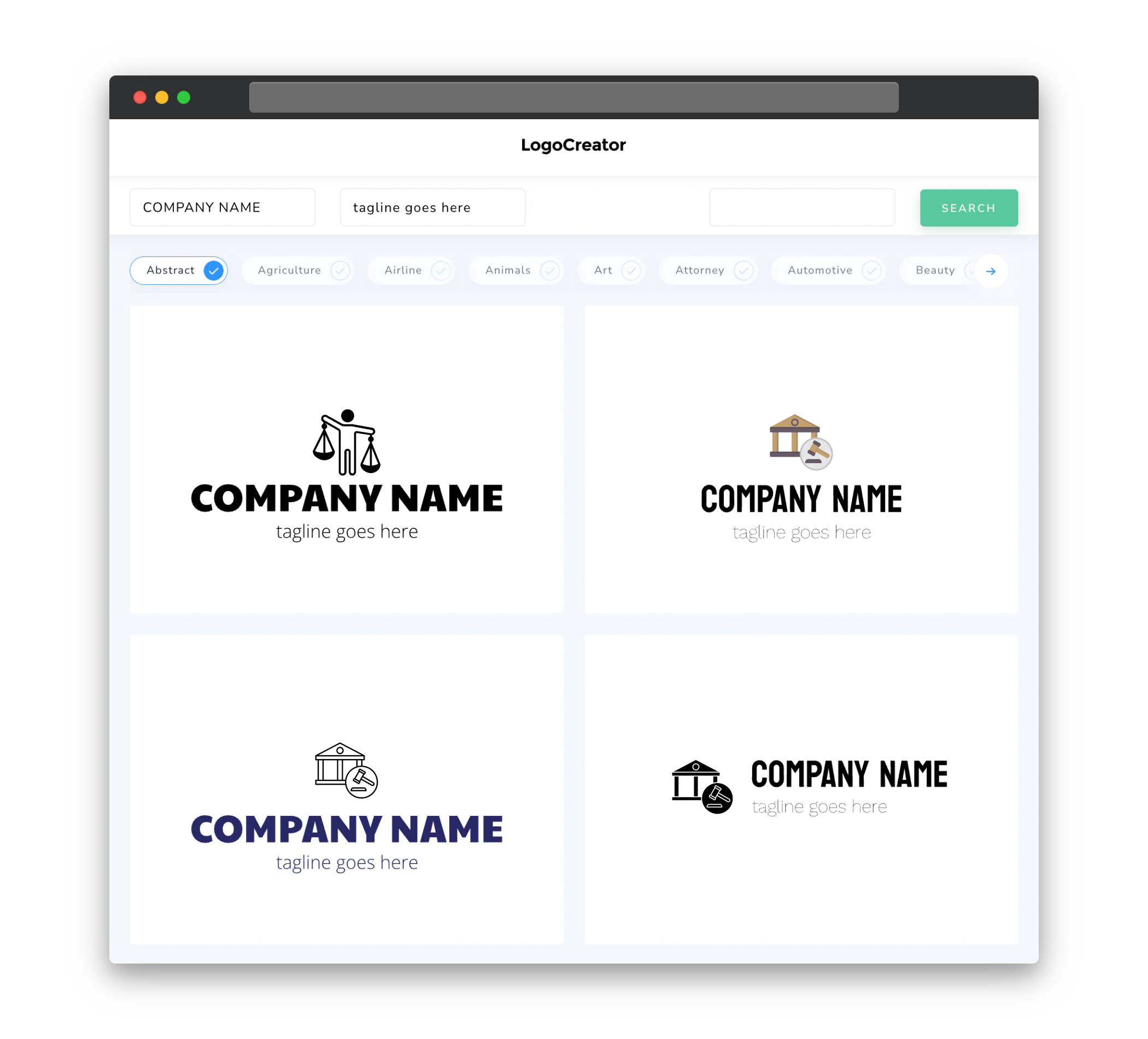
Icons play a significant role in creating a logo for a judiciary organization. They can be powerful visual elements that represent different aspects of the legal system. Common icons used in judiciary logos include gavels, scales of justice, law books, and columns. These symbols symbolize justice, fairness, knowledge, and stability. It is important to choose icons that are clear, simple, and easily identifiable, ensuring that they leave a lasting impression on your audience.
Color
The choice of color in your judiciary logo is crucial as it can evoke certain emotions and convey specific messages. Traditionally, deep and authoritative colors such as navy blue, black, and gold are associated with the judiciary system. These colors symbolize stability, professionalism, and trust. However, you can also consider using other colors to add a modern and approachable touch to your logo. It is important to strike the right balance between tradition and innovation, while ensuring that the colors you choose reflect the seriousness and importance of the judiciary system.
Fonts
Selecting the right fonts for your judiciary logo is essential in conveying a sense of authority and professionalism. Serif fonts are often preferred as they are associated with tradition and formality. They provide a sense of elegance and security. Popular serif fonts for judiciary logos include Times New Roman, Baskerville, and Garamond. These fonts are timeless and exude a sense of trust. When choosing fonts, it is important to prioritize legibility and avoid overly decorative or frivolous options that may detract from the serious nature of the judiciary.
Layout
The layout of your judiciary logo should be clean, balanced, and well-structured. A simple and symmetrical design can portray an image of order and fairness, which are essential aspects of the judiciary system. Consider incorporating symmetrical elements such as columns or balanced placement of icons and text. A balanced layout helps create a sense of stability and professionalism. Furthermore, keeping the logo design uncomplicated allows for easy recognition and versatility across various branding materials.
Usage
Your judiciary logo will be used in a variety of contexts, so it is important to ensure its scalability and adaptability. It should look equally impressive when displayed on large banners or on small items like business cards. Your logo should also be easily adaptable to different mediums including websites, social media profiles, letterheads, and signage. Consider creating variations of your logo for different applications, such as horizontal, vertical, and simplified versions. This versatility will ensure consistency and recognition of your judiciary brand across all platforms.


