Audience
When it comes to literacy, it’s important to create a logo that resonates with your target audience. Whether you’re a literacy organization, a tutoring service, or an individual educator, your logo should capture the essence of literacy in a way that appeals to your specific audience. Consider the age group you’re targeting, their interests, and their level of literacy. For instance, if you’re focusing on children’s literacy, your logo could incorporate playful icons and vibrant colors to engage young learners. If your audience is adults, a more professional and sleek design might be more suitable. By understanding your audience, you can create a logo that effectively communicates your literacy mission and connects with those who need your services or support.
Icons
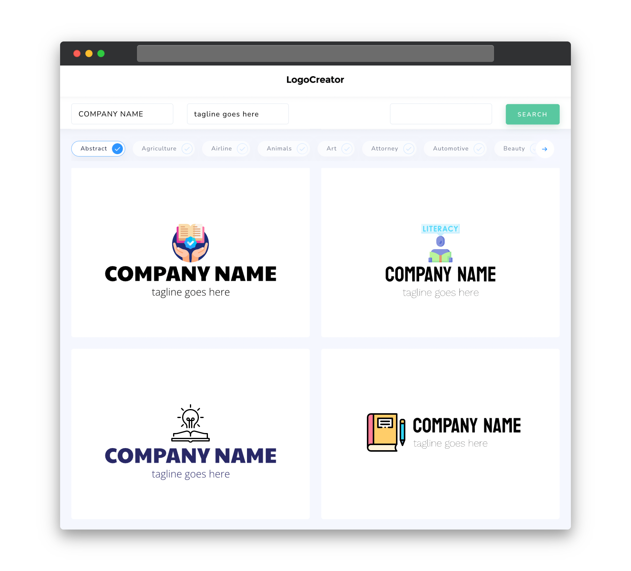
Icons are a powerful tool in logo design as they can quickly convey the essence of your literacy brand. When choosing icons for your literacy logo, consider symbols that are universally recognized and associated with literacy. For example, a book or an open book can symbolize knowledge and learning, while a pencil or a pen can represent writing and creativity. If your organization has a specific focus, such as reading comprehension or literacy in marginalized communities, you could incorporate relevant icons, such as a magnifying glass or diverse group of people, to communicate your unique mission. Remember to keep the icons simple and easily recognizable to ensure that they effectively communicate your message at first glance.
Color
The choice of color in your literacy logo is crucial in evoking emotions and conveying the right impression. Different colors have different associations, and understanding color psychology can help you select the most suitable palette for your logo. Blue, for example, is often associated with trust and reliability, making it a popular choice for literacy organizations that aim to build credibility with their audience. Green can symbolize growth and renewal, which is fitting for logos related to education and personal development. Yellow is often associated with optimism and happiness, making it a great choice for logos that target young learners. Consider the message you want to convey and choose colors that align with your brand identity and evoke the desired emotions in your audience.
Fonts
The fonts you choose for your literacy logo should reflect the goals and values of your organization. When it comes to literacy, it’s essential to select fonts that are clear, readable, and accessible to all. Avoid overly decorative or elaborate fonts that may be difficult to read, especially for individuals with literacy challenges. Instead, opt for clean, legible fonts that strike a balance between professionalism and approachability. Sans-serif fonts are often a safe choice, as they are clean and modern, while still maintaining a sense of friendliness. If your brand has a specific tone or personality, consider fonts that reflect those characteristics. Ultimately, the fonts in your logo should contribute to the overall message and make your literacy brand easily identifiable.
Layout
The layout of your literacy logo plays a crucial role in creating a visual hierarchy and ensuring that your message is effectively communicated. Consider the placement and balance of your logo elements to create a cohesive and harmonious composition. One common approach is to place the icon or image on the left side of the logo, followed by the organization or brand name on the right side. This arrangement allows for easy recognition and legibility. Alternatively, you could place the icon above the text for a more compact logo design. Experiment with different layouts and variations to find the one that best represents your literacy brand and creates a visually pleasing logo.
Usage
Once you’ve created your literacy logo, it’s important to consider how it will be used across various platforms and mediums. A versatile logo should work well on both digital and print materials, such as websites, social media profiles, business cards, and promotional materials. Ensure that your logo is scalable, ensuring it retains its clarity and legibility when scaled up or down. Consider creating different variations of your logo for different applications, such as a simplified version for small icons or a horizontal variation for banners or headers. By thinking about the practical usage of your logo from the beginning, you can create a design that is flexible, adaptable, and maintains its impact across different contexts.


