Audience
When designing a logo for a medical research organization, it is crucial to consider the target audience. A medical research logo should convey professionalism, trustworthiness, and credibility. The audience for such a logo would mainly consist of scientists, medical professionals, and healthcare institutions. These individuals and organizations would want to associate themselves with a logo that reflects their commitment to advancing medical knowledge and improving patient care. Therefore, your logo should appeal to this audience by incorporating elements such as scientific symbols, clean lines, and a modern design aesthetic.
Icons
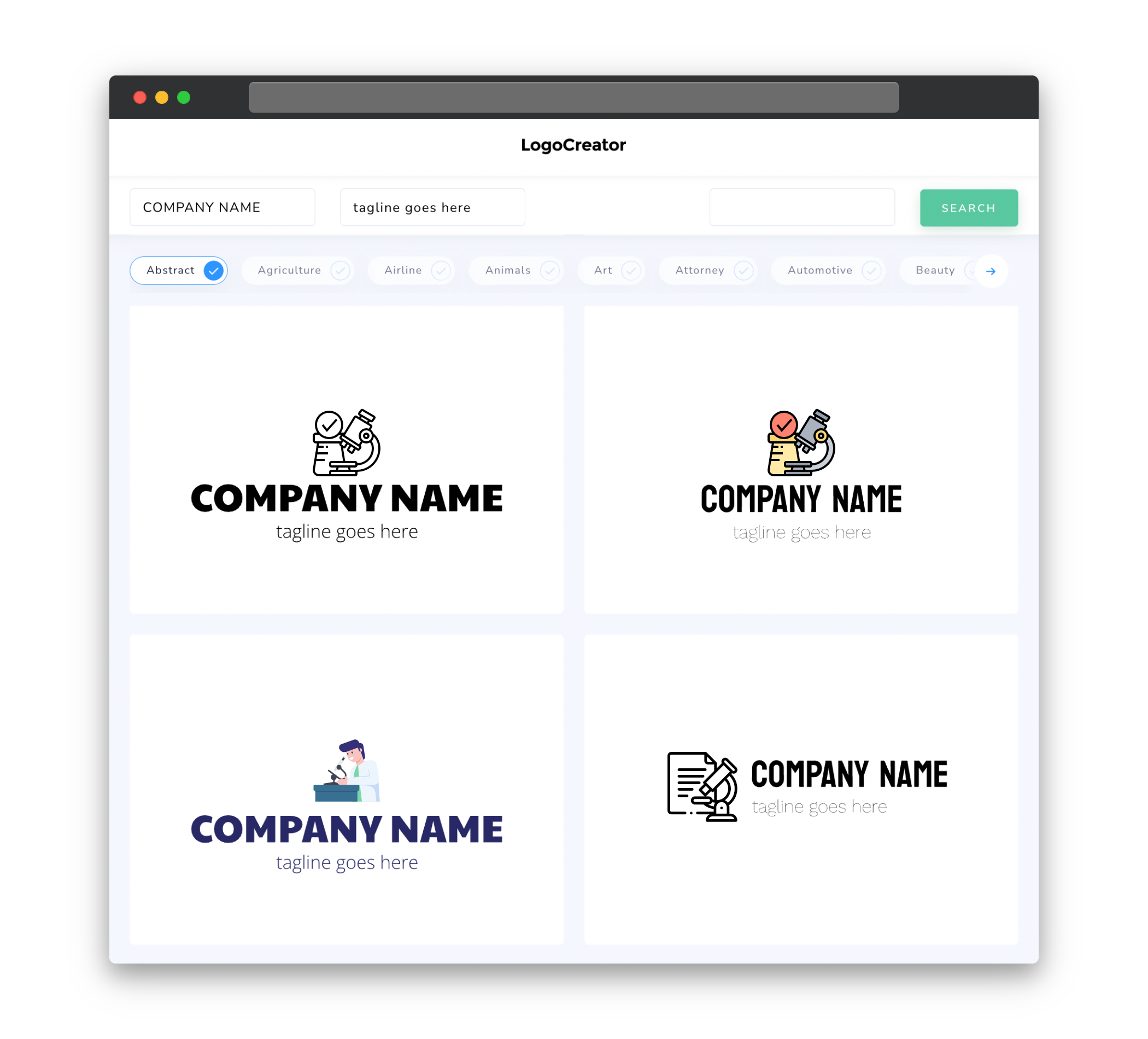
Icons play a significant role in medical research logos as they can visually represent various aspects of the field. When choosing icons for your logo, it is essential to consider their relevance and symbolism. Some commonly used icons in medical research logos include DNA strands, laboratory flasks, microscopes, and abstract representations of cells or molecules. These icons can help communicate the scientific nature of the organization and create an immediate association with medical research.
Color
Color selection is a crucial aspect of logo design, as different colors evoke different emotions and meanings. When designing a medical research logo, it is recommended to use colors that align with the field’s connotations of trust, reliability, and professionalism. Shades of blue are often associated with healthcare and evoke a sense of calmness and trust. Green can symbolize growth, health, and positivity. Additionally, neutral tones like gray and white can be used to convey a sense of sophistication and balance.
Fonts
The choice of fonts for a medical research logo should reflect the organization’s professionalism and expertise. Clean, modern, and easily readable fonts are often preferred for this type of logo. Sans-serif fonts, such as Arial or Helvetica, can convey a sense of simplicity and clarity, while also appearing modern and professional. It is important to ensure that the chosen font is easily legible, even at smaller sizes, to maintain a professional appearance.
Layout
The layout of a medical research logo should be well-balanced and visually appealing. Consider using symmetrical or balanced compositions to create a sense of stability and order. A simple and uncluttered layout can help convey a professional and organized image. Additionally, it is essential to consider how the logo will scale and be used across different platforms. A versatile logo layout will be easily recognizable whether it’s placed on a website, a document, or a physical sign.
Usage
A medical research logo must be versatile and usable across different mediums and formats. Consider how the logo will be used in various applications, such as websites, letterheads, business cards, and presentations. Ensure that the logo is easily scalable without losing its clarity or legibility. Furthermore, it is important to provide the logo in both color and black-and-white variations to accommodate different printing or display requirements. By creating a logo that is adaptable and functional, you can maintain a consistent and professional brand image for your medical research organization.


