Audience
When it comes to creating a Mental Health logo, it’s important to keep your audience in mind. Understanding who you are targeting with your logo can help you make design decisions that resonate with them. Your audience may include mental health professionals, therapists, counselors, support groups, or organizations focused on mental health awareness. Consider the age range, gender, and cultural background of your target audience to create a logo that speaks to them on a personal level. By carefully considering your audience, your logo will be more effective in catching their attention and conveying the right message.
Icons
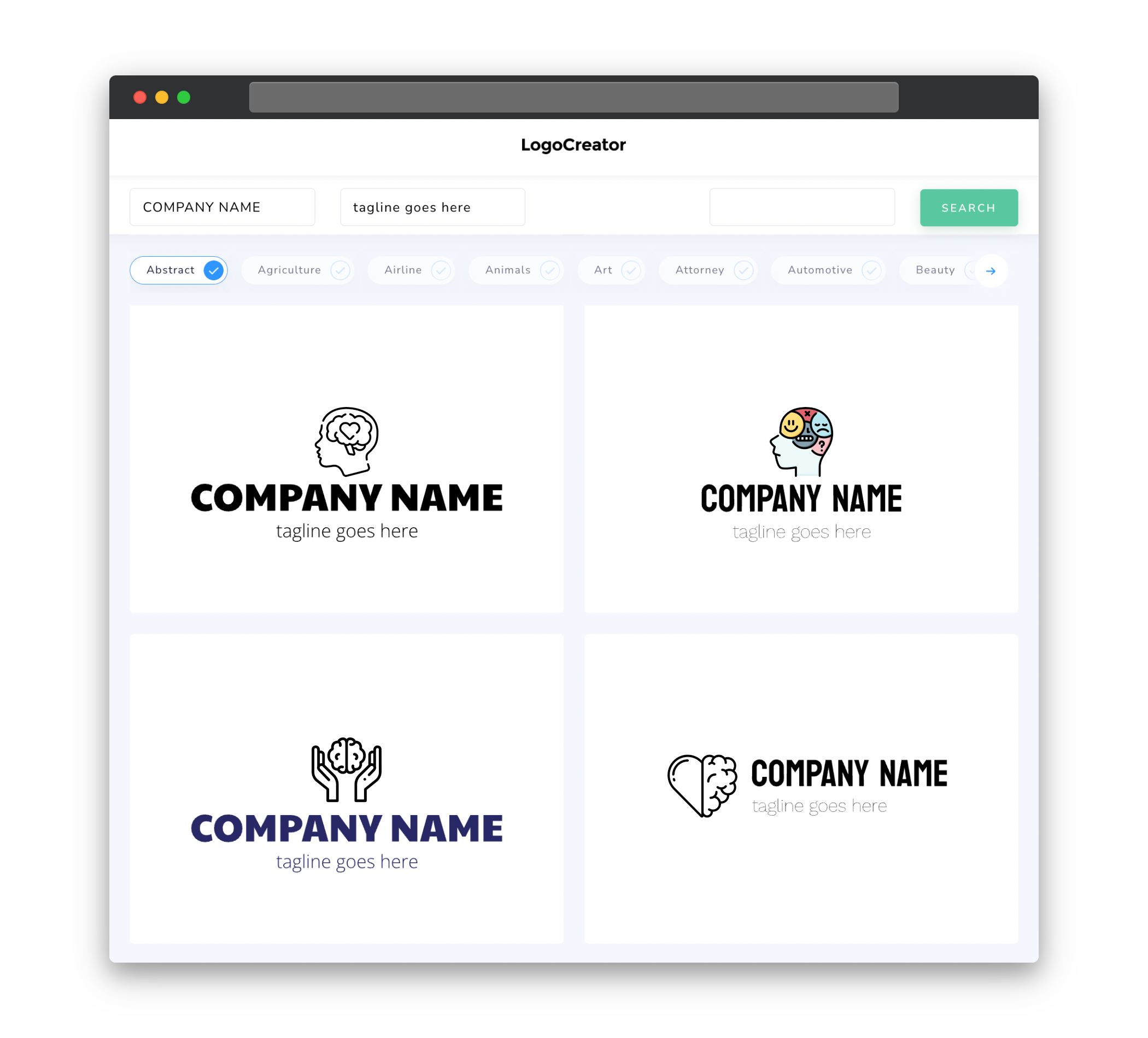
Choosing the right icons for your Mental Health logo is crucial in capturing the essence of mental health. Consider incorporating symbols that signify peace, balance, serenity, growth, or unity. Icons such as a heart, brain, tree, lotus flower, or puzzle piece are commonly associated with mental health and can evoke emotions of calmness and healing. Select icons that align with the message you want to convey through your logo and ensure they are easily recognizable and visually appealing. These icons will serve as visual representations of your brand, helping to create a memorable and impactful logo.
Color
Colors play a significant role in a Mental Health logo as they have the power to evoke specific emotions and convey meaning. Soft and soothing colors are often used to create a calming and supportive atmosphere. Shades of blue, green, and purple are commonly associated with mental health and can promote feelings of tranquility, harmony, and positivity. However, it’s important to strike the right balance and avoid colors that may inadvertently trigger negative emotions or imply a sense of instability. Selecting a harmonious color palette that complements your logo’s message can help create a sense of trust and empathy with your audience.
Fonts
Choosing the right fonts for your Mental Health logo is essential in setting the tone and conveying the sense of professionalism and empathy associated with mental health. Opt for clean and easily readable fonts that evoke a sense of calmness and professionalism. Sans-serif fonts are often preferred for their simplicity and modern touch, while script fonts can add a more personal and humanistic appeal to the logo. Remember to avoid overly decorative or complex fonts that may hinder legibility. By choosing the right fonts, you can strike a balance between professionalism and approachability in your Mental Health logo.
Layout
The layout of your Mental Health logo should be well-balanced and visually appealing. A clean, uncomplicated design is usually preferred to avoid overwhelming your audience. Consider incorporating negative space to create a sense of openness, tranquility, and mental clarity. The arrangement of text and icons should be coherent, with a focus on proportion and symmetry. Experiment with different layouts to find the one that conveys your message most effectively. Whether you choose a simple logo with a centered design or a more dynamic layout, ensure that it aligns with your brand identity and resonates with your target audience.
Usage
Once you’ve created your Mental Health logo, it’s important to consider how it will be used in various formats and contexts. Ensure that your logo is scalable, so it can be easily resized without losing its visual integrity. This allows for versatility in its application, whether it’s on websites, social media profiles, printed materials, or promotional items. Additionally, consider creating variations of your logo to accommodate different backgrounds or color schemes. This will ensure that your logo maintains its impact and readability across different platforms and environments. Finally, always use your Mental Health logo with integrity, representing your brand’s values and commitment to mental well-being.


