Audience
When creating a logo for a national park, it’s essential to consider the target audience. National parks attract a diverse range of visitors, from nature enthusiasts and adventure seekers to families and tourists. Therefore, your logo should appeal to a wide range of people while still reflecting the unique characteristics of the park. A well-designed logo will capture the attention of potential visitors, creating a sense of curiosity and excitement about the park’s natural beauty and outdoor activities. By understanding your audience and their interests, you can create a logo that resonates with them and motivates them to explore the national park further.
Icons
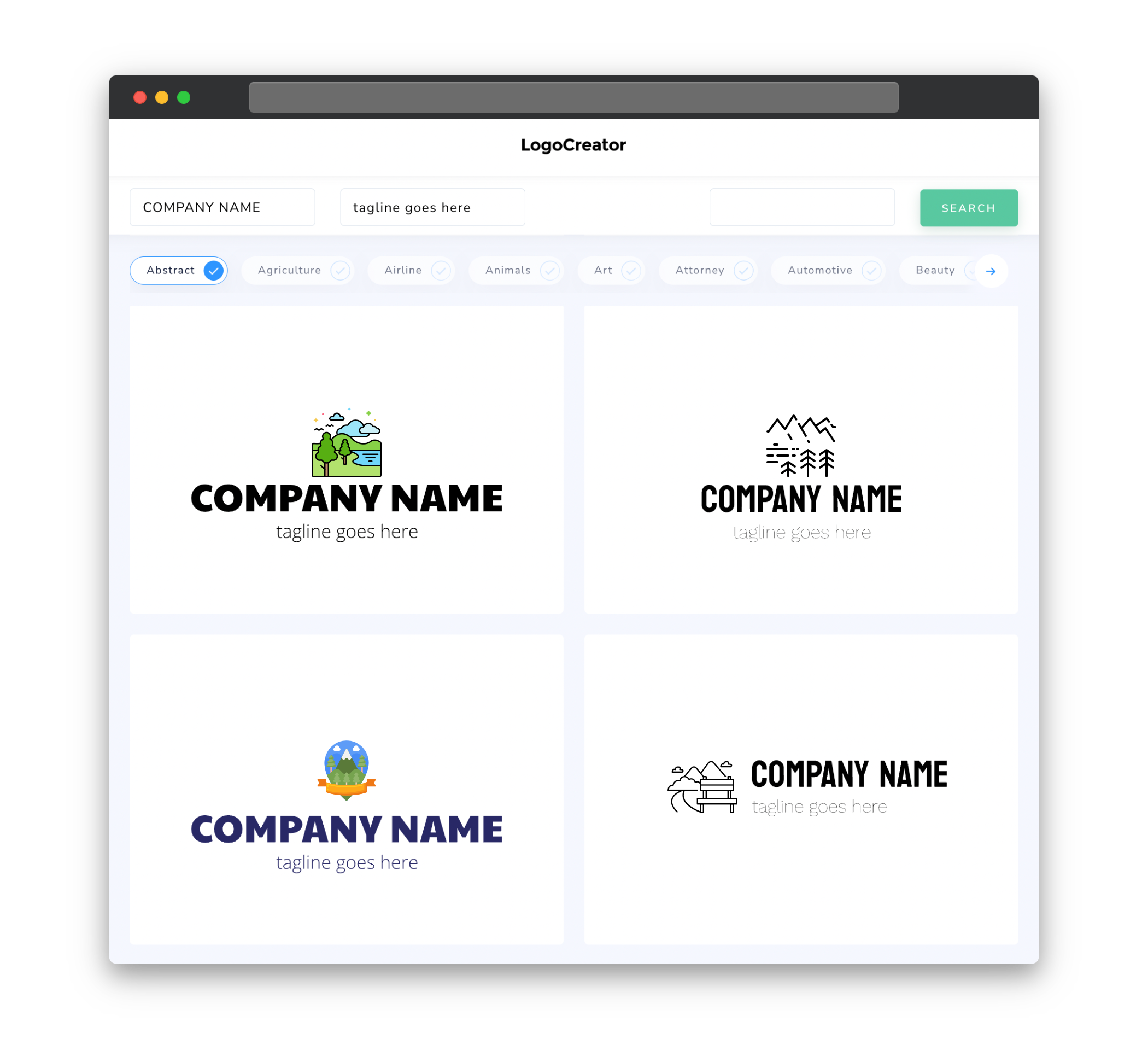
Icons play a crucial role in a national park logo. They serve as visual representations of the park’s most iconic features, such as mountains, forests, rivers, or wildlife. Including recognizable symbols in your logo design not only adds visual interest but also helps to establish a sense of identity for the park. These icons can evoke emotions and memories associated with the natural beauty and unique experiences visitors may encounter within the park. It’s important to select icons that are relevant, memorable, and easily identifiable, ensuring that they contribute to the overall branding and recognition of the national park.
Color
Color selection is a crucial aspect of designing a national park logo. Colors can evoke emotions and convey various meanings, allowing you to effectively communicate the park’s identity and values. When choosing colors for your logo, consider the natural environment of the park. Earthy tones such as greens, browns, and blues can symbolize the park’s connection to nature and create a sense of tranquility and harmony with the surroundings. Vibrant colors can also be incorporated to represent the park’s vivid landscapes and diverse flora and fauna. Whatever color scheme you choose, ensure that it aligns with the park’s branding and creates a visually appealing logo that stands out and leaves a lasting impression on visitors.
Fonts
The choice of fonts in a national park logo should reflect the park’s personality and overall image. Typically, serif or sans-serif fonts are used to achieve a clean, professional, and timeless look. Serif fonts are often associated with tradition, elegance, and authority and can lend a sense of credibility and sophistication to the logo. On the other hand, sans-serif fonts portray modernity, simplicity, and clarity, which may be more suitable for a national park aiming for a contemporary and approachable image. Whichever font style you choose, ensure that it is legible and easy to read, allowing visitors to quickly recognize and remember the national park’s name.
Layout
The layout of a national park logo must be carefully considered to ensure that it effectively communicates the park’s essence and captures the attention of viewers. A well-balanced and harmonious composition will enable the logo to be visually appealing and easily recognizable. Consider symmetry and proportion in your design, ensuring that all elements are aligned properly. It’s important to strike a balance between simplicity and detail, as an overly busy or cluttered logo can be overwhelming and difficult to identify. By carefully arranging the icons, text, and other visual elements, you can create a visually pleasing logo that conveys the unique characteristics and charm of the national park.
Usage
A national park logo should be versatile and suitable for various applications. It will be used on a variety of mediums, such as signage, brochures, merchandise, and the park’s website. Therefore, it should be scalable and adaptable to different sizes and formats without compromising its visual impact. Additionally, it’s essential to consider how the logo will appear in different color variations, such as full-color, black and white, or grayscale. By creating a flexible and adaptable logo design, you can ensure that the park’s branding remains consistent and recognizable across all platforms.


