Audience
When it comes to designing a logo for your nursery school, it is essential to consider your target audience. Your audience primarily consists of parents and guardians who are searching for a nurturing and safe environment for their children. Therefore, your logo should evoke a sense of trust, professionalism, and warmth. Consider using child-like elements, such as playful colors and friendly characters, to appeal to both children and their parents. Keep in mind that simplicity is key to ensuring that your logo can be easily recognized and remembered by parents who are juggling numerous options for their child’s education.
Icons
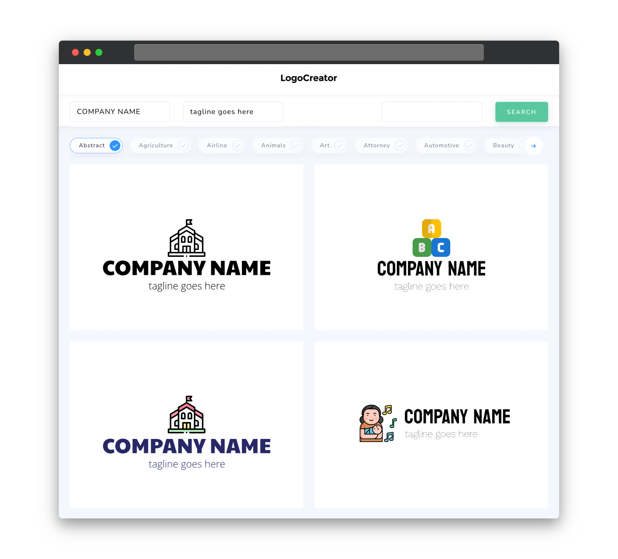
Choosing the right icons for your nursery school logo is crucial in conveying the desired message. Opt for icons that represent childhood, education, and care. For example, you could utilize icons of happy children playing, crayons, books, or a tree symbolizing growth and development. These icons will not only resonate well with parents but also create a visually appealing and relatable image for both adults and children.
Color
The choice of colors for your nursery school logo is vital in setting the right tone and emotion. Bright and vibrant colors, such as yellow, orange, green, and blue, often evoke feelings of joy, energy, and creativity. These colors can create a positive and inviting atmosphere, which is essential in reassuring parents that your school is a fun and engaging place for their children. It is a good idea to use a combination of colors that complement each other, while also ensuring that they are visually appealing to both children and parents.
Fonts
Selecting appropriate fonts for your nursery school logo is essential in conveying professionalism, creativity, and approachability. Opt for fonts that are clear, easy to read, and child-friendly. Consider combining a bold and playful font for the school name with a more traditional font for a tagline or additional text. This blend will create a balanced and visually appealing logo that exudes both warmth and professionalism.
Layout
The layout of your nursery school logo should be clean, simple, and well-balanced. A well-structured logo ensures that all elements are proportionate and harmonious, making it visually pleasing and easy to understand. Consider arranging the elements in a way that creates a clear focal point, such as placing the school name prominently and incorporating relevant icons or illustrations. Remember to keep the logo design versatile, allowing for easy adaptation across different mediums, such as websites, stationary, and promotional materials.
Usage
When using your nursery school logo, it is important to ensure consistency across all platforms and mediums. Maintain the same color scheme, fonts, and layout to establish a unified and recognizable brand identity. Your logo should appear on various materials, including your website, social media profiles, signage, school uniforms, and promotional materials. By consistently using your logo, you will build brand recognition and trust among parents, making your nursery school stand out from the competition.


