Audience
When it comes to designing a logo for your outreach program, it’s important to understand your target audience. The key to effective outreach is connecting with your audience on an emotional level, and your logo can play a crucial role in achieving that. Consider who your outreach program is targeting and what will resonate with them. Are you targeting a specific age group, gender, or demographic? Understanding your audience will help you create a logo that speaks directly to them and captures their attention.
Icons
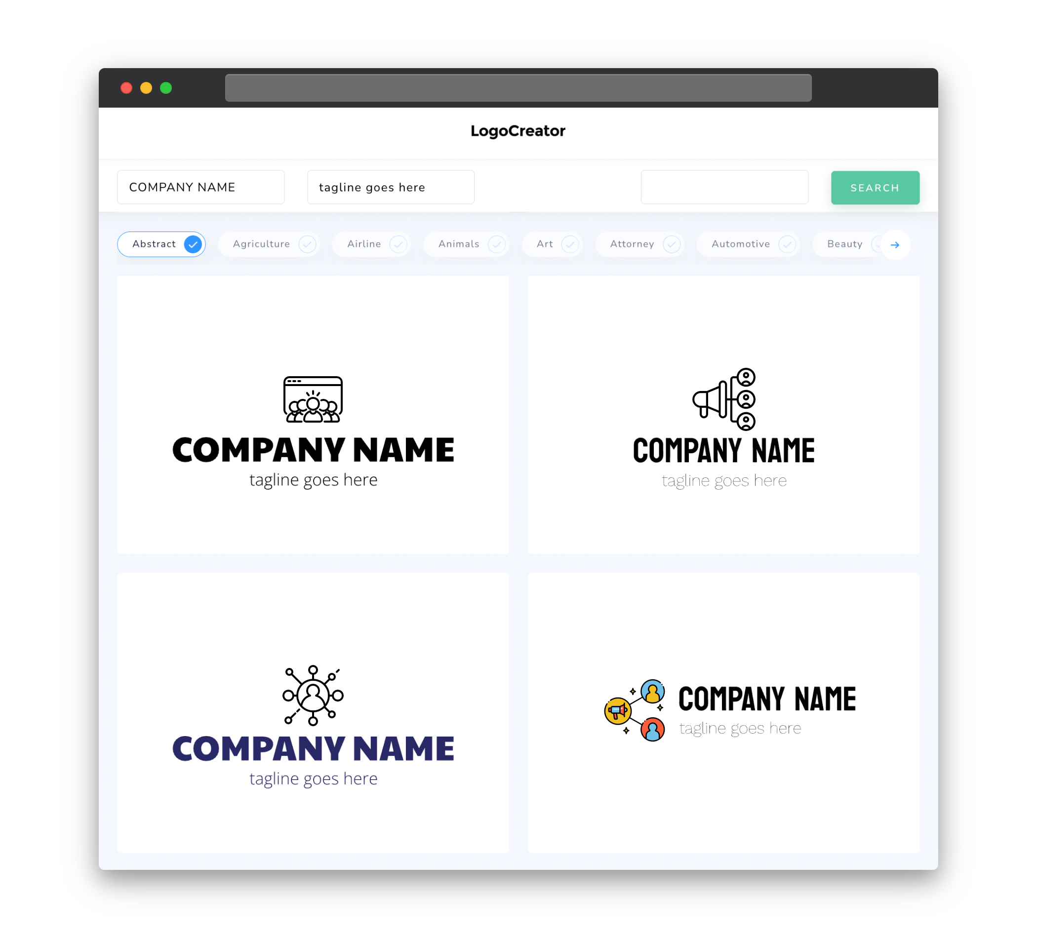
Icons are a powerful visual element that can enhance your logo and make it instantly recognizable. When choosing icons for your outreach program logo, think about the message you want to convey. Icons can represent various concepts such as community, education, activism, or health. Look for icons that align with your program’s goals and values, and ensure they are clear, simple, and scalable. Remember, the purpose of an icon is to grab attention and communicate your message effectively.
Color
Choosing the right colors for your outreach program logo is crucial as colors have a strong psychological impact on viewers. Different colors evoke different emotions and can influence how people perceive your program. Consider the tone and message you want to convey. For example, bright colors like orange or yellow can create a sense of energy and enthusiasm, while cool blues and greens can evoke a feeling of calm and trust. It’s important to strike a balance between using colors that align with your program’s brand and resonating with your target audience.
Fonts
Fonts play a significant role in logo design as they can convey a specific mood or style. When selecting fonts for your outreach program logo, aim for readability and legibility. Consider using fonts that are clear, distinct, and align with your program’s personality. For a modern and sleek look, sans-serif fonts are a popular choice, while serif fonts can convey a sense of tradition and elegance. Experiment with different font combinations to find the perfect balance between readability and aesthetics.
Layout
The layout of your outreach program logo should be clean, balanced, and visually appealing. Consider how the elements of your logo (icons, text, etc.) are arranged and ensure they work harmoniously together. A well-organized layout will not only make your logo visually appealing but also make it easier to recognize and remember. Keep in mind that your logo should look great at different sizes and in various applications, such as social media profiles, websites, and printed materials.
Usage
Your outreach program logo will be used in various contexts, so it’s important to consider its versatility. Ensure that your logo looks great in different sizes and formats, from a small favicon to a large billboard. It should also be easily identifiable when used in both color and black and white. Additionally, think about how your logo will be used across different platforms such as social media, websites, and print materials. By considering the usage scenarios, you can create a logo that remains consistent and impactful regardless of where it’s displayed.


