Audience
When it comes to designing a logo for your pastry chef business, it’s important to consider your audience. Your logo should appeal to both potential customers who are looking for delicious treats, as well as those who appreciate the skill and artistry that goes into creating pastries. Your logo must convey a sense of elegance and professionalism that sets you apart from other bakeries or dessert shops. By understanding your target audience and their preferences, you can create a logo that speaks directly to them, making a lasting impression and attracting more customers to your bakery.
Icons
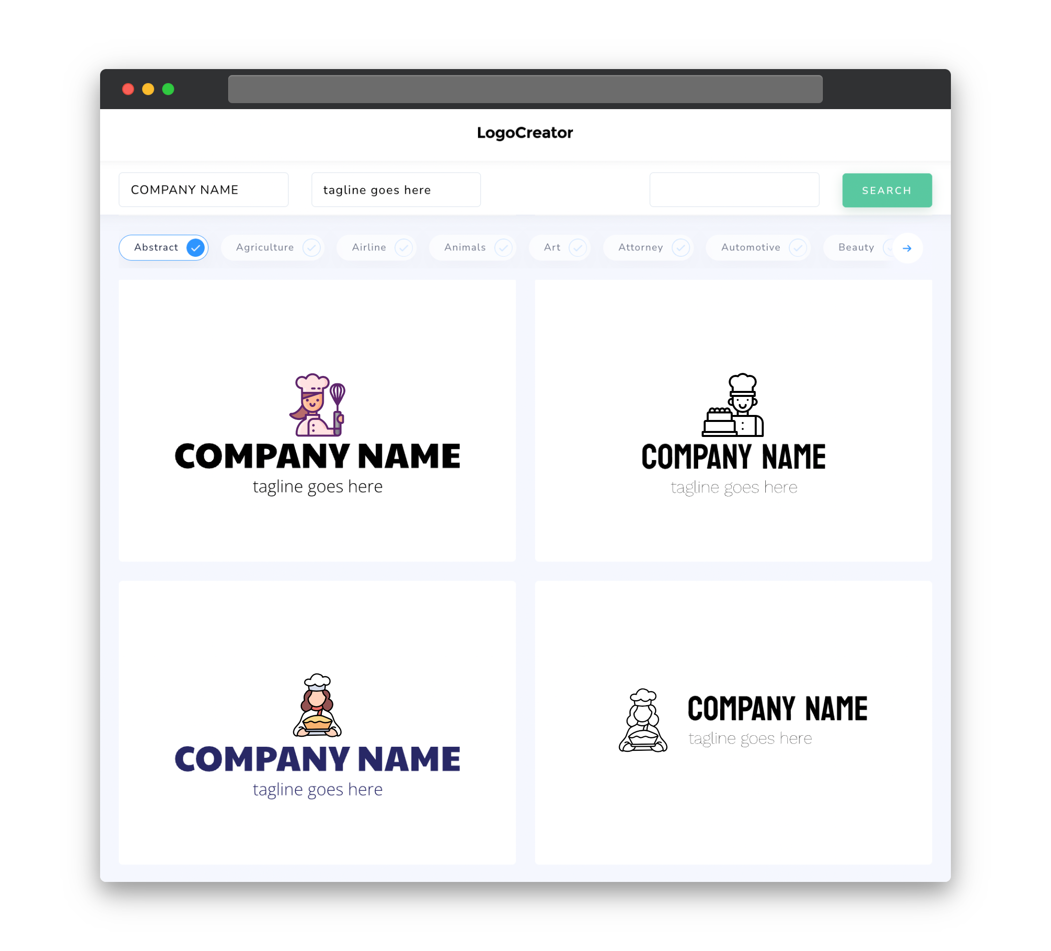
Choosing the right icon for your pastry chef logo is crucial in representing your brand’s identity. A well-designed icon can instantly communicate what your business is about. Consider using icons that represent common pastry items such as croissants, cakes, or cookies. Alternatively, you can use cooking utensils like rolling pins or chef hats to symbolize your expertise as a pastry chef. Whatever icon you choose, make sure it aligns with the overall theme and style of your bakery, creating a visual connection that resonates with your audience.
Color
When selecting colors for your pastry chef logo, you want to evoke feelings of warmth, creativity, and deliciousness. Soft pastel shades like blush pink, cream, and mint green can create a delightful and appetizing vibe. Alternatively, bold and vibrant colors like deep red, dark chocolate brown, or golden yellow can convey a sense of decadence and luxury. Ultimately, the choice of colors will depend on your brand’s personality and the emotions you want to evoke in your audience. Consider using a combination of colors to add depth and contrast to your logo while maintaining a cohesive and visually pleasing design.
Fonts
The right choice of fonts can greatly enhance the overall look and feel of your pastry chef logo. Consider selecting a font that reflects the style and ambiance of your bakery. Elegant and script fonts can convey a sense of sophistication and craftmanship, while clean and modern sans-serif fonts can create a more contemporary and professional look. Whichever font you choose, ensure that it is easily readable and complements the other elements of your logo. A well-chosen font can help establish your brand identity and set the tone for your pastry chef business.
Layout
The layout of your pastry chef logo plays a crucial role in showcasing your unique style and capturing the attention of your audience. A clean and balanced layout allows for easy recognition and ensures that your logo looks visually appealing across different platforms and sizes. Consider the placement of your icon, text, and other elements, ensuring that they work harmoniously together to create a cohesive design. Experiment with various arrangements and spacing to find the perfect layout that reflects your bakery’s unique identity and makes a memorable impression.
Usage
Your pastry chef logo should be versatile and adaptable to different types of media and marketing materials. Ensure that your logo looks good in both digital and print formats, as it will be used on your website, social media profiles, business cards, and other promotional materials. A logo that can be scaled down or up without losing its impact is essential for maintaining consistency across different platforms. Additionally, consider creating variations of your logo to suit different backgrounds and color schemes, ensuring that your brand remains instantly recognizable in any context.


