Audience
When it comes to creating a successful pastry logo, you need to consider your target audience. Think about who your potential customers are and what will resonate with them. Are you targeting a high-end clientele who appreciate elegance and sophistication? Or are you appealing to a younger, more fun-loving crowd? Understanding your audience’s preferences will help you design a pastry logo that captures their attention and speaks to their desires.
Icons
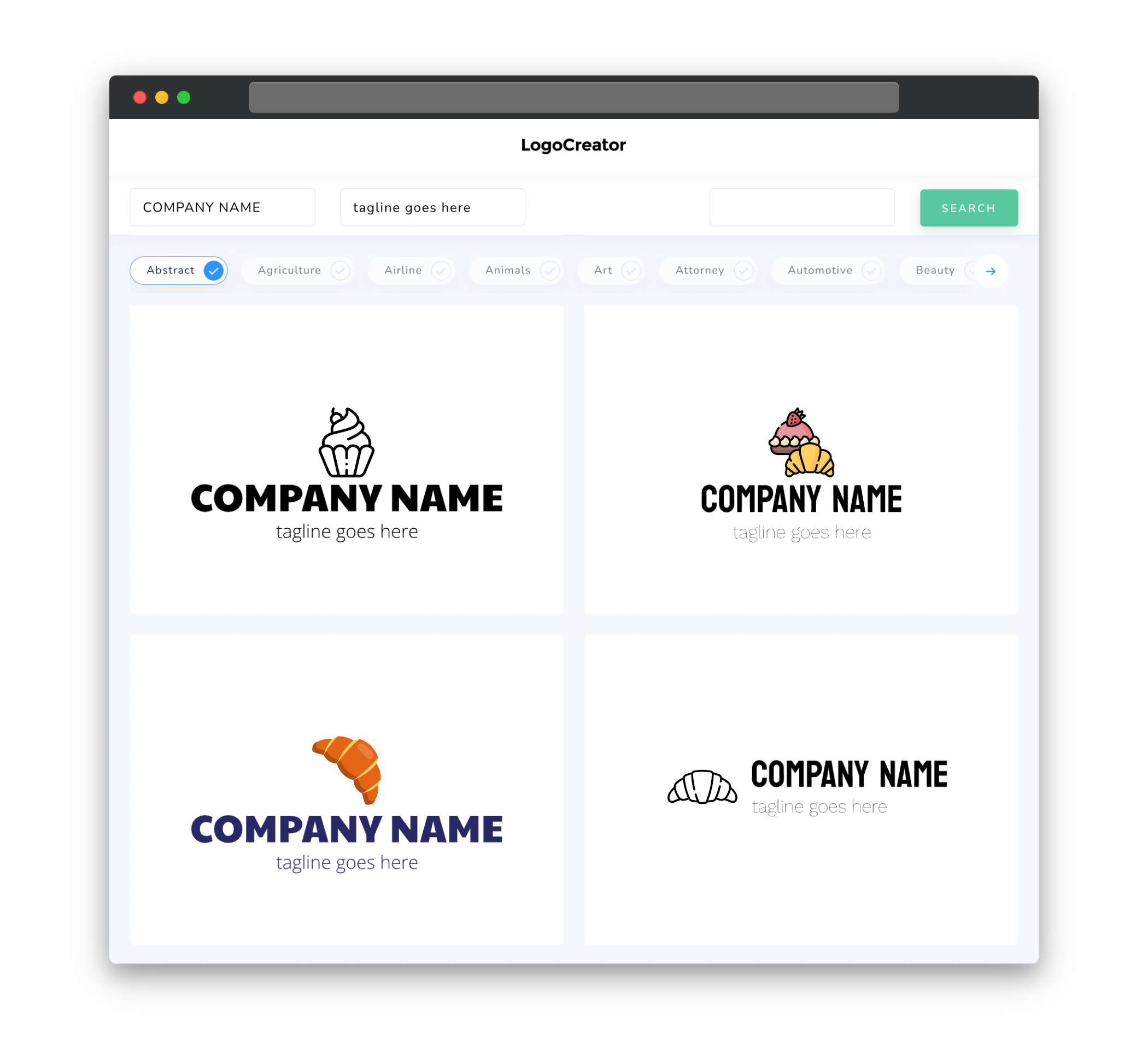
Icons play a crucial role in pastry logos as they help convey the essence of your brand in a visual and memorable way. Incorporating pastry-related icons such as croissants, cakes, or rolling pins can instantly communicate your business’s focus. Consider whether you want a simple and minimalist icon or a more detailed and elaborate design. Ultimately, the choice of icons should align with your brand’s personality and message.
Color
The color scheme you choose for your pastry logo is essential in creating the right mood and attracting your target audience. Warm, inviting colors like shades of brown, soft pinks, or pastel hues can evoke feelings of comfort and indulgence. Alternatively, vibrant and bold colors like reds or yellows can convey a sense of energy and excitement. It’s important to strike the right balance between colors that reflect your brand’s identity and those that appeal to your target audience’s preferences.
Fonts
The choice of fonts in your pastry logo can greatly influence how your audience perceives your brand. Consider using fonts that are elegant and sophisticated if you’re targeting a higher-end market. Script or cursive fonts can add a touch of elegance, while sans-serif fonts can give a more modern and clean look to your logo. Play around with different font combinations to find the right balance between readability and aesthetic appeal.
Layout
The layout of your pastry logo should be thoughtfully designed to ensure a balanced and visually appealing composition. Consider organizing your logo elements in a way that highlights the most important aspects, such as your business name or the icon representing your specialty. Experiment with different placements and sizes to ensure that your logo is easy to recognize and remains visually cohesive across different sizes and platforms.
Usage
When creating a pastry logo, it’s crucial to consider its potential use across various platforms and mediums. Ensure that your logo maintains its clarity and legibility when scaled down to smaller sizes, such as on social media profile pictures or business cards. Additionally, consider how your logo will appear in both color and black and white formats, as well as on different backgrounds. By anticipating and planning for these different scenarios, you can ensure that your pastry logo remains versatile and effective in any context.


