Audience
When it comes to designing a logo for a pediatrician, it is important to consider the target audience â parents and children. The logo needs to convey a sense of trust, professionalism, and warmth. Parents should immediately feel confident in the care their child will receive, while children should find the logo inviting and friendly. To achieve this, the logo should have elements that appeal to both parents and children, striking a balance between professionalism and playfulness.
Icons
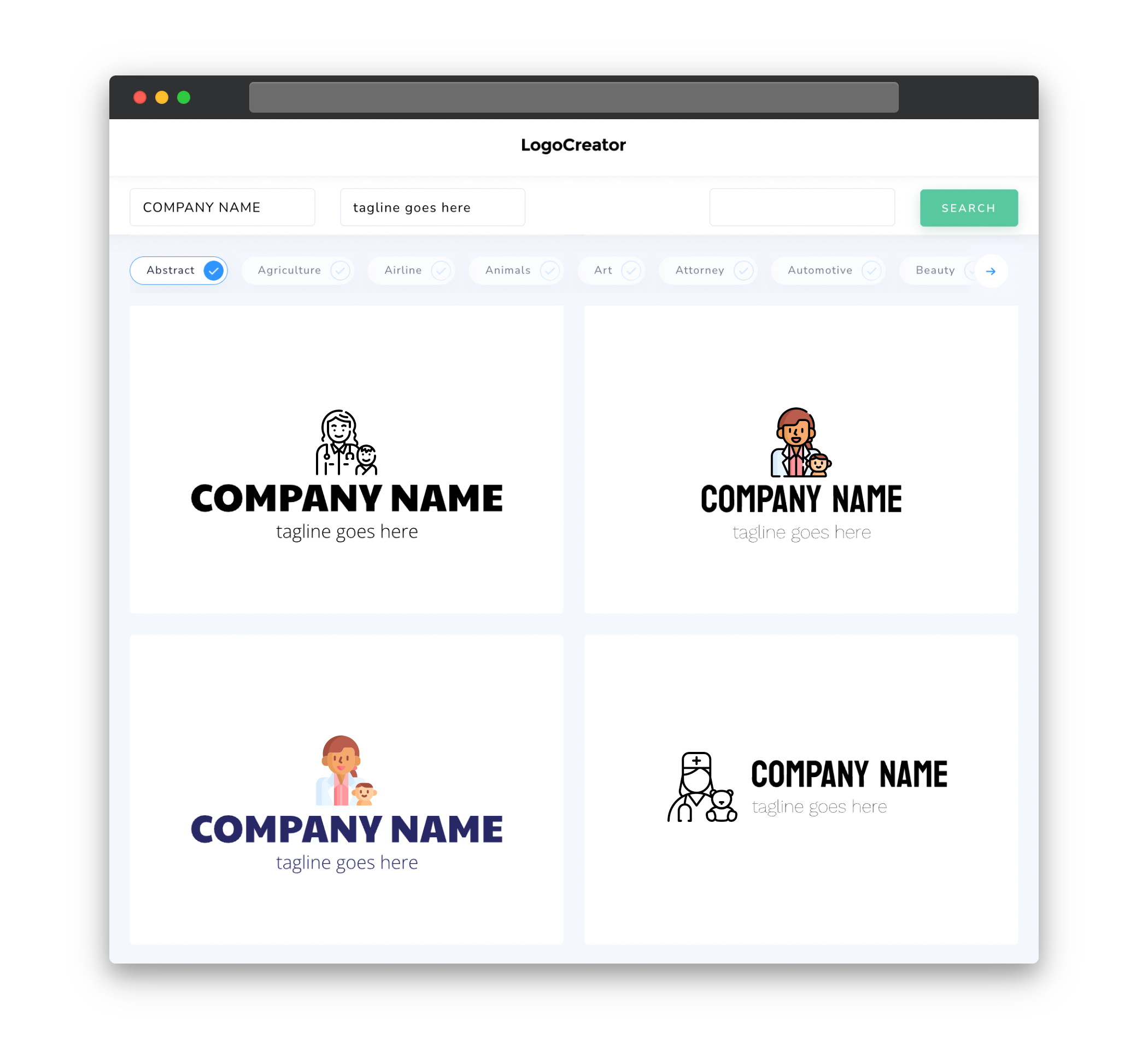
Incorporating relevant icons into the pediatrician logo can be an effective way to visually represent the services offered. Icons such as a baby bottle, stethoscope, or teddy bear can help convey the focus on child healthcare. It is important to choose icons that are easily recognizable and relatable to both parents and children. The icons should be simple and clean, ensuring that they work well at different sizes and are easily distinguishable when used in various applications.
Color
Color plays a crucial role in evoking emotions and conveying the values of a pediatrician’s practice through a logo. It is important to choose colors that are associated with trust, warmth, and care. Soft pastel shades or bright, vibrant colors can be used to create a visually appealing logo that appeals to both parents and children. However, it is important to avoid using too many colors as it can make the logo appear cluttered and unprofessional. Stick to a color palette of 2-4 colors to maintain a clean and cohesive look.
Fonts
Choosing the right fonts for a pediatrician logo is essential for reflecting professionalism, trustworthiness, and friendliness. Opt for clear and easily legible fonts, such as sans-serif or script fonts, to ensure readability in all sizes and applications. A combination of fonts can also be used to create a visual hierarchy and highlight important elements of the logo, such as the practice name or tagline. Remember to keep the fonts simple and avoid overly decorative or elaborate styles that may distract from the overall message.
Layout
The layout of a pediatrician logo should be clean, balanced, and visually appealing. It is important to consider the placement and arrangement of various elements such as icons, text, and any additional graphical elements. A well-balanced layout ensures that the logo is easy to understand and visually pleasing. Incorporating negative space or whitespace can also help create a sense of openness and simplicity in the logo design, allowing the elements to breathe and be clearly distinguishable.
Usage
A pediatrician logo should be versatile and adaptable to various applications, ranging from digital platforms to printed materials. It is important to create a logo that works well in both color and black and white formats, ensuring that it remains visually impactful across different mediums. Additionally, consider designing variations of the logo for different purposes, such as horizontal and vertical layouts, simplified versions for smaller sizes, and versions with or without taglines. This versatility allows for consistent branding and easy recognition across different touchpoints.


