Audience
When it comes to creating a pesticide logo, itâs essential to consider your target audience. Your logo should resonate with individuals and businesses within the pesticide industry. This can include agricultural professionals, pest control companies, farmers, gardeners, and even homeowners who seek to tackle pest-related issues.
To effectively appeal to your target audience, consider the specific concerns and values that drive them. Think about the trust and reliability they seek in a pesticide product, as well as the importance of safety and sustainability. By understanding the needs and preferences of your audience, you can create a logo that speaks directly to their interests and establishes a strong connection with your brand.
Icons
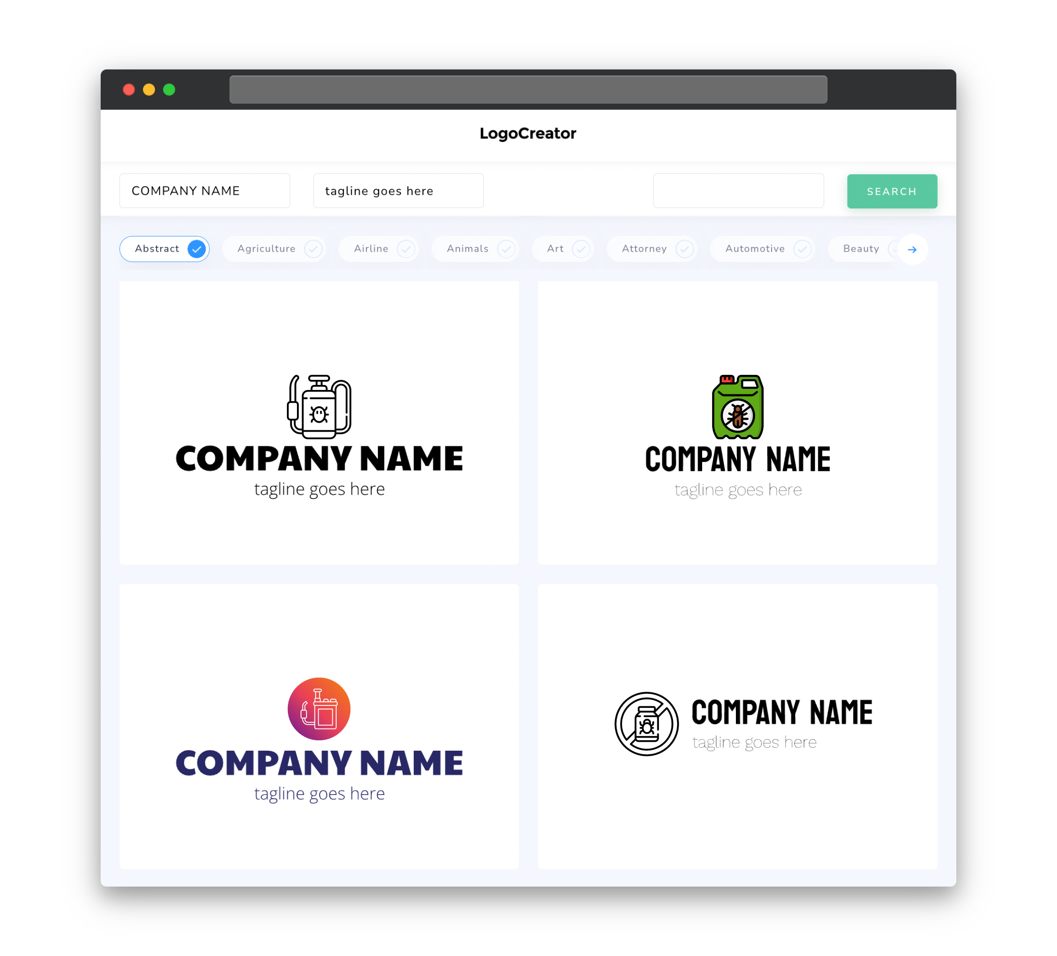
Icons play a crucial role in pesticide logos, as they visually represent the purpose and nature of the product. A well-designed icon can convey the idea of pest control, cleanliness, and efficiency. Icons such as sprayers, leaves, bugs, or a combination of these elements can be incorporated to add context and visual appeal to your logo.
It’s important to strike a balance between creating a recognizable icon and avoiding cliché designs. While it’s tempting to opt for a generic or obvious symbol, finding a unique perspective or a fresh approach will help your pesticide logo stand out from the competition. Ultimately, your icon should be easily identified and memorable, leaving a lasting impression on your audience.
Color
Color selection can significantly impact the effectiveness of your pesticide logo. When choosing colors, consider the emotions and associations they evoke. Green, for example, is often associated with nature, freshness, and growth, which makes it a popular choice in pesticide logos. It conveys a sense of environmental responsibility and emphasizes the natural aspects of pest control.
In contrast, blues and greys can create a sense of professionalism, trust, and reliability. These colors are often used to establish credibility, and they can be combined with other shades to convey additional characteristics. It’s important to strike the right balance between color harmony and conveying the specific values and messages you want your pesticide logo to communicate.
Fonts
Fonts are an essential element in your pesticide logo design. A well-chosen font can enhance the overall message and visual impact. Typically, clean, simple, and legible fonts work best for pesticide logos, as they convey professionalism and reliability.
Sans serif fonts, such as Arial or Helvetica, are popular choices for pesticide logos due to their clean lines and contemporary feel. They are easily readable across various mediums and sizes, ensuring your logo remains recognizable and impactful. It’s important to choose a font that complements your overall design aesthetic and conveys the qualities and values you want your brand to represent.
Layout
The layout of your pesticide logo can significantly influence its visual impact and effectiveness. A balanced and visually appealing layout ensures that your logo is easy to identify and understand. Consider factors such as symmetry, spacing, and proportions when designing your layout.
One common approach is to create a logo that combines both text and icon, balancing them harmoniously. Placing the text below or beside the icon can create a well-structured composition. Additionally, ensuring that your logo is scalable and readable across different sizes and platforms is crucial for maintaining its legibility and impact.
Usage
Your pesticide logo will be used across various platforms and mediums, so it’s important to design a versatile logo that adapts to different contexts. Consider how your logo will look on packaging, websites, social media profiles, and other marketing materials. This will help ensure that your logo remains consistent and recognizable, regardless of where it is displayed.
Creating a vector-based logo allows for scalability and ensures that your logo does not lose quality when resized. Additionally, it’s important to consider the usage of both color and black and white versions of your logo. Having a simplified black and white version can be useful for situations where color may not be available or appropriate, while maintaining the essence and impact of your design.


