audience
When it comes to creating a philanthropy logo, it is important to consider your target audience. Your logo should be designed in a way that resonates with the people who are passionate about making a difference in the world. Whether you are a non-profit organization, a charitable foundation, or a social enterprise, your logo should appeal to individuals who share your vision and values. Consider the demographics, interests, and aspirations of your target audience to create a logo that instantly connects with them.
icons
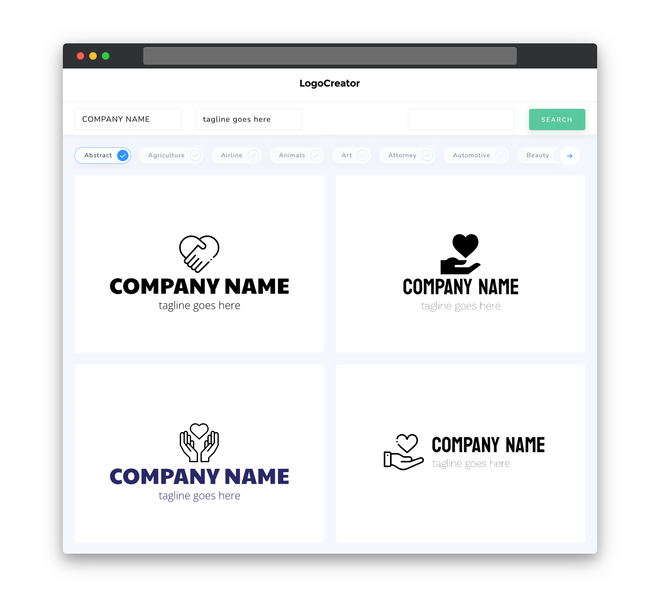
Icons play a crucial role in creating a philanthropy logo that effectively communicates your mission and values. Choose icons that symbolize concepts like giving, unity, compassion, and social impact. Some commonly used icons in philanthropy logos include hands, hearts, globes, leaves, and people holding hands. These icons are instantly recognizable and convey a sense of empathy and positivity. From simple and minimalist designs to more elaborate and detailed illustrations, the choice of icons should align with your organization’s identity and goals.
color
Color is a powerful tool that can evoke emotions and make a lasting impact on your audience. When designing a philanthropy logo, consider using colors that convey the values and goals of your organization. Blue, for example, is often associated with trust, harmony, and peace, making it a popular choice for philanthropy logos. Green, on the other hand, symbolizes nature, growth, and sustainability, which can be relevant for environmental and conservation-focused organizations. Additionally, colors like red, yellow, and orange can be used to represent energy, passion, and urgency, ideal for organizations working in emergency relief or social justice. Careful selection and implementation of colors in your logo can help create a strong and meaningful visual identity.
fonts
Fonts play a significant role in creating a visually appealing and impactful philanthropy logo. When selecting fonts, consider the personality and tone of your organization. Serif fonts are often associated with tradition, reliability, and professionalism, while sans-serif fonts can convey a more modern, clean, and approachable image. It’s important to choose fonts that are legible and easy to read, even at smaller sizes. Depending on the message you want to convey, you can experiment with different font styles, weights, and spacings. The right combination of fonts can add sophistication, warmth, or a sense of urgency to your philanthropy logo.
layout
The layout of your philanthropy logo should be carefully designed to effectively represent your organization’s message and values. Consider the hierarchy of elements within the logo, ensuring that the most important aspects are given prominence. Place the icon or graphic element strategically, ensuring it complements and enhances the overall design. Experiment with different arrangements and compositions, such as stacking elements vertically or arranging them in a circular or square shape. A well-balanced and visually pleasing layout will contribute to the overall impact and memorability of your philanthropy logo.
usage
A philanthropy logo needs to be versatile and adaptable for various applications. Ensure that your logo looks great across different mediums such as websites, social media profiles, print materials, and merchandise. A scalable vector format, such as SVG or EPS, will allow for easy resizing without loss of quality. Additionally, consider creating versions of your logo that work well in both full color and black and white, allowing for flexibility in different contexts. By designing a logo that is versatile and easy to use, you can effectively maintain a strong and consistent brand presence in all your philanthropic endeavors.


