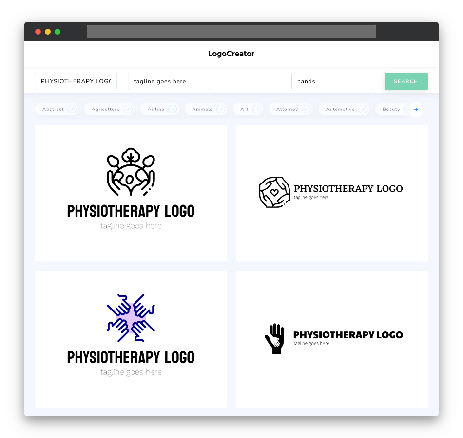
Is a physiotherapy logo the right choice for you?
A physiotherapy logo is a perfect choice if you’re in the field of physical therapy, rehabilitation, or wellness. It’s also ideal for clinics, fitness centers, and anyone who wants a logo that symbolizes the restoration of mobility and well-being. If you want a logo that captures the essence of healing, movement, and your dedication to promoting physical health, a physiotherapy logo is the right choice for your brand.
What makes a good physiotherapy logo?
A good physiotherapy logo should convey healing, wellness, and the potential for improved mobility while being visually soothing and memorable. Look for designs that incorporate elements like stylized body silhouettes, hands, hearts, or abstract representations of movement. Balance is key, and the design should reflect the importance of physical well-being and the power of therapeutic care. Choose fonts and typography that convey a sense of professionalism, empathy, and the dynamic nature of physiotherapy, enhancing the logo’s overall impact. Your physiotherapy logo should inspire trust and confidence in your ability to promote healing and well-being.
What are the best icons for physiotherapy logos?
Icons for physiotherapy logos should align with the themes of healing, movement, and wellness. Consider using icons like hands supporting a body, abstract figures in motion, hearts intertwined with body shapes, or stylized physical therapy tools. These icons not only reinforce your brand’s connection to physical well-being but also resonate with individuals who value the restoration of health and mobility. Keep the design soothing and visually appealing, ensuring that the icon enhances the overall look and feel of your logo while evoking feelings of healing and care.
What colors are best for physiotherapy logos?
When selecting colors for your physiotherapy logo, opt for shades that represent healing, wellness, and vitality. Calming and soothing colors like blues, greens, and soft purples often evoke feelings of trust and well-being, ideal for brands focused on physical health. Warm and inviting colors like oranges and yellows can symbolize energy and vitality, making them suitable for fitness centers and rehabilitation clinics. The key is to ensure that your chosen color palette captures the essence of healing and well-being while maintaining a visually comforting and harmonious design.
Which fonts go best with physiotherapy logos?
Choosing the right fonts for your physiotherapy logo depends on your brand’s identity and messaging. Clean and modern fonts like Helvetica or Proxima Nova are popular choices for their ability to convey a sense of professionalism and clarity, aligning with physiotherapy logo themes. Script fonts can add a touch of empathy and personal care, which may be suitable for those who emphasize patient-centered treatment. Ultimately, the font you choose should align with your brand’s personality and messaging, enhancing the sense of healing and well-being that your physiotherapy logo represents.
Ready to brand your physiotherapy practice, rehabilitation clinic, or wellness center with a logo that embodies healing and well-being? Try our physiotherapy logo maker today and create a logo that’s as comforting and professionally caring as your brand’s mission. Your perfect physiotherapy logo is just a few clicks away!


