Audience
When it comes to creating a logo for your Ramen business, it’s important to consider your target audience. Understanding who your customers are will help you design a logo that appeals to them and stands out in the competitive market. Are you targeting young adults who are looking for a trendy and modern dining experience? Or perhaps families who are seeking a wholesome and authentic Ramen experience? Defining your target audience will guide your design decisions and ensure that your logo resonates with your customers.
Icons
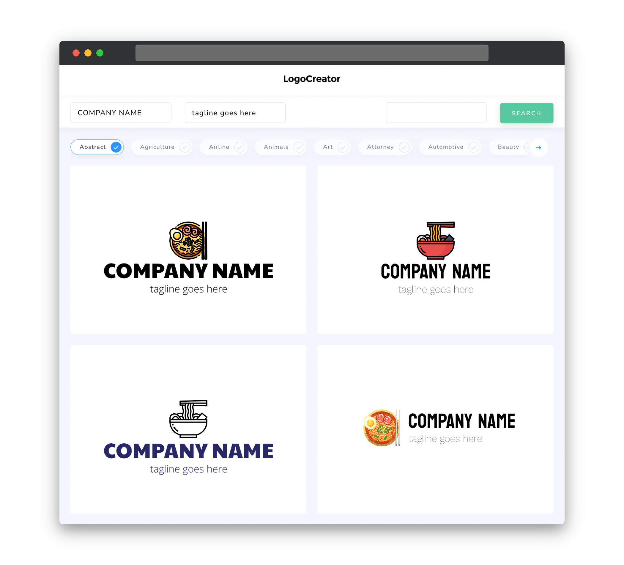
Incorporating icons into your Ramen logo can be a powerful way to communicate your brand message and evoke the essence of your business. From the iconic Ramen bowl to chopsticks or steaming hot soup, there are numerous symbols that can instantly convey the theme of your restaurant. Icons not only add visual interest to your logo design, but they can also make it more memorable and recognizable to your customers. Whether you opt for a minimalist or detailed representation, choosing the right icon can elevate your logo and make it truly stand out in the minds of your target audience.
Color
Color plays a crucial role in logo design as it can evoke different emotions and impressions. When crafting your Ramen logo, it’s important to consider the colors that reflect the essence of your brand. For a lively and energetic feel, vibrant shades of red and orange can be used to represent the spiciness and boldness of your Ramen dishes. On the other hand, muted earth tones or cool shades of blue can convey a sense of authenticity and sophistication, ideal for those aiming for a traditional and serene Ramen experience. Experimenting with different color combinations can help you find the perfect balance that resonates with your brand and appeals to your target customers.
Fonts
Choosing the right font for your Ramen logo can greatly contribute to its overall look and feel. The font should be readable and harmonize with the theme of your restaurant. Consider using a clean and modern font for a contemporary Ramen eatery that caters to a younger crowd. Alternatively, if your Ramen business prides itself on tradition and authenticity, a more ornate and elegant font may be fitting. Striking the right balance between legibility and aesthetics will ensure that your logo effectively communicates your brand’s personality and values.
Layout
The layout of your Ramen logo is an essential consideration in its design. Whether you prefer a compact and minimalist design or a more intricate composition, the layout should be visually appealing and easy to remember. One popular approach is to position the icon or main visual element prominently while incorporating the business name or slogan in a complementary manner. This helps to create a cohesive and balanced design that is both visually striking and informative. The overall layout should be adaptable to different sizes and formats, ensuring that your logo looks great whether it’s displayed on a website, menu, or signboard.
Usage
A well-designed Ramen logo should be versatile and cater to various usage scenarios. It should look equally fantastic across different mediums, such as print and digital platforms, as well as in color or black and white. To ensure flexibility, consider creating versions of your logo that can be adapted for both horizontal and vertical placements. Additionally, designing simplified variations of your logo for smaller spaces or social media avatars can maintain brand recognition even in limited display areas. By keeping the usage requirements in mind during the design process, your Ramen logo will be well-equipped to represent your brand consistently and effectively in any scenario.


