Audience
When it comes to designing a rental logo, it is crucial to understand your target audience. Your logo should align with the preferences and interests of your potential customers. Are you targeting a specific age group or demographic? Is your rental business focused on a particular niche, such as vacation rentals or event rentals? By considering your audience, you can create a logo that resonates with them and helps to establish your brand identity.
Icons
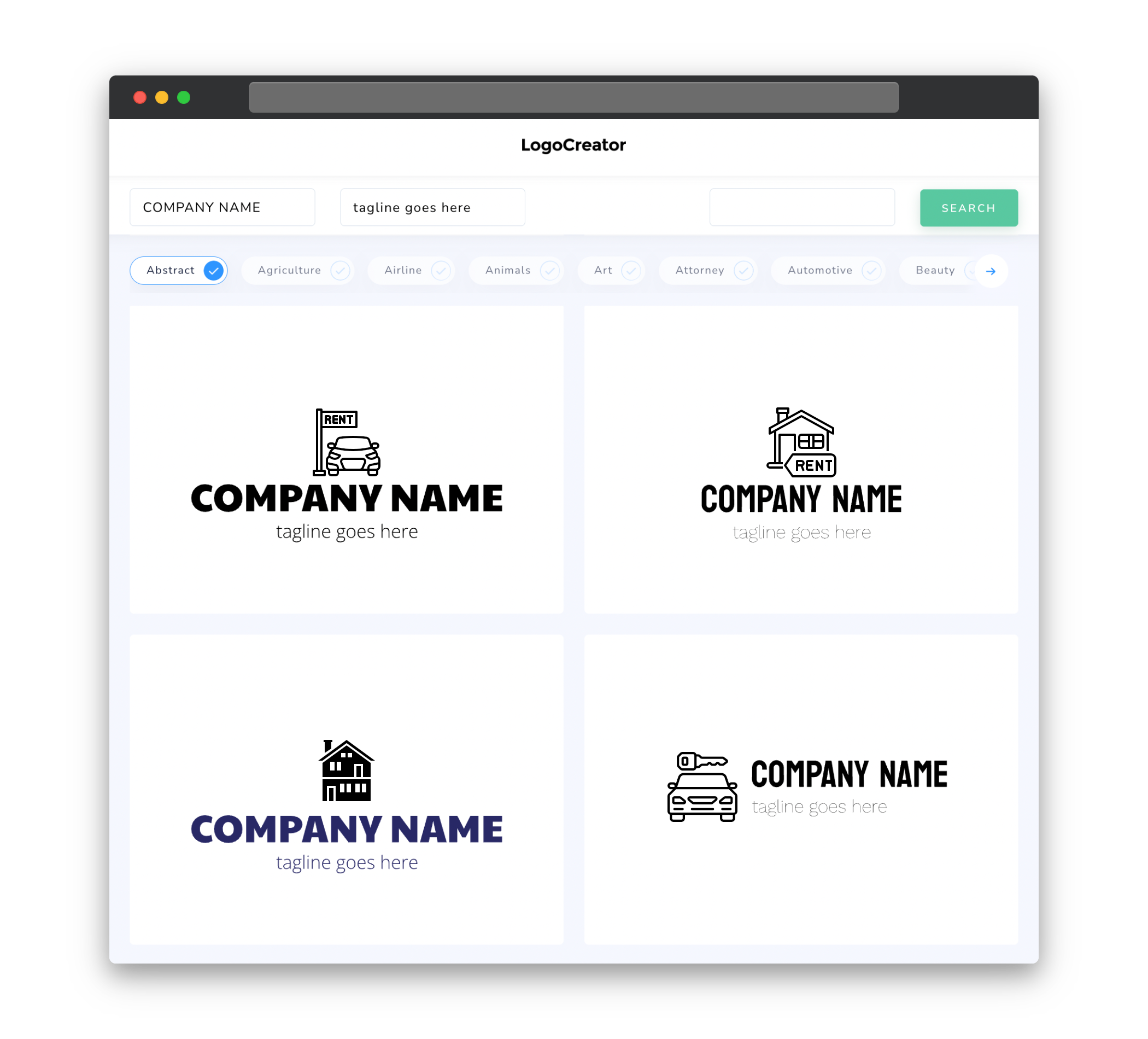
Icons are a powerful way to visually communicate the essence of your rental business. Including relevant icons in your logo can instantly convey the type of rentals you offer. For example, if you specialize in vacation rentals, incorporating a beach umbrella or suitcase icon can evoke the feeling of relaxation and travel. On the other hand, if you focus on event rentals, including icons such as tables, chairs, or party hats can help convey a festive and celebratory atmosphere. Icons can be used creatively to make your rental logo unique and memorable.
Color
Choosing the right colors for your rental logo is key in creating a visually appealing and impactful design. Colors evoke emotions and can influence how your target audience perceives your brand. For rental businesses, colors such as blue and green can convey a sense of trustworthiness and reliability. Additionally, colors like red and orange can create a sense of excitement and energy, which might be suitable for event rental businesses. It is important to select colors that align with your brand identity and the message you want to convey to your audience.
Fonts
The choice of fonts in your rental logo can greatly impact how your brand is perceived. Fonts have different personalities and can evoke various emotions. For example, a clean and modern font can project professionalism and sophistication, which might be suitable for luxury vacation rentals. On the other hand, a playful and bold font can convey a sense of fun and excitement, which might be appropriate for event rentals. It is important to choose fonts that are legible and align with your overall brand image.
Layout
The layout of your rental logo is crucial in creating a visually appealing and balanced design. A well-designed logo should have a clear hierarchy, with important elements positioned strategically. For example, the name of your rental business may take center stage, while icons or taglines are positioned to complement and enhance the overall design. A clean and uncluttered layout can help convey professionalism, while asymmetrical designs can add a touch of creativity and uniqueness.
Usage
Your rental logo will be used across various platforms and mediums, so it is important to consider its versatility and adaptability. Your logo should look equally appealing on both digital and print materials, such as websites, social media profiles, business cards, and signage. It should be scalable and maintain its integrity when resized. Additionally, it’s essential to have variations of your logo for different backgrounds, such as a version with a transparent background for overlaying on images. Ensuring your rental logo is versatile will allow you to maintain a consistent and professional brand identity across all touchpoints.


