Audience
When it comes to designing a shoe store logo, it’s important to think about your target audience. Consider the age range, gender, and style preferences of your customers. Younger audiences may prefer bold and vibrant designs, while older audiences might prefer more elegant and sophisticated logos. Understanding your audience will help you create a logo that resonates with your customers and effectively communicates your brand’s identity.
Icons
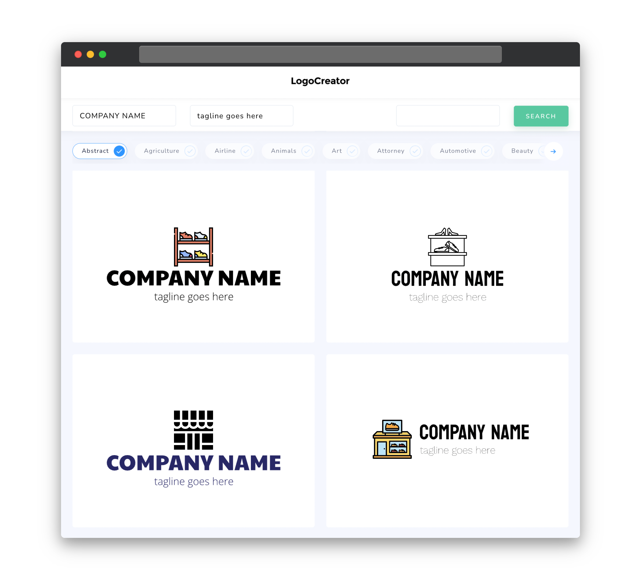
Incorporating icons into your shoe store logo can help visually represent your brand and create a memorable image. Consider using shoe-related icons such as sneakers, high heels, or boots to instantly convey the type of shoes your store offers. You can also think outside the box and use icons that symbolize comfort, fashion, or durability. Just make sure the icon you choose aligns with your brand’s values and resonates with your target audience.
Color
Color plays a crucial role in creating a compelling and eye-catching shoe store logo. Different colors evoke different emotions and can influence how customers perceive your brand. When choosing colors for your logo, consider your brand’s personality and the emotions you want to convey. For example, using vibrant colors like red or yellow can suggest energy and excitement, while cool tones like blue or green can convey trust and calmness. It’s also important to choose colors that complement each other and are visually appealing to the eye.
Fonts
Fonts are an integral part of your shoe store logo as they communicate the personality and style of your brand. Choose a font that is legible and easy to read even in small sizes. Consider the type of shoes you sell and the overall aesthetic of your store. If your brand is more casual and trendy, you may opt for a modern and playful font. On the other hand, if your store focuses on high-end or luxury footwear, a sophisticated and elegant font might be more suitable. Don’t be afraid to experiment with different fonts to find the one that best represents your brand’s unique identity.
Layout
The layout of your shoe store logo should be visually appealing and well-balanced. The arrangement of elements such as the text and icons should create a harmonious composition. Consider using symmetry or asymmetry to create visual interest and make your logo stand out. Experiment with different arrangements and proportions to find the layout that best represents your brand. Additionally, make sure to test your logo’s visibility and legibility at different sizes to ensure it looks great both on a signage outside your store and on a small social media profile picture.
Usage
Your shoe store logo will be used across various platforms and mediums, so it’s important to design it with versatility in mind. Ensure that your logo works well in both color and grayscale, allowing for easy reproduction in different printing formats. It should also be scalable without losing its visual impact. Consider using different variations of your logo, such as a simplified version for small sizes or a horizontal layout for certain applications. By creating a logo that is adaptable, you will have a brand identity that can be effectively used across all your marketing materials, ensuring a consistent and recognizable presence for your shoe store.


