Audience
When it comes to creating a social services logo, it’s important to consider your target audience. Your logo should not only reflect the values and mission of your organization but also resonate with the people you serve. Social services cater to a diverse range of individuals, including those in need of assistance or support, as well as potential donors, volunteers, and government entities. Therefore, your logo design should be inclusive, compassionate, and visually appealing to evoke trust, empathy, and a sense of community.
Icons
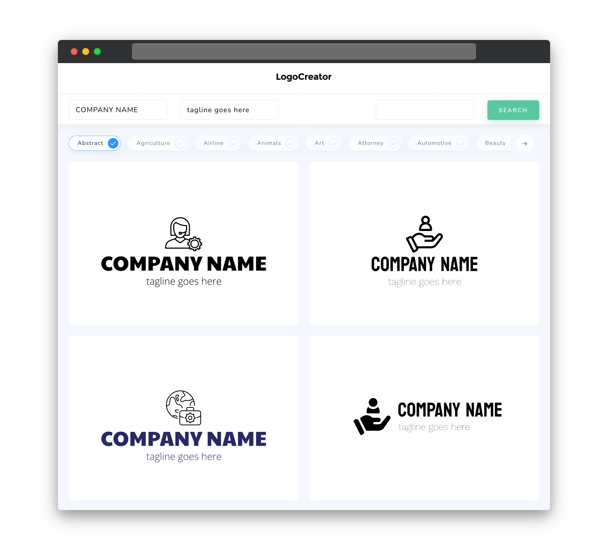
Choosing the right icons for your social services logo is crucial as they can effectively convey the purpose and scope of your organization at a glance. It’s essential to select symbols that symbolize care, support, and empowerment. Common icons used in social services logos include hands reaching out, hearts, circles representing unity, and silhouettes depicting diverse individuals or families. By incorporating meaningful icons in your logo, you can capture the essence of your services and create a visual representation that resonates with your target audience.
Color
Color plays a vital role in creating a compelling social services logo. Different colors evoke different emotions and can help communicate the values and mission of your organization. When choosing colors for your logo, consider using soft and comforting shades such as blues and greens to convey trust, compassion, and tranquility. Additionally, warm colors like oranges and yellows can evoke feelings of happiness, warmth, and positivity. However, it’s essential to strike a balance and avoid using colors that may be too overwhelming or intense, as they may not align with the sensitive and supportive nature of social services.
Fonts
Selecting the right fonts for your social services logo is crucial in conveying the appropriate tone and message. When it comes to font choices, opt for clean, legible, and modern typefaces. Serif fonts can add a touch of sophistication and professionalism, while sans-serif fonts can create a clean and contemporary look. Aim for fonts that are easily readable at various sizes, ensuring that your logo remains clear and impactful on different platforms and materials. Remember that simplicity is key in logo design, so avoid using too many different fonts, which can clutter the overall design and make it appear less cohesive.
Layout
The layout of your social services logo should be well-balanced, visually appealing, and scalable across different mediums. Consider utilizing a clean and organized layout that allows for easy recognition and memorability. Whether you choose a graphical logo or a text-based logo, ensure that the elements are properly aligned and spaced to create a harmonious composition. A well-designed logo layout not only enhances the aesthetic appeal but also facilitates brand recognition and leaves a lasting impression on your target audience.
Usage
Having a versatile social services logo is essential for its usage in various contexts and platforms. It should be easily adaptable to both digital and printed materials. A scalable vector-based logo is recommended to ensure that it remains crisp and clear when resized. This way, you can use your logo on websites, social media profiles, business cards, signage, and other promotional materials without compromising its quality. Additionally, consider creating logo variations or alternative layouts to accommodate different placements and orientations, ensuring your logo remains visually impactful regardless of the context in which it is presented.


