Audience
When it comes to designing a logo for your sofa business, it’s important to consider your target audience. Your logo should resonate with the specific group of people you are trying to attract. Whether you cater to modern homeowners, minimalist interior designers, or traditional furniture enthusiasts, understanding your audience’s preferences and tastes will help you create a logo that effectively communicates your brand message. By conducting market research and analyzing your target market’s demographics, you can tailor your logo design to appeal to your ideal customers.
Icons
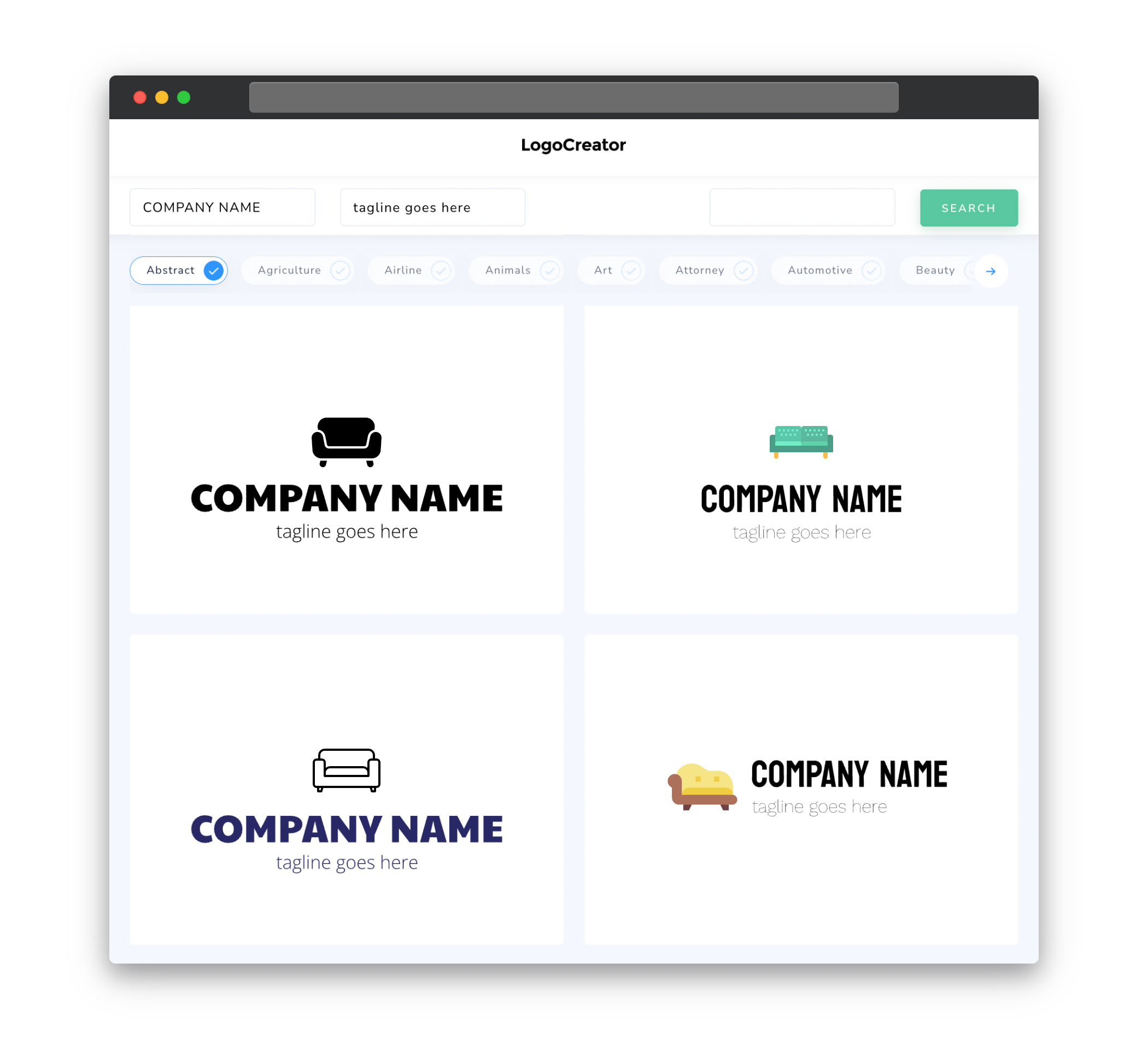
Icons play a crucial role in sofa logos, as they are often used to visually represent the essence of your brand. Incorporating relevant icons such as sofas, furniture elements, or abstract shapes can help convey the nature of your business at a glance. The icon you choose should be simple, easily recognizable, and aligned with the overall theme and style of your brand. It should also be versatile enough to be visually appealing and identifiable across different platforms, from digital media to print materials.
Color
Color is an essential aspect of any logo design, and for a sofa logo, it can significantly impact the visual appeal and brand perception. When selecting colors for your sofa logo, opt for shades that reflect your brand’s personality and evoke the desired emotions in your target audience. Earthy tones, such as warm browns and soft neutrals, can convey a sense of comfort, reliability, and elegance. Bright colors like blues and greens can add a touch of freshness, while darker tones like charcoal or navy can create a more luxurious and sophisticated look. It’s crucial to choose a color palette that complements your brand identity and stands out from competitors in the industry.
Fonts
Choosing the right fonts for your sofa logo is essential for creating a harmonious and cohesive design. Consider using clean, modern, and simple fonts that exude elegance and professionalism. Sans-serif fonts, such as Helvetica or Arial, are often a popular choice for sofa logos as they offer a sleek and contemporary look. However, if you want to convey a more traditional or vintage feel, you may opt for serif fonts like Times New Roman or Baskerville. Whichever font style you choose, ensure that it is legible and maintains clarity even when scaled down or used in different applications.
Layout
The layout of your sofa logo should be visually balanced and well-organized to create a strong visual impact. Experiment with different arrangements of your logo elements, such as icons and text, to find the most visually appealing composition. Consider incorporating negative space to create a sense of openness and elegance. A well-designed logo layout should be flexible enough to adapt to various marketing materials, such as business cards, websites, or product packaging. Test your logo in different sizes and formats to ensure that it remains clear and legible across all platforms and mediums.
Usage
Your sofa logo should be versatile and adaptable for various marketing purposes. It should be easily usable on different platforms such as websites, social media profiles, business cards, signage, and product labels. Consider creating different versions of your logo, such as a simplified version for small-scale applications or a black and white version for one-color printing. By ensuring that your logo is scalable, readable, and adaptable, you can maintain a consistent brand identity and effectively showcase your sofa business across multiple channels.


