Audience
When it comes to creating a sun logo, you want to ensure that it appeals to your target audience. The sun symbolizes warmth, energy, and positivity, so it is often used in logos for businesses in industries such as hospitality, wellness, and outdoor activities. For example, a hotel or resort can use a sun logo to convey a welcoming and serene atmosphere, while a fitness or yoga studio can use it to represent vitality and wellbeing. By understanding your audience’s preferences and the message you want to convey, you can create a sun logo that resonates with them and effectively communicates your brand identity.
Icons
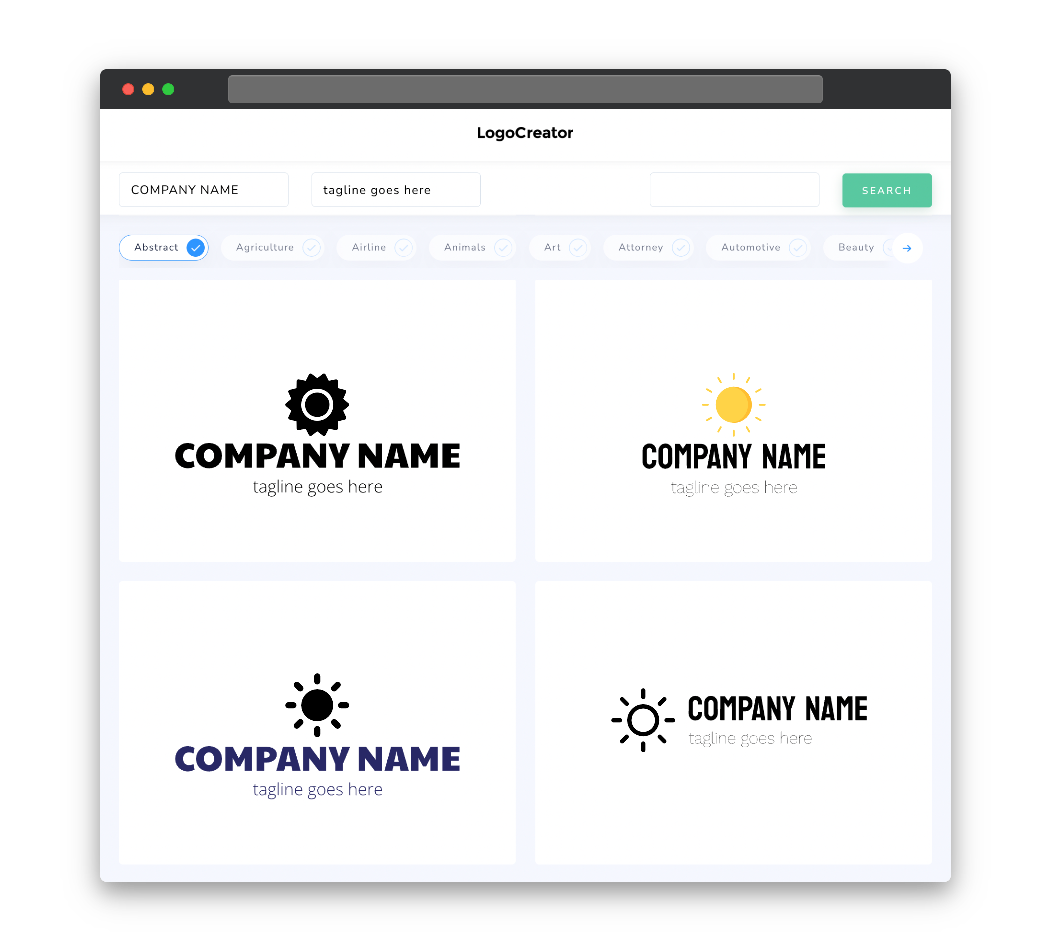
Choosing the right icon for your sun logo is crucial in conveying the desired message. There are various options to consider, such as a simple circle with rays emanating from it, which represents the traditional sun symbol. Alternatively, you can incorporate additional elements like mountains, waves, or leaves to give your logo a specific context or cater to a particular industry. It’s important to strike a balance between simplicity and uniqueness, ensuring that your sun logo stands out while remaining easily recognizable and memorable.
Color
Colors play a significant role in creating an impactful sun logo. Typically, vibrant and warm colors are associated with the sun, such as shades of yellow, orange, and golden hues. These colors evoke feelings of energy, optimism, and happiness. However, it’s essential to consider the overall branding and target audience when choosing colors for your logo. Neutral or cool tones can be added as complementary colors to create a harmonious composition or to convey a specific message. Experimenting with different color combinations can help you find the perfect balance that represents your brand values and captures attention.
Fonts
When selecting fonts for your sun logo, it’s important to consider legibility, aesthetics, and brand personality. Clean and modern sans-serif fonts can convey a sense of simplicity and contemporary style. On the other hand, elegant serif fonts can add a touch of sophistication and tradition. Additionally, handwritten or script fonts can bring a more personalized and artistic feel to your logo. Whichever font style you choose, ensure that it complements the overall design of your logo and aligns with your brand’s tone and message.
Layout
The layout of your sun logo should be carefully planned to create a visually appealing and balanced composition. Consider the placement and size of the sun icon in relation to any accompanying text or additional design elements. The goal is to achieve harmony and clarity while ensuring that the logo is easily recognizable and readable, whether it is displayed on a website, product packaging, or other marketing materials. Experiment with different layouts, such as centered, aligned, or overlapping elements, to find the most visually pleasing arrangement for your sun logo.
Usage
When using your sun logo, it’s important to be mindful of its proportions and placement. Ensure that it is scalable, meaning it can be resized without losing its visual impact or becoming distorted. This is particularly important for applications such as social media profiles, where the logo may appear small on a mobile device. Additionally, consider various backgrounds and how your logo will stand out against them. It should be versatile enough to adapt to different color schemes or be easily recognizable in both light and dark backgrounds. By designing a flexible and versatile sun logo, you can effectively use it across various platforms and mediums to create a strong and consistent brand presence.


