Audience
When it comes to creating a swimming logo, you want to make sure that your design captures the attention of your target audience – swimmers and swimming enthusiasts. Your logo should appeal to both professional swimmers and casual swimmers, as well as individuals and families who enjoy spending time in the water. It’s important to consider the age range of your target audience as well. If your swimming logo is for a kids’ swim school, you may want to use fun and playful icons and colors. On the other hand, if your logo is for a competitive swim team, you might want to opt for a more sleek and professional design.
Icons
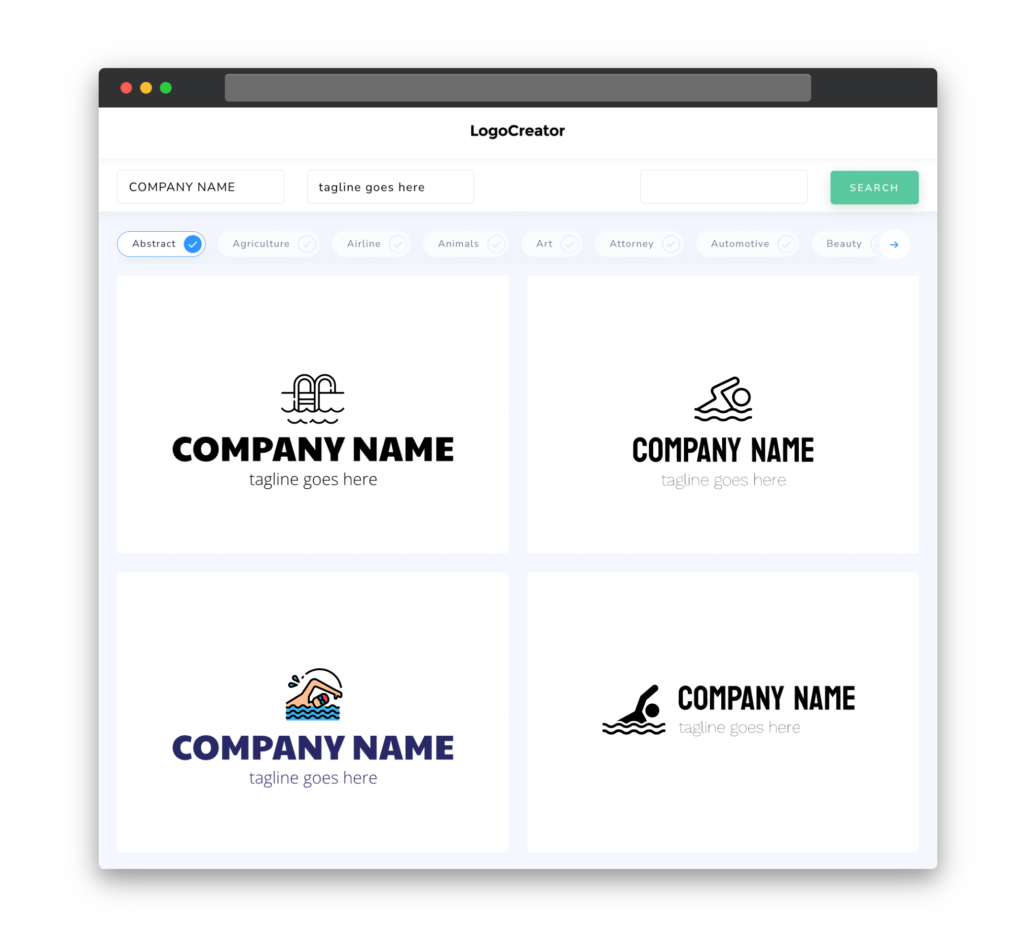
Icons are an essential part of any swimming logo as they help visually represent the concept of swimming. When choosing icons for your swimming logo, consider incorporating elements such as waves, swimmers, goggles, or even a pool. These icons can help convey the idea of movement, water, and athleticism associated with swimming. Make sure to select icons that are simple, easily recognizable, and scalable to different sizes. Remember, your logo needs to be effective not only on larger marketing materials but also on smaller items like swim caps or social media profile pictures.
Color
Color plays a significant role in creating a visually impactful swimming logo. The color choice for your logo should evoke feelings of freshness, energy, and tranquility associated with swimming. Blues and greens are often used in swimming logos, as they represent water and nature. However, you can also consider using vibrant colors like orange or yellow to capture attention and convey energy. Choose colors that complement each other well and create a harmonious balance in your logo. It’s a good idea to limit your color palette to two or three colors to avert visual clutter.
Fonts
The choice of fonts in your swimming logo can convey different emotions and characteristics. Consider using fonts that are clean, modern, and readable. Sans-serif fonts are often preferred for swimming logos as they have a contemporary and sleek appearance. However, if you’re targeting a younger audience or want to add a playful touch to your logo, you may opt for a script or handwritten font. Ensure that the chosen font is legible even at small sizes. Experiment with different font combinations to find the perfect balance between readability and style for your swimming logo.
Layout
The layout of your swimming logo should be designed to effectively showcase the chosen icons and text. Keep in mind that your logo will be displayed in different sizes and formats, so it’s crucial to create a layout that remains recognizable and pleasing regardless of its dimensions. Consider placing the icons and text in a balanced and visually appealing composition. You can experiment with different arrangements, such as placing the icon above or next to the text, to find the most aesthetically pleasing design. Additionally, make sure that your logo works well in both horizontal and vertical orientations to accommodate different applications.
Usage
Your swimming logo will be used across a variety of mediums, from digital platforms to print materials. It’s important to design a logo that works well in different sizes and formats. Test your swimming logo by resizing it to a smaller scale to ensure that all elements are still clearly visible and recognizable. Additionally, consider the versatility of your logo in terms of its adaptability to different backgrounds and color schemes. Ensure that your logo remains legible and visually appealing when used on various backgrounds, be it a white web page or a more vibrant backdrop.


