Audience
When it comes to creating a tax logo, it’s important to consider your target audience. The individuals and businesses who will be using your tax services have unique needs and expectations. Your logo should resonate with them and communicate that you understand their specific tax-related challenges. Are you catering to individual taxpayers, small businesses, or large corporations? Understanding your audience will help you select the right visuals and messaging for your logo design.
Icons
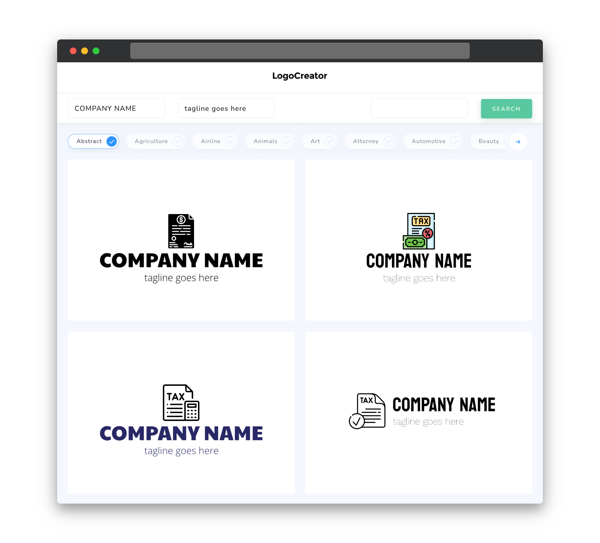
Icons are a great way to visually represent key elements of your tax services in your logo. Consider incorporating icons that symbolize concepts like finance, money, taxes, and growth. These icons can help convey the nature of your services at a glance and add an extra layer of meaning to your logo. Remember to keep the icons simple and easy to understand, as cluttered designs can be confusing and less effective in making a memorable impression.
Color
Choosing the right colors for your tax logo is crucial in creating a strong visual identity. Different colors evoke different emotions and perceptions. For a tax-related logo, it’s important to choose colors that convey professionalism, trust, and reliability. Blues and greens are commonly associated with these qualities. However, it’s worth considering other color options that align well with your brand personality and target audience. Be sure to select colors that complement each other and create a harmonious visual experience for your logo.
Fonts
When selecting fonts for your tax logo, opt for clean and professional typography. Fonts can contribute to the overall tone and perception of your brand. Sans-serif fonts tend to convey a modern and clean aesthetic, while serif fonts can evoke a more traditional and authoritative feel. It’s important to strike a balance between readability and style when choosing a font. Ensure that the font you select is easy to read in different sizes and formats, as your logo will be used across various mediums.
Layout
A well-designed tax logo should have a clear and balanced layout. The visual elements, including icons and text, should be arranged in a coherent and visually appealing manner. Consider the positioning and spacing of the different elements to ensure a harmonious composition. The layout should guide the viewer’s eye smoothly and intuitively, highlighting the key elements of your logo design. Remember, simplicity is key when it comes to logo design, so avoid cluttering the layout with unnecessary elements.
Usage
Your tax logo will be used across a variety of mediums, ranging from digital platforms to printed materials. It’s important to consider the versatility and adaptability of your logo design. Ensure that your logo looks great and maintains its integrity when scaled down or used in different orientations. It should be easily recognizable whether it’s displayed on a small business card or a large billboard. Additionally, consider creating different versions of your logo, such as a simplified version for small sizes or a single-color version for use on faxed documents or black-and-white prints.


