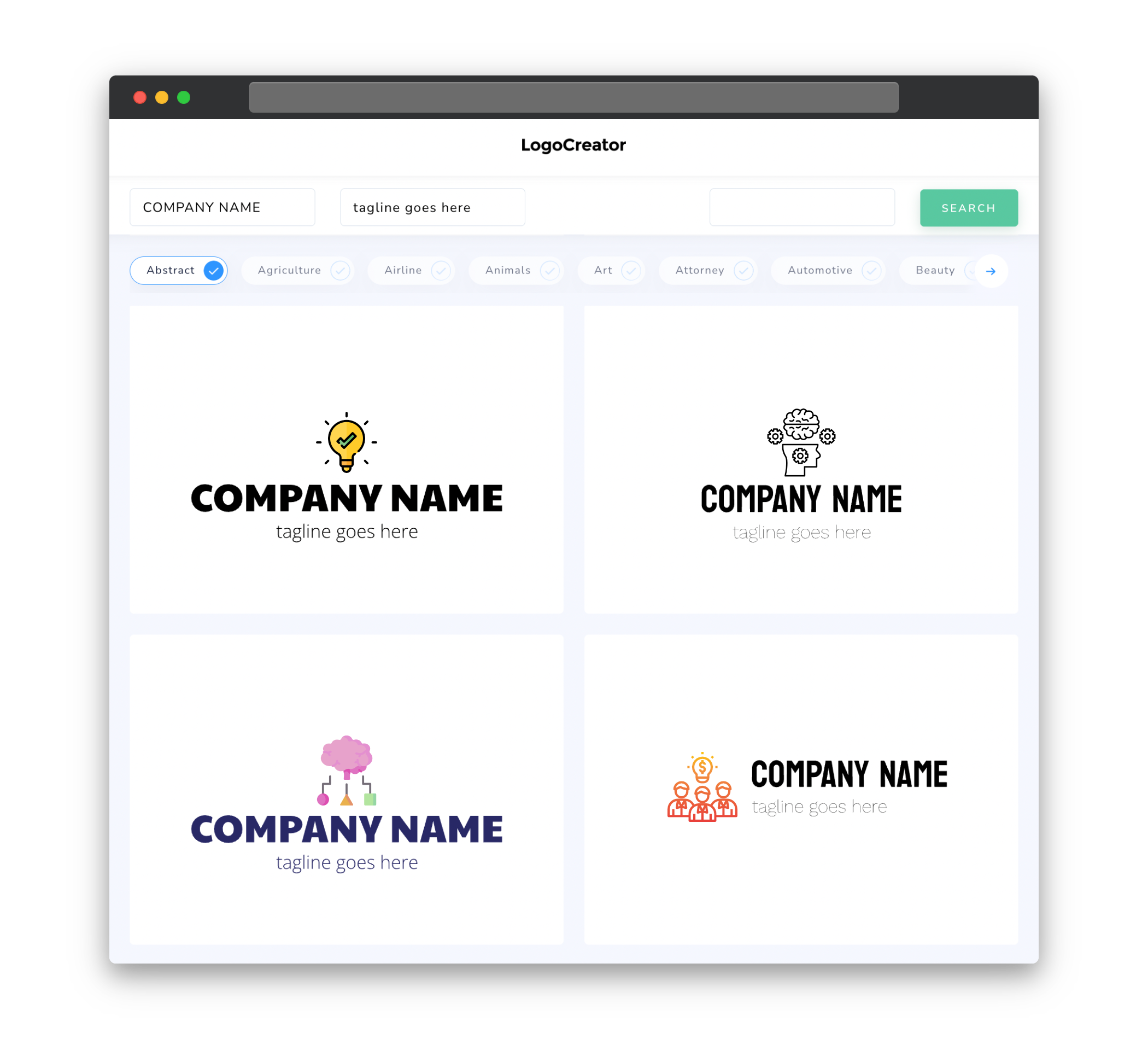
Audience
When it comes to creating a logo for your think tank, it is important to consider the audience you are targeting. A well-designed logo can instantly communicate the values and vision of your think tank, attracting the right audience. Whether your think tank focuses on policy research, innovation, or collaboration, your logo should reflect the unique characteristics that set your organization apart.
Having a clear understanding of your target audience will help you choose the right elements to incorporate into your logo design. For example, if your think tank caters to government officials and policymakers, you might want to consider using professional and authoritative icons and fonts. On the other hand, if your target audience consists of entrepreneurs and startups, a more modern and innovative look might be more appropriate.
Icons
Icons play a crucial role in conveying the essence of your think tank through your logo. The choice of icons should align with the core values and mission of your organization. Whether you opt for abstract symbols or specific visuals that represent your think tank’s expertise, the icons you use can help differentiate your logo from others in the industry.
Consider using icons that are easily recognizable and memorable. Icons related to brainstorming, collaboration, and knowledge can be great choices for think tank logos. You can also explore symbols that represent growth, ideas, and forward-thinking to convey the innovative nature of your organization. Remember to strike a balance between simplicity and uniqueness to create a logo that stands out and leaves a lasting impression.
Color
Color is a powerful tool that can evoke emotions and create visual appeal in your think tank logo. The choice of colors should align with your organization’s values, brand identity, and the message you want to convey. Selecting the right color palette will help create a cohesive and visually appealing logo that resonates with your target audience.
Consider the characteristics associated with different colors. For example, blue often represents trust, stability, and professionalism, which can be suitable for a think tank focused on policy research. On the other hand, green conveys growth, innovation, and sustainability, making it ideal for a think tank promoting environmental solutions. Remember to choose colors that complement each other well and create a harmonious visual impact.
Fonts
Fonts are an essential element of logo design as they give your think tank’s identity a unique personality. The choice of fonts will depend on your organization’s style and vision. Consider selecting fonts that are legible, versatile, and align with your desired image.
For a think tank that wants to appear refined and professional, serif or sans-serif fonts can convey a sense of authority and expertise. On the other hand, if your think tank aims to project a more modern and innovative image, you can explore using geometric or script fonts. Whatever fonts you choose, make sure they are clear and readable even at smaller sizes to ensure your logo remains visually appealing across various formats.
Layout
The layout of your think tank logo is crucial in creating a visually appealing and balanced design. The arrangement of elements and their proportional relationships will determine how well your logo communicates your organization’s message and values.
Consider the overall composition and balance of your logo. Whether you opt for a symmetrical or asymmetrical layout, ensure that the spacing and alignment of elements are visually appealing. Experiment with different arrangements to find the layout that best represents your think tank’s identity.
Usage
Once you have created a compelling logo for your think tank, it is important to consider its usage across different mediums. Your logo should be adaptable and scalable to ensure it looks great on various platforms, including websites, social media profiles, stationery, and promotional materials.
Consider creating different versions of your logo to suit different usage scenarios. For example, you may need a simplified version for smaller sizes or a monochrome version for situations where color printing is not available. By considering the practicality of your logo’s usage, you can ensure that it remains impactful and recognizable across different mediums.


