Audience
When it comes to creating a logo for your tie business, you want it to resonate with your target audience. Your logo should appeal to both men and women who appreciate fashion-forward ties and accessories. Whether you cater to professionals looking for sleek and sophisticated designs or to fashion enthusiasts seeking bold and unique patterns, your tie logo should reflect the style and personality of your brand. By understanding your target audience’s preferences and staying up-to-date with the latest trends, you can create a logo that captures their attention and establishes a strong brand identity.
Icons
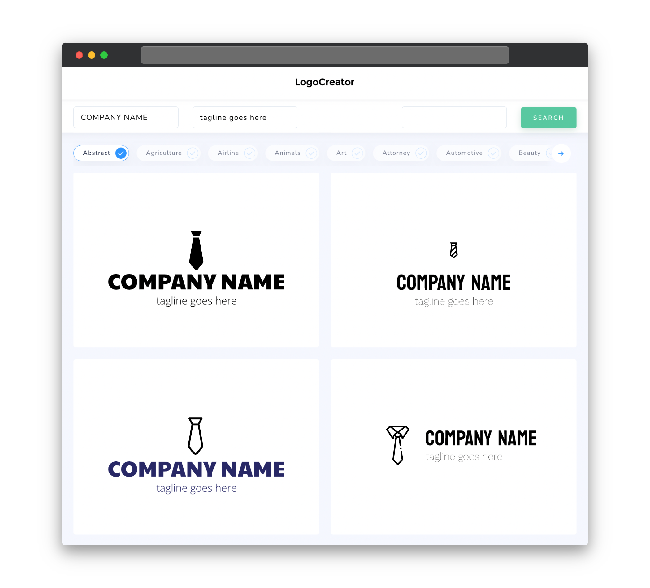
Icons play a crucial role in tie logos as they can instantly convey the essence of your brand. Including iconic elements such as ties, knots, or bowties in your logo design can help make an immediate connection with your audience. These recognizable symbols make it easy for people to associate your brand with the world of ties and evoke a sense of professionalism and style. The key is to strike a balance between simplicity and creativity, ensuring that the icon is memorable, versatile, and scalable for use across different marketing materials.
Color
Color is an essential aspect of any logo design, and for tie logos, it can greatly influence the perception of your brand. The choice of colors should align with your brand’s identity, style, and target audience. Classic colors like navy blue, black, and white represent elegance, while bolder colors like red or purple can evoke a sense of confidence and creativity. Consider using complementary colors that enhance the overall impact of your logo and create a harmonious visual experience. Remember that the color scheme needs to be easily reproducible and adaptable to different materials, such as ties, packaging, and online platforms.
Fonts
Choosing the right font(s) for your tie logo is crucial in conveying your brand’s personality and creating a cohesive visual identity. Opt for clean and legible fonts that can be easily read, especially when scaled down on small items like labels or tie tags. Serif fonts can add a touch of sophistication, while sans-serif fonts can give a modern and sleek look. Experiment with different combinations to find the perfect balance between elegance and readability. Additionally, consider customizing certain letterforms or integrating unique typographic elements to make your logo truly stand out.
Layout
The layout of your tie logo will determine how all the elements of your design come together to create a visually appealing and cohesive composition. When considering the layout, think about how the logo will be displayed on your ties, packaging, and promotional materials. A horizontal layout may work well for tags or labels, while a square or circular logo can be more versatile for use on social media profiles or website icons. Experiment with different arrangements of the icon, text, and any supporting elements to create a balanced and visually pleasing logo that captivates your audience.
Usage
Your tie logo should be versatile and adaptable to various marketing materials and platforms. Ensure that the logo is scalable, allowing it to be resized without losing its clarity or compromising its visual impact. This is especially important when designing your tie logo, as it needs to be legible and recognizable even on small areas such as tie tags or labels. Keep in mind that your logo will appear on different backgrounds, so consider creating versions with both light and dark color schemes to ensure visibility and suitability. Make sure to test your logo across different mediums to ensure it functions effectively and represents your brand consistently.


