Audience
When it comes to designing a logo for your toy store, it is important to consider your target audience. Your logo should appeal to both children and their parents, as they are the primary customers of your store. Children are attracted to bright colors and fun designs, so incorporating playful elements into your logo can help capture their attention. Parents, on the other hand, will appreciate a logo that portrays professionalism and trustworthiness. Balancing these two aspects is key to creating a logo that resonates with your target audience and represents the essence of your toy store.
Icons
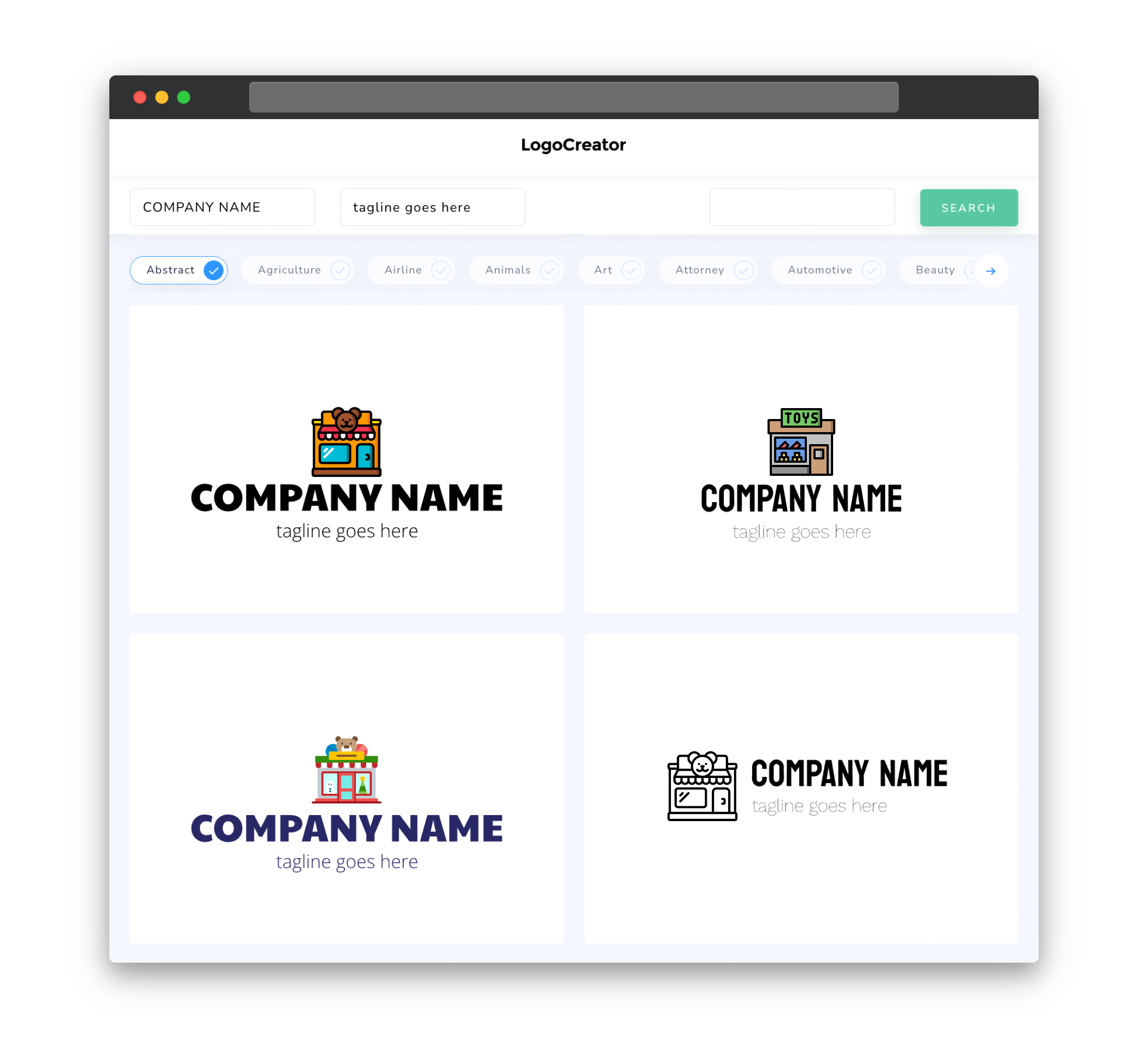
Choosing the right icons for your toy store logo is crucial to effectively communicate your brand message. Since toys come in various forms and categories, you should carefully select icons that represent the types of toys your store offers. For example, if you specialize in educational toys, incorporating icons like books, puzzles, or building blocks can help convey that message. On the other hand, if your store focuses on plush toys, using icons like teddy bears or animals can be more appropriate.
Color
Color plays a significant role in logo design, as it helps evoke emotions and create associations with your brand. For a toy store logo, using bright and vibrant colors is a great way to capture the attention and imagination of children. Incorporating primary colors, such as red, blue, and yellow, can help create a sense of excitement and playfulness. Additionally, you may consider using softer pastel colors to appeal to younger children, while still maintaining a fun and inviting atmosphere.
Fonts
When choosing fonts for your toy store logo, it is important to prioritize readability and simplicity. Since the main purpose of your logo is to communicate your brand name, using clear and legible fonts is essential. Avoid overly decorative or intricate fonts that may be difficult to read, especially at smaller sizes. Additionally, consider the personality you want to convey through your logo. Selecting a font that reflects the playful and joyful nature of toys can help reinforce your brand’s message.
Layout
The layout of your toy store logo should be carefully considered to ensure a balanced and visually appealing design. One popular layout option for toy store logos is to incorporate a central icon or symbol, surrounded by the store name or slogan. This layout helps establish a visual hierarchy, with the icon drawing attention and the text providing important information. Alternatively, you may opt for a more minimalist approach, using a single element or wordmark as the primary focus. Whichever layout you choose, make sure it is visually appealing and effectively represents your toy store’s brand identity.
Usage
Once you have created a visually appealing logo for your toy store, it is important to consider how it will be used across various platforms. Your logo should be versatile and adaptable to different mediums, such as websites, social media profiles, signage, and merchandise. To ensure consistency, it is recommended to have your logo available in different file formats (e.g., PNG, SVG, EPS) and color variations (e.g., full color, black and white) to accommodate different printing and display needs. By having a well-designed and adaptable logo, you can enhance your brand recognition and create a cohesive visual identity for your toy store.


